Made in Europe, buy from Europe.

Want portraits and landscapes in one gallery without cropping anyone’s head off? That’s what a WordPress masonry gallery does. Every photo keeps its shape, and the columns fill in like a stone wall.
The Gallery block built into WordPress can’t do this. It lines photos up in rows, so mixed shapes get cropped or leave gaps.
We make Modula, and its free version has a Masonry layout and a built-in lightbox. The whole job takes four steps:
- Install Modula, then open Modula → Content and click New gallery.
- Click + Add and bring in your photos.
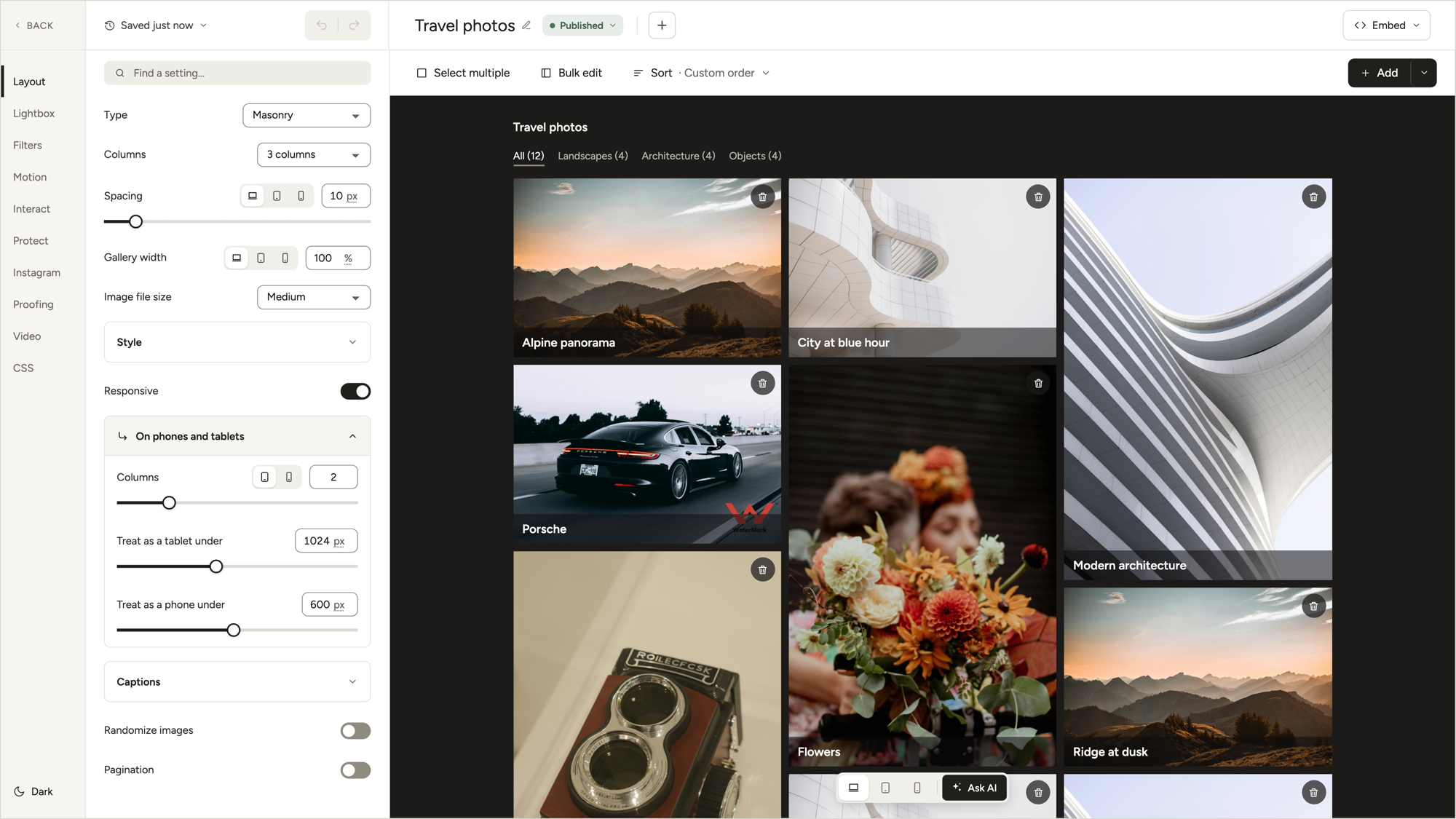
- Open Layout, set Type to Masonry and pick your Columns.
- Click Save, then Embed, and paste the shortcode into a page or drop in the Modula Gallery block.
What is a masonry gallery?
A masonry gallery is a Pinterest-style layout: columns of equal width, photos at their natural height. Each new photo drops into the shortest column, so there are no big holes and nothing gets cropped. Pinterest and Unsplash are examples you’ve already scrolled through.
The name comes from stonework. The Masonry JavaScript library describes it as “sort of like a mason fitting stones in a wall.”
Masonry is made for sets that mix tall and wide shots: a wedding, a road trip, interiors, artwork. Two cases where another layout fits better:
- All the same shape? A potter’s 12 product shots on white look tidier in a Uniform grid.
- Want even rows, not even columns? That’s what Justified grid does.
Our guide to tiled layouts compares them side by side.

How to create a masonry gallery in WordPress
All you need for a masonry photo gallery is the free Modula plugin and a folder of photos. No code.
Install Modula
From your dashboard, open Plugins → Add Plugin, search “Modula”, then install and activate it. It’s free on wordpress.org, with 160,000+ active installations. The install guide goes step by step.
Create a gallery and add your photos
Go to Modula → Content, click New gallery and give it a name you’ll recognize (“Lake Como wedding” beats “Gallery 7”). + Add opens your Media library to reuse photos; its arrow has Upload files for new ones.
Photos appear in the order you add them, and in masonry that order matters. Sorting options come with the Starter plan.
When your photos are in, click Save in the top bar (or press Cmd/Ctrl+S).
Choose Masonry and set the columns
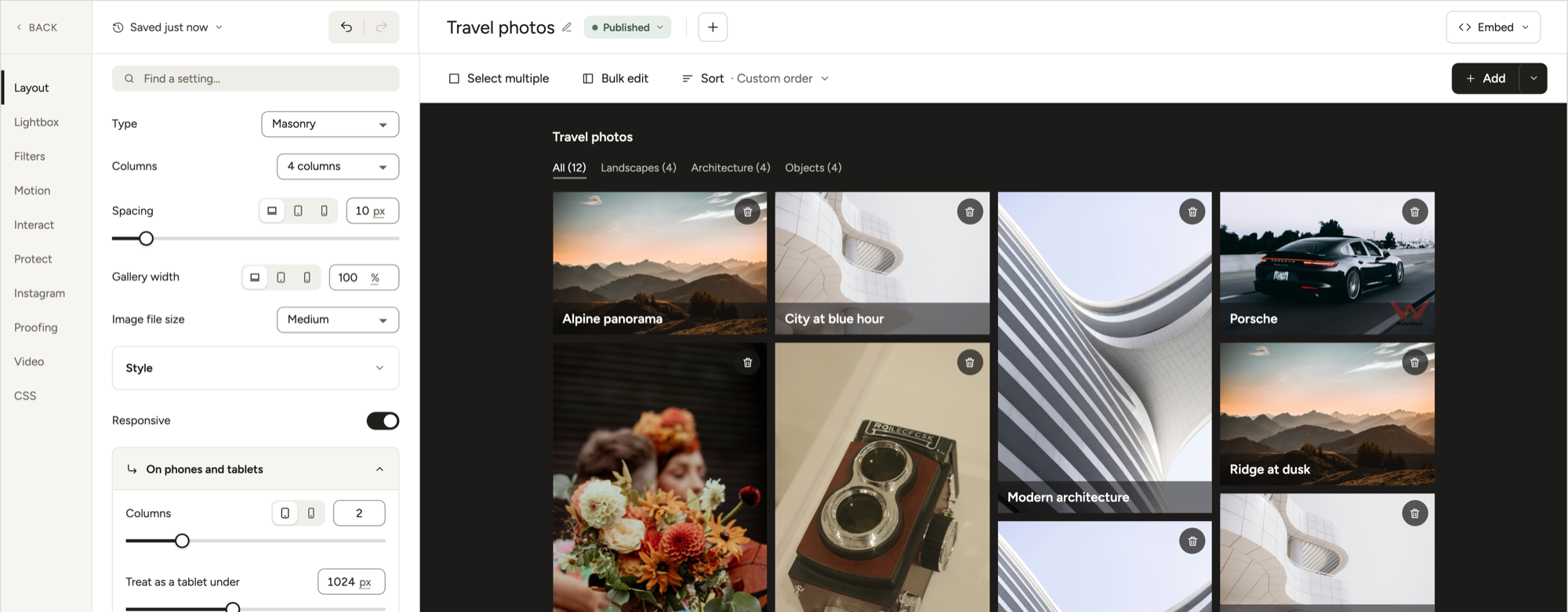
Open Layout in the left rail and set Type to Masonry, under Automatic layouts. Then check these four:
- Columns: 1 to 12, with 3 as the default. Three or four suit most pages.
- Spacing: 10 px by default. Desktop, tablet and mobile can each get their own gap.
- Image file size: leave it at Medium. Big and Retina screens get larger copies anyway.
- Randomize images: shuffles the order on every page load. Leave it off if order matters.
Set up captions and the lightbox
The lightbox is on from the start. A click on any photo opens it full size (On click: Open in lightbox), and visitors can swipe or click through the whole set. That’s your masonry lightbox gallery, done.
For captions, open Captions in the Layout section and put the text on the photo or under it. Our captions guide has the details.
Check it on phones and tablets
Four columns that look great on a laptop turn into slivers on a phone. Modula handles that for you: Responsive is on by default.
Under On phones and tablets, you get 2 columns on tablets (screens under 1024 px) and 1 on phones (under 600 px).
Change those if your theme needs it, then check with the Desktop, Tablet and Mobile buttons under the preview. Our mobile gallery guide has more.
Add it to a page
Click Save, then Embed in the top bar, and copy the shortcode, a short tag like [modula id="89"] that WordPress swaps for your gallery. Paste it wherever the photos belong, or insert the Modula Gallery block and choose your gallery.
On a page builder? Modula has an Elementor widget, a Divi module and a Beaver Builder module, so a Divi or Elementor masonry gallery takes the same few clicks. See our Elementor and Divi guides.
🎬 Video: Modula 3.0 masonry gallery walkthrough, from New gallery to Embed
Tips for a better masonry gallery
Good to know
In a Modula masonry gallery, put your strongest photos first. Each photo goes into the shortest column, in the order you added them. With 3 columns, your first 3 photos become the top row: the part everyone sees before scrolling.
- Mix shapes on purpose. Same-shape photos make masonry look like a plain grid. It shines when portraits and landscapes alternate.
- Upload big enough photos. Aim for at least twice your column width, so phones and Retina screens stay sharp.
- Split big galleries. Filters (Starter and up) show one category at a time, like Ceremony or Reception. Pagination and Load More (Business) keep the first load light.
- Write alt text. Screen readers rely on it. To edit it, click that photo in the preview.
Want your masonry gallery to move?
Two Modula features make a masonry gallery move: Parallax and loading effects.
- Parallax: a masonry-style gallery type whose columns drift at different speeds as visitors scroll. The Scroll effect setting picks the pace: Calm, Balanced or Dynamic. Any Modula Pro plan includes it.
- Loading effects: in the Motion section, turn on Reveal tiles as they scroll in, pick Scale and lower its Amount below 100%, so photos grow into place. Both are free; Rotate and Slide are Pro. Loading effects don’t work on Parallax galleries.

How to animate a gallery shows both in action.
Wrapping up
A WordPress masonry gallery takes just three things: the free Modula plugin, the Masonry type (one of its 8 free layouts) and a few minutes on columns. Want Parallax or filters later? The pricing page has the plans.
Frequently asked questions
Yes. Masonry is one of 8 free gallery types, along with Uniform grid, Fit grid, Justified grid, Custom grid, Tiles, Polaroid and Template. The lightbox and the phone and tablet columns are free too. The other 8 of Modula’s 16 types need a paid plan.
No. Only the column width is fixed, so each photo keeps its proportions. That’s the difference from a regular grid: Modula’s Uniform grid gives every tile the same shape and crops photos to fit it. Fit grid also uses equal tiles but shows each photo whole.
Not with the built-in Gallery block: in WordPress 7.1 it has no masonry option. Native CSS masonry (display: grid-lanes) works only in Safari 26.4 and newer so far, about 12.5% of users worldwide (caniuse, October 2026).
The Masonry JavaScript library works everywhere, but you write the code and get no lightbox, captions or phone settings.
Your column width decides it. For example, 3 columns in a 1,200 px content area are about 390 px wide each. Upload originals at twice that, 800 px or more, so Retina screens stay sharp. Image file size can stay at Medium: Modula hands bigger copies to the screens that need them.