According to new research, unique mobile users reached a staggering 5.44 billion in January 2023. It means that 2 out of 3 people worldwide already use a mobile phone. With this in mind, every website should seriously consider optimizing for mobile.
Images need even more attention to ensure they are fully responsive when switching devices.
Look no further if you need a responsive image gallery for your WordPress website! For an elegant and clean way to present your images, Modula will help you build a mobile responsive image gallery.
Your photographs will appear stunning on desktop, tablet, and mobile devices thanks to our responsive WordPress gallery, which adjusts to any screen size!
In this article, you will find out the following:
- What plugin should you use to make mobile responsive images?
- How to create a mobile image gallery in WordPress.
- More customization to showcase your galleries.
- And much more.
Table of contents
Why make your image galleries mobile responsive?
Websites need mobile responsive image galleries for several reasons:
- Mobile Traffic: Due to the rise in the use of mobile devices to access the internet, websites have to be optimized for small screens. A mobile responsive gallery plugin ensures images are displayed correctly on all devices.
- User Experience: Images appearing distorted or cut off in a non-responsive image gallery will cause a bad user experience. No matter what device a user uses, a mobile responsive gallery offers a seamless and consistent experience.
- SEO (Search Engine Optimization): Google promotes websites that offer a positive user experience and are mobile-friendly. The search engine ranking of your website may benefit from a mobile-friendly image gallery.
- Increased Engagement: A mobile responsive image gallery can increase engagement by making it easier for users to view and interact with images on their mobile devices.
In summary, a mobile responsive image gallery is essential for enhancing user experience, optimization for search engines, and website engagement.
Why use Modula?
We live in an era where the focus is on the client. For this reason, start focusing on your clients by using a user-friendly plugin to design galleries and albums to delight your visitors.
With Modula, there are many features at your disposal. The plugin offers you six different grid types (creative, custom, masonry, video, BnB, and slider), video extension, and many gallery features like hover effects, filterable galleries, and image loading effects.
You can even password-protect your galleries, add watermark and social sharing buttons, create albums, give user roles, and much more.
You can also design an awesome image gallery with features like lazy loading, image optimization, and other customization choices.
Our galleries aren’t just user-friendly and customizable, but they’re also mobile responsive. The following section will show you exactly how this feature works.

Modula Gallery Plugin
Create stunning, responsive photo galleries with ease. Showcase your work, captivate your audience, and boost engagement. You don’t need to do any coding.
How to create a mobile responsive photo gallery in WordPress?
Because it is so easy to use, creating a gallery in WordPress with Modula will take only a few minutes. You need to install and activate Modula to create a mobile responsive gallery.
Install and activate Modula
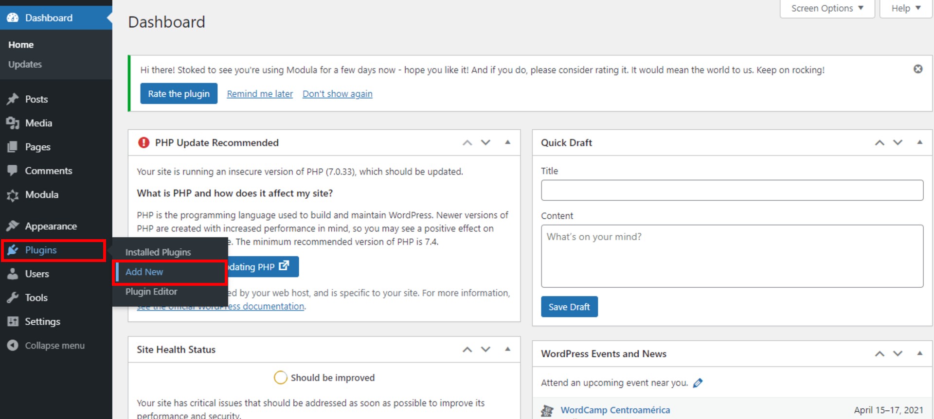
I will show you how to install and activate this WordPress plugin. First, go to your WordPress Dashboard, and look for Plugins. Then, click on Add New.
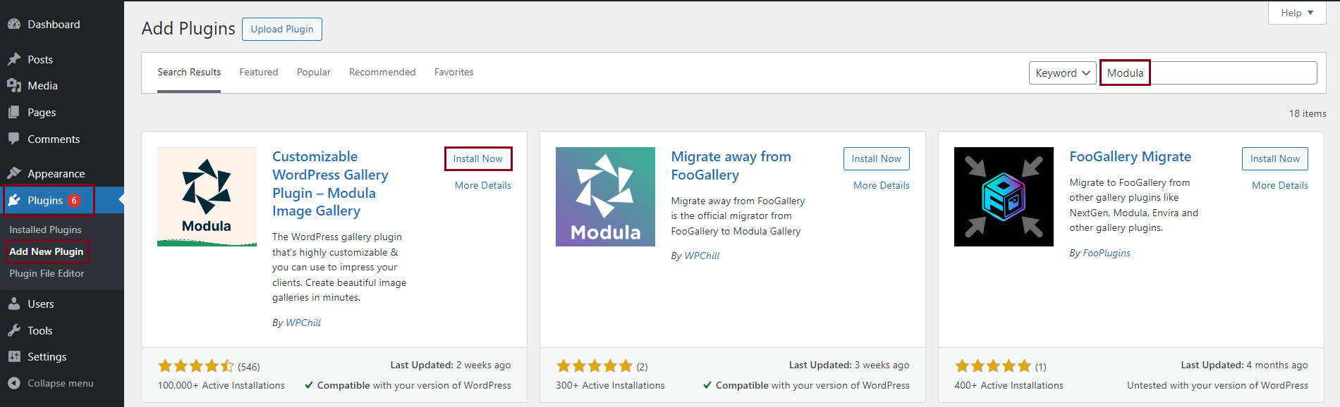
Next, type Modula, and when you find it, click on Install Now.
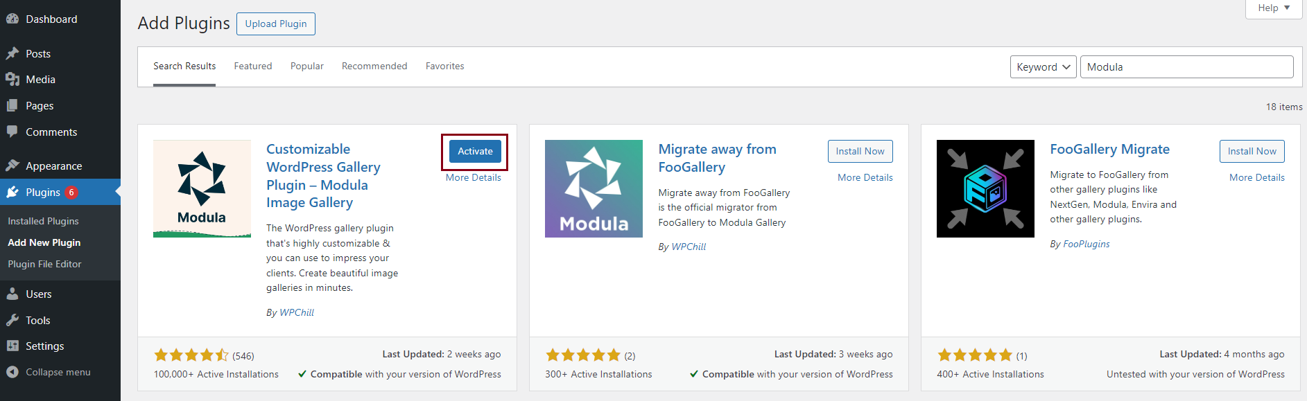
To activate it, you need to click on the Activate button when the installation is done. Modula will appear in the WordPress menu on the left.
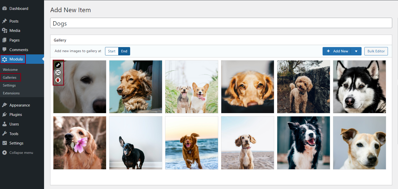
Create an image gallery
Whenever you want to create a gallery using this plugin, go to Modula > Galleries > Add New.
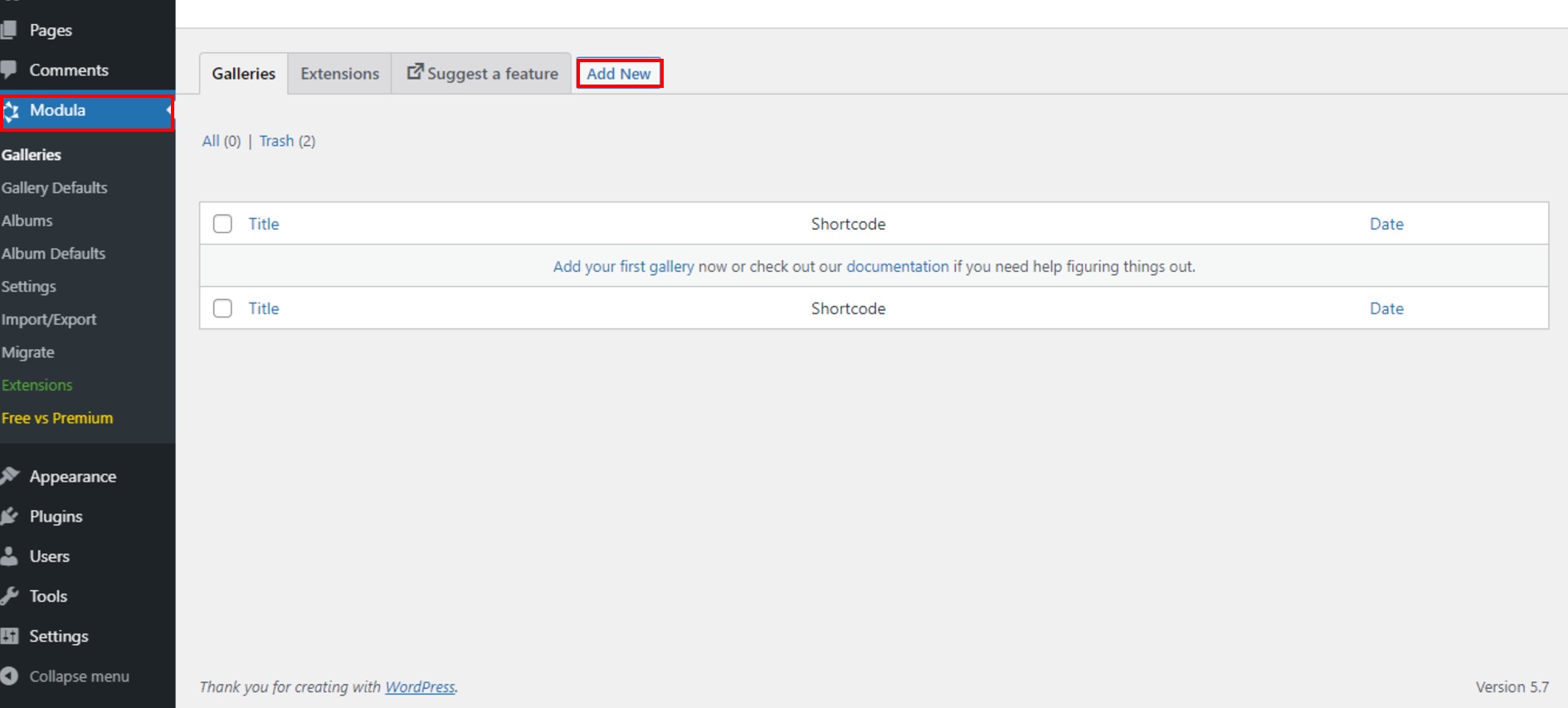
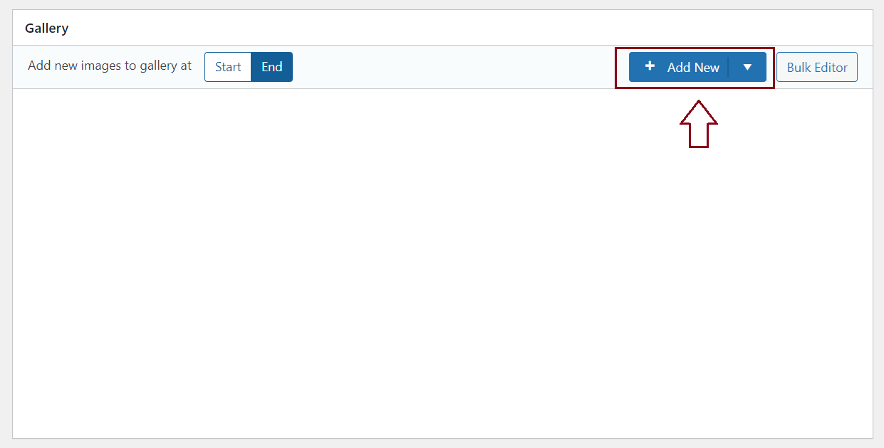
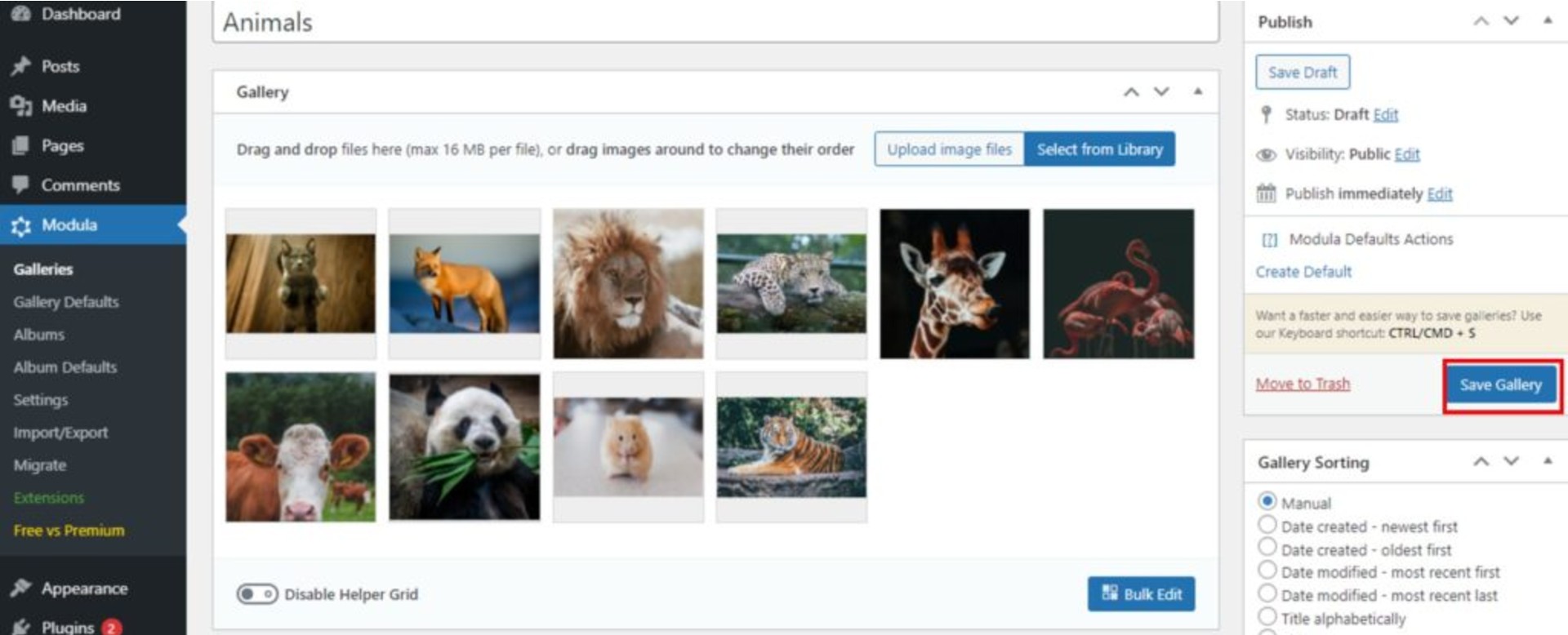
After that, you can give your gallery a name and add images using the Add New button.
Make your gallery mobile responsive
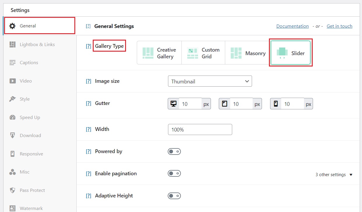
The responsive tab only shows up for the: Custom Grid, Masonry, and Slider gallery types. The Creative gallery type is responsive by default.
For my gallery, I choose the Slider grid type. To select your gallery type, go to Settings > General > Gallery Type and choose the Slider option.
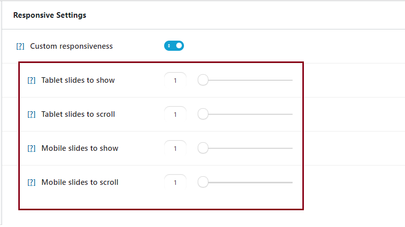
You need to go to Responsive > Custom responsiveness and enable it. This way, your slider will become mobile responsive.
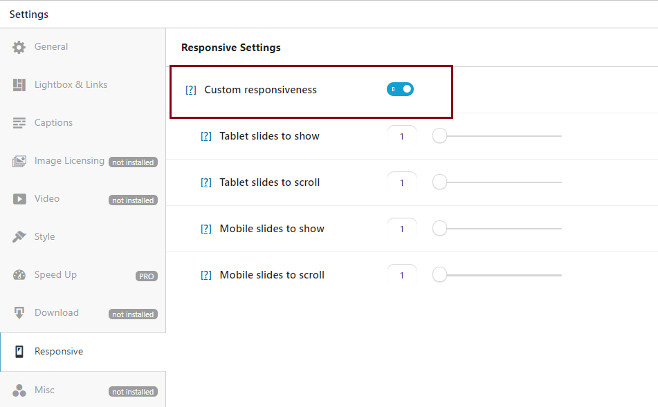
As you can see, there are a few settings, like how many slides to scroll on tablet/mobile and how many slides to show on tablet/mobile.
I’ve set the slides to one for mobile and two for tablet. When you set the number to one, each image will be displayed full width. Of course, you can set it to how much you want depending on the desired layout, but showing only one column on mobile keeps the page looking cleaner.
More customization for your gallery
Even if we set our gallery as mobile responsive, all the remaining features are still available to style our gallery.
The responsive feature is just another one with many others. The only thing that changes is that your gallery will become responsive. I want to share with you some of them that apply to both the custom grid and the slider gallery types.
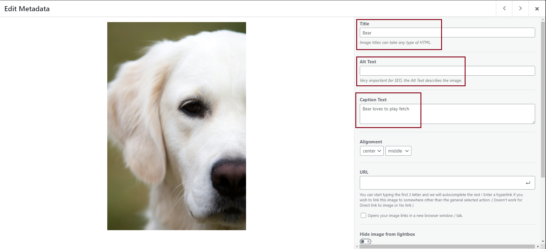
You can start by editing your images. So, go to your pictures and click on the Edit icon.
Start with changing their names and adding alt text, which is very important for SEO (Search Engine Optimization).
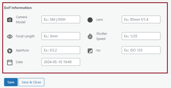
There is another feature that allows you to edit the EXIF metadata. Edit each image’s date, focal length, lens, etc.
Finally, remember to save your changes for each image. Click on Save & Close. You can repeat these steps for each image from your gallery.
You can design your gallery by adding borders to your images. Set the border size, radius, and color, and then select the shadow size and the color in the Style section.
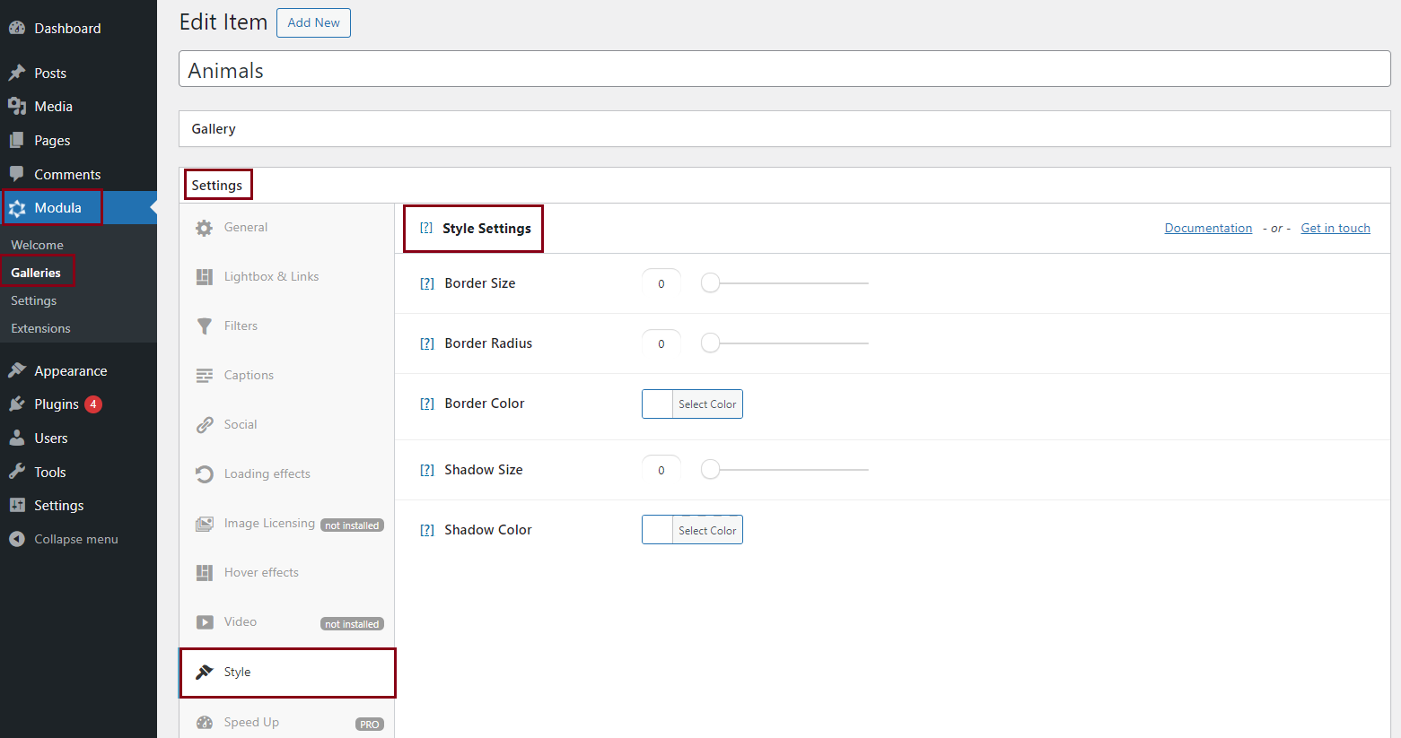
Once you’ve finished, remember to save your gallery.
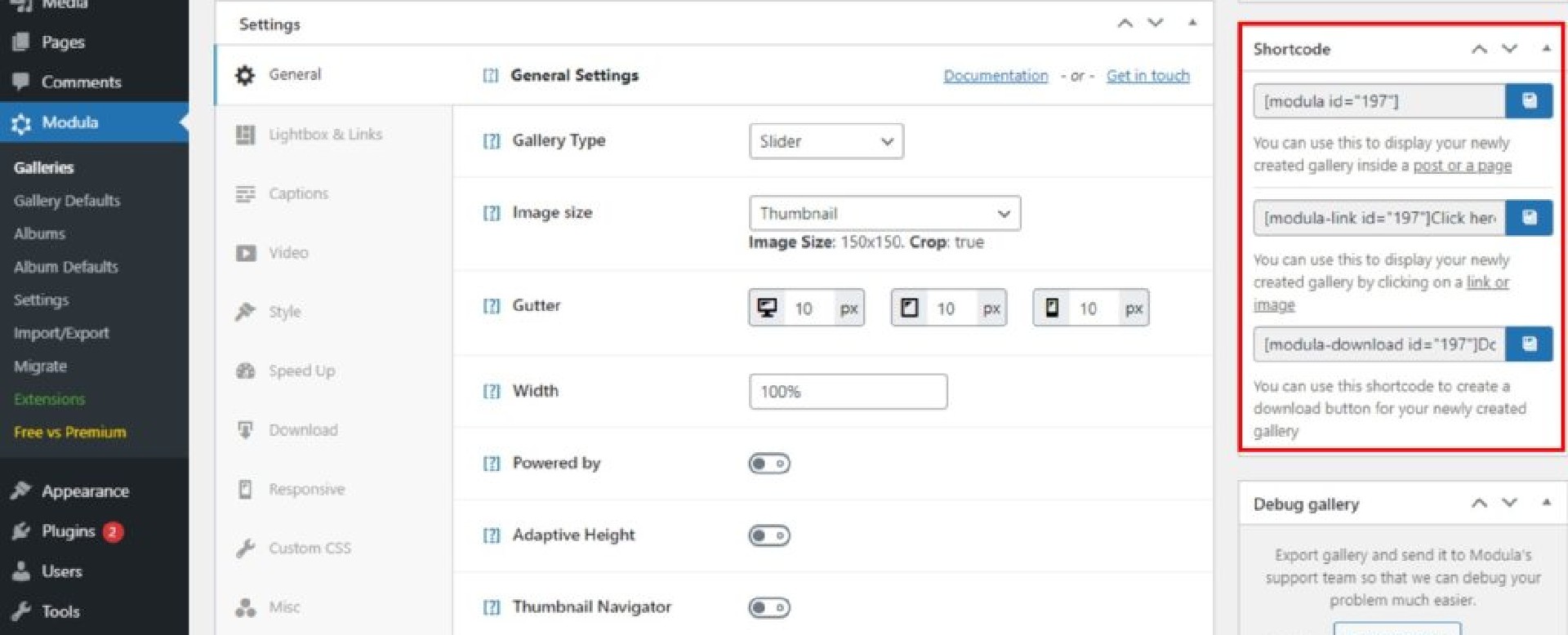
Modula will generate a shortcode for your mobile responsive gallery. All you have to do now is copy and paste the shortcode into a page or post.
Final thoughts – Mobile responsive gallery
There you have it; a super simple solution for creating mobile responsive galleries. Nobody said you had to be a brain surgeon to make one!
It’s an easy process that everyone can achieve, regardless of their experience with WordPress.
Don’t settle for a basic, obsolete mobile image gallery. Take your website to the next level by giving Modula a try and create the best responsive image gallery!
Modula Gallery Plugin
Create stunning, responsive photo galleries with ease. Showcase your work, captivate your audience, and boost engagement. You don’t need to do any coding.
