Made in Europe, buy from Europe.
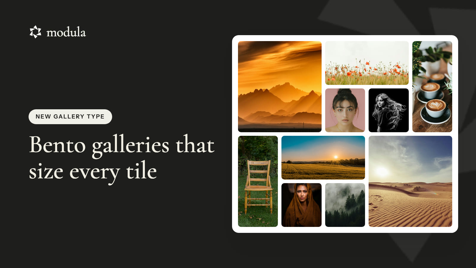
A bento gallery is a photo grid with boxes of different sizes. One big box, a few wide ones, a tall one on the side. It all fits together like a Japanese lunch box.
These grids look great. But building one by hand takes a long time. Each photo needs a box that fits its shape, with no gaps left over.
Modula’s new Bento layout does it for you. You add your photos. Bento picks a box for each one and fits them all together.
In this guide, you’ll learn:
- What a bento gallery is
- How Bento fits photos of any size
- Why a bento gallery helps
- How to make one in WordPress, step by step
- Answers to common questions
What is a bento gallery?
A bento gallery is a photo grid with boxes of different sizes. Some boxes are small. Some are wide. Some are tall. Some are big.
The name comes from the Japanese bento box. It is a lunch box with many small parts that fit together.
Different box sizes make a gallery more fun to look at. Your eyes go to the big photos first.
Here’s a live one below.


A live Bento gallery with 12 photos of different sizes.
Mix any photo sizes and Bento makes them fit.
With Bento, you can mix any photos you like. Wide photos, tall photos, square photos.
Bento looks at each photo and picks a box that fits it. A wide photo gets a wide box. A tall photo gets a tall box.
Then Bento fits all the boxes together. The grid ends up neat on every side, with no empty spots.
You don’t have to plan anything. Just add your photos.
Why use a bento gallery?
A bento gallery looks hand-made, but it takes no work.
- Your best photos stand out. Some photos get a big box, so people know where to look.
- Your photos keep their shape. Tall photos get tall boxes and wide photos get wide boxes, so less gets cut off.
- No messy edges. The grid always ends with a straight, clean edge.
- No manual work. Add, remove or move a photo, and Bento fixes the grid by itself.
How to make a bento gallery in WordPress
You can make a bento gallery in four steps.
Good to know
Bento is part of Modula Pro. You need Modula 3.0.19 and Modula Pro 3.0.22 or newer.
Step 1: Create a gallery and add photos
Go to Modula → Content and click New gallery. Click + Add and pick your photos.
Use a mix of wide and tall photos. That’s when Bento looks best.
Step 2: Pick Bento
Click Layout on the left. Open the Type list. Pick Bento. You’ll find it under Creative layouts.
The preview changes right away.
Step 3: Pick columns and spacing
Columns is how many boxes fit side by side. Spacing is the gap between the boxes.
Try 4 columns for a wide page. Try 3 columns inside a blog post.
Click the phone icon under the preview to see how it looks on a phone. You can pick fewer columns for phones.
Step 4: Change the order if you like
The order of your photos changes the layout. Click Sort, then Open drag-and-drop reorder, and move your photos around.
Want a quick new look? Pick another option in Sort, like Title A–Z or Random. Bento builds a new grid right away.
When you’re happy, click Embed. Copy the shortcode and paste it into a page. Or add the Modula Gallery block and pick your gallery.
Frequently asked questions
No. Bento comes with Modula Pro. You need Modula 3.0.19 and Modula Pro 3.0.22 or newer.
No. Bento picks the boxes for you. To change the layout, change the order of your photos. If you want full control, use Custom grid.
Yes. That’s what Bento is made for. Mix wide, tall and square photos, and Bento fits them together.
Yes. You can pick fewer columns for phones, and the grid still looks neat on a small screen.
Wrapping up
A bento gallery makes your photos look like a designer laid them out. You just add photos and pick Bento.
Update to Modula 3.0.19 and Modula Pro 3.0.22 to try it today.