

In July we shipped the first beta of Modula 3.0. We asked you for feedback.
You gave us a lot. Almost all of it was about one thing.
Not the new gallery types. Not the hover effects. The editor. That is where you spend most of your time. And it is the part we had worked on the least.
So round two is all about the editor.
The old editor was hard to work in
That is not an insult. Almost every WordPress gallery plugin works this way. Ours did too, for eight years.
You open a settings page. There is a grid of photos at the top. Below it are tabs and fields. You change one field. You hit Update. You open the page to look. You go back. You change the next field.
Each trip like that takes about fifteen seconds. One trip is fine. But a gallery needs fifty of them. Now you have lost twelve minutes.
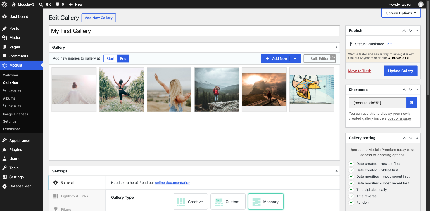
The new editor stops the back and forth.
What you see is what you get
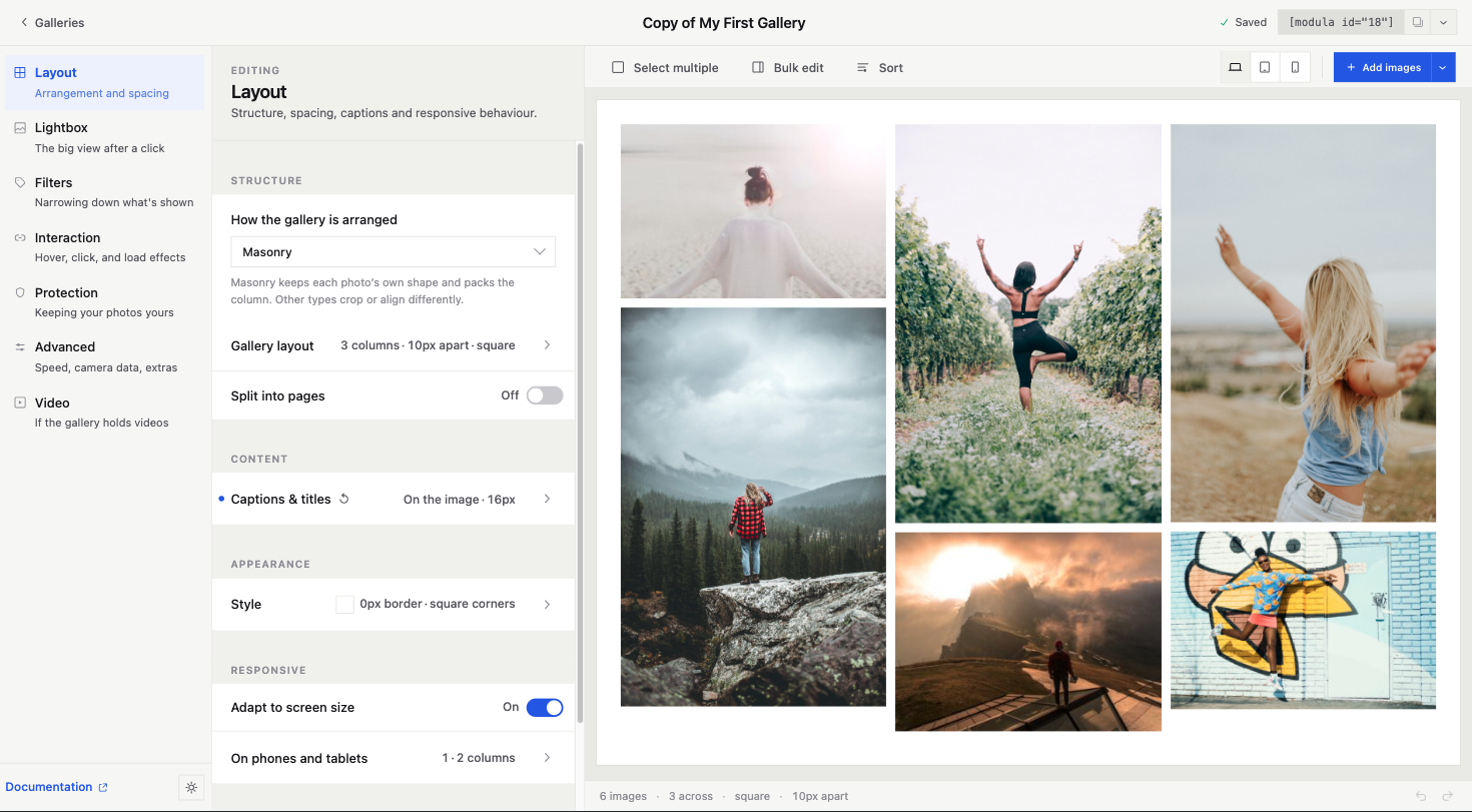
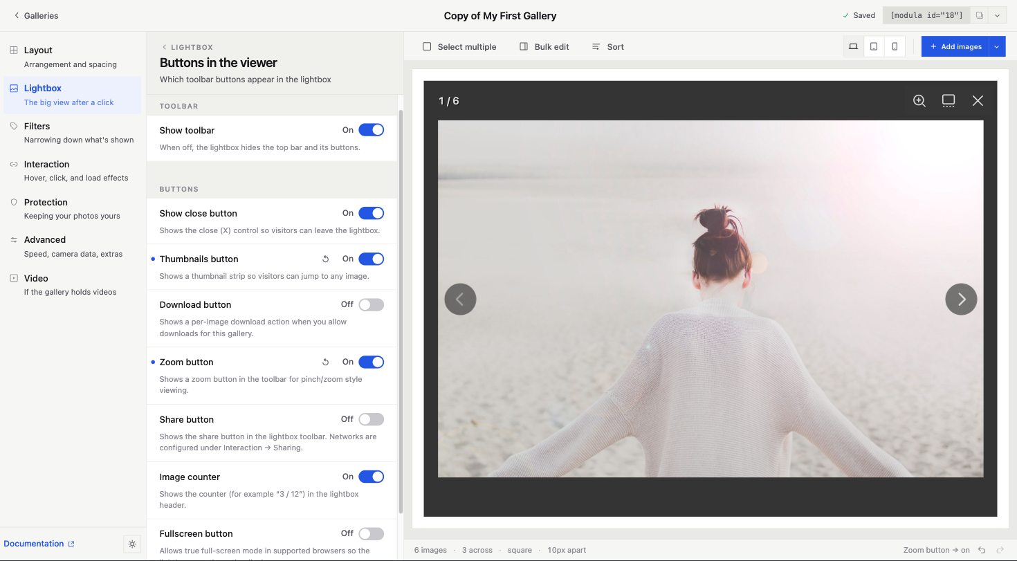
The preview is not a fake preview. It uses the same code that runs on your live site. Same look. Same layout. Same lightbox.
Change the number of columns and the gallery moves. Change the spacing and it moves. Click a photo and the real lightbox opens, right there in the editor. Turn the arrows off and they go away.
At the top there is a switch for desktop, tablet, and phone. It is not fake. It shows how the gallery really looks at each size.
We worked hard to keep this honest. If the preview lies to you even once, you stop trusting it. So we made sure it never lies.
Set phone and tablet options right here
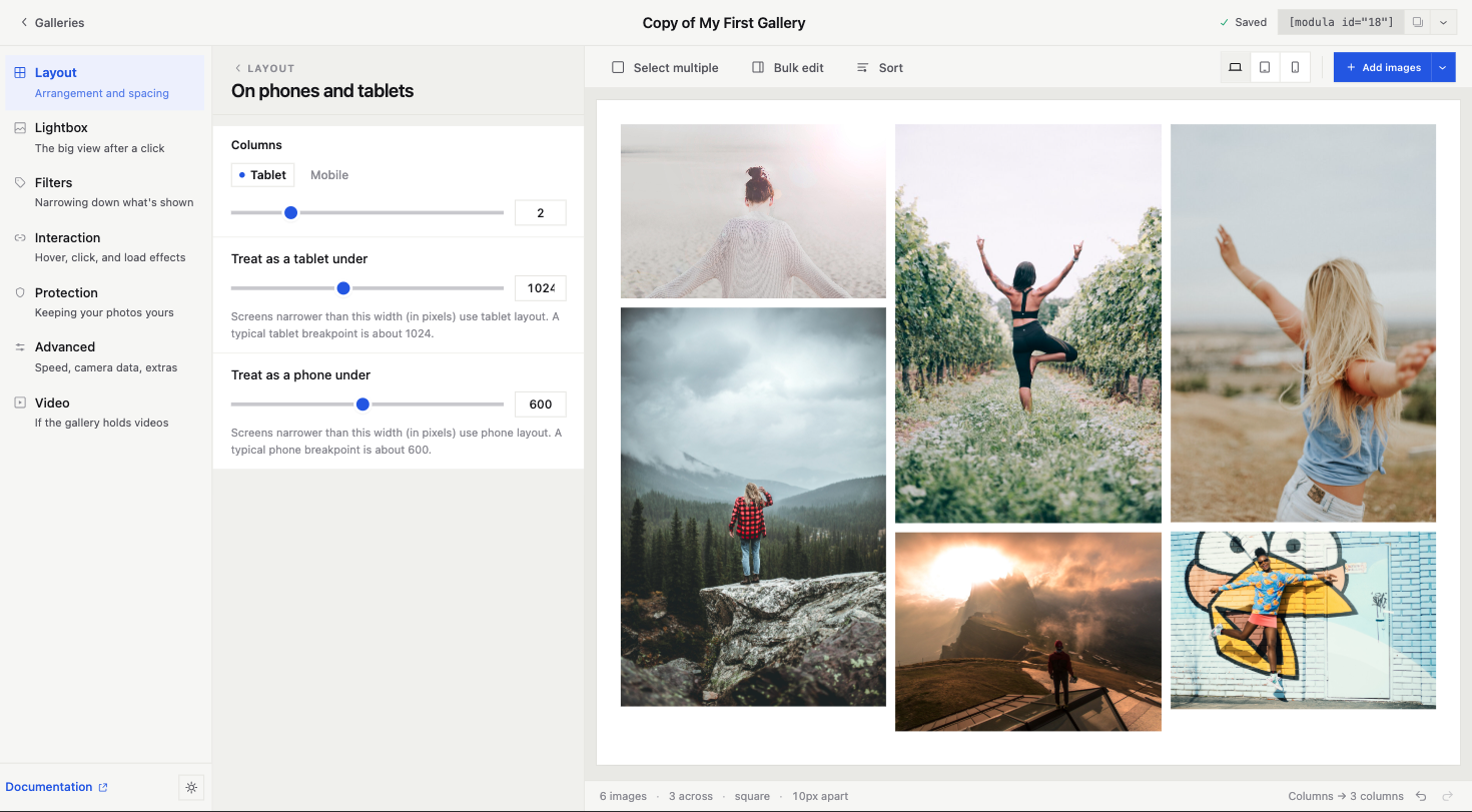
The device switch is not just for looking. Under Layout there is a part called On phones and tablets. There you set how many columns to show on a tablet and on a phone. You also set the width where each one starts. Tablet under 1024px. Phone under 600px. Or any size your theme needs.
Change the tablet columns. Click the tablet view. See it. That is the whole job, and it takes two seconds.
This was the worst part of the old editor. The phone settings were just numbers in a box. The only way to check them was to open the live page and drag the window smaller. Everyone hated it.
Spacing works the same way. The gap has its own tabs for desktop, tablet, and phone. So you can make a grid tighter on phones without touching the desktop look.
Settings are grouped by what you want to do
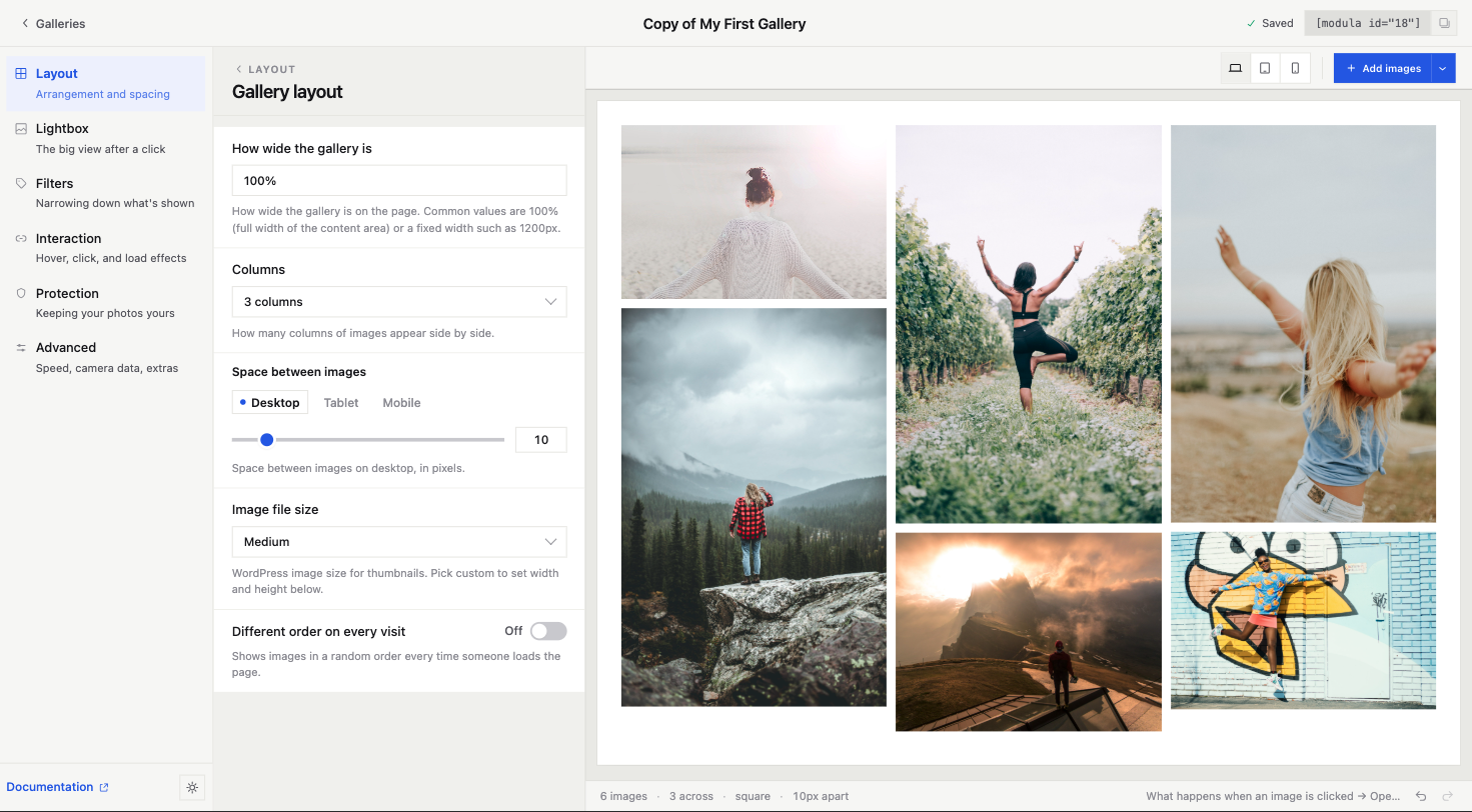
The menu on the left has six items:
- Layout. How photos are placed and spaced.
- Lightbox. The big view after a click.
- Filters. Show only some photos.
- Interaction. Hover, click, and load effects.
- Protection. Keep your photos yours.
- Advanced. Speed, camera data, and extras.
Each item has one line under it that says what it does. Words like Interaction and Advanced do not mean much on their own, so we explain them.
Inside each part, the common settings show first. If a part has a lot of controls, it gets its own small panel with a back button. That keeps the main panel short.
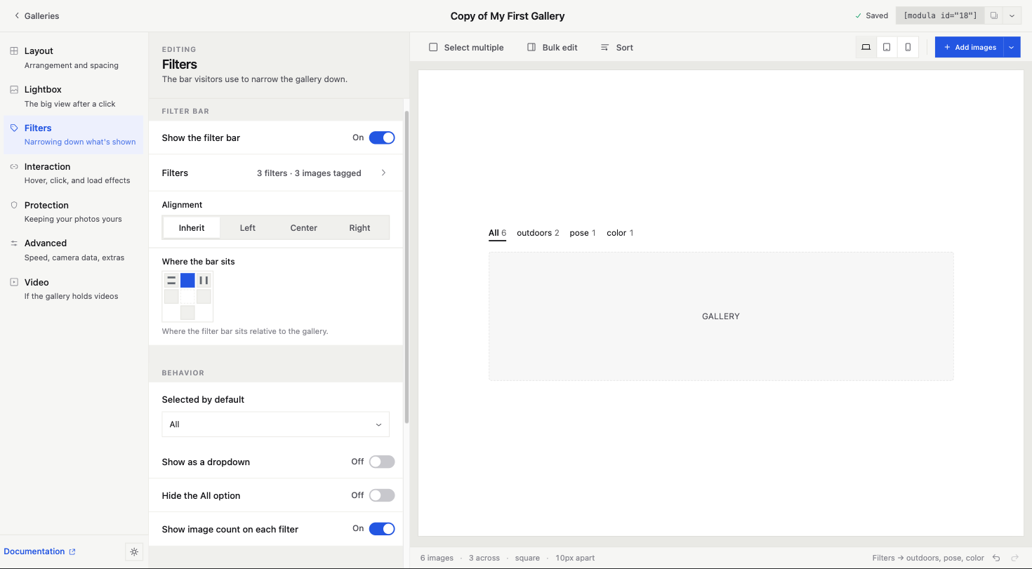
At the bottom there is a small status line. It says things like: 6 images, 3 across, square, 10px apart. On the right, it shows the last thing you changed. If you come back later and forget what you did, that line helps.
Undo and redo, at last
Every change is a step you can take back. Use the button at the bottom right, or press Ctrl/Cmd+Z like everywhere else.
This sounds basic, because it is. But the old editor saved to the database when you hit Update. To undo, you had to remember the old number yourself. You try a gap of 30. You do not like it. What was it before? 10? 12?
Now you just press Z.
This changes how you work. When mistakes are easy to undo, you try more things.
Edit a photo without a pop-up in the way
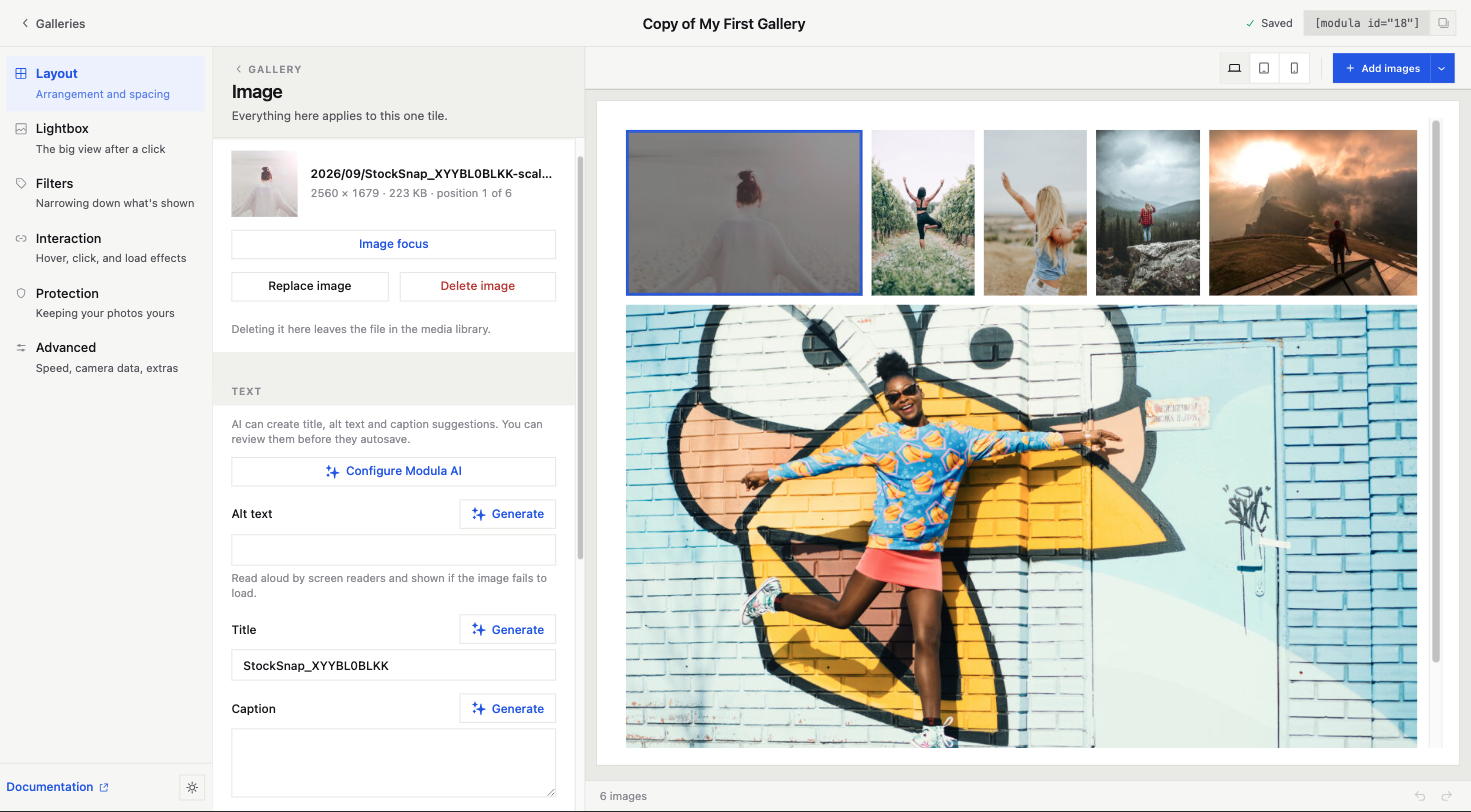
Click a photo. The sidebar now shows that photo.
You see the file name, size, and place. You set the focus point. You can replace it or delete it. You can edit the alt text, title, and caption. If you use Modula AI, there is a Generate button next to each one. You get to check what it writes before it saves.
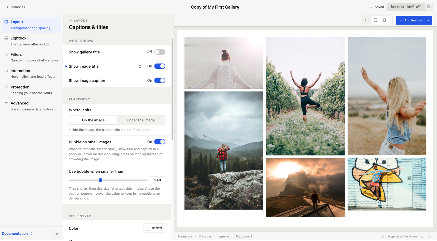
The gallery stays in view the whole time. Change a caption and you see it on the photo. Click another photo and the sidebar follows.
The old Edit Metadata pop-up did the job. But it covered the whole screen, had its own Save button, and put a big text toolbar on a one-line caption. It is gone now.
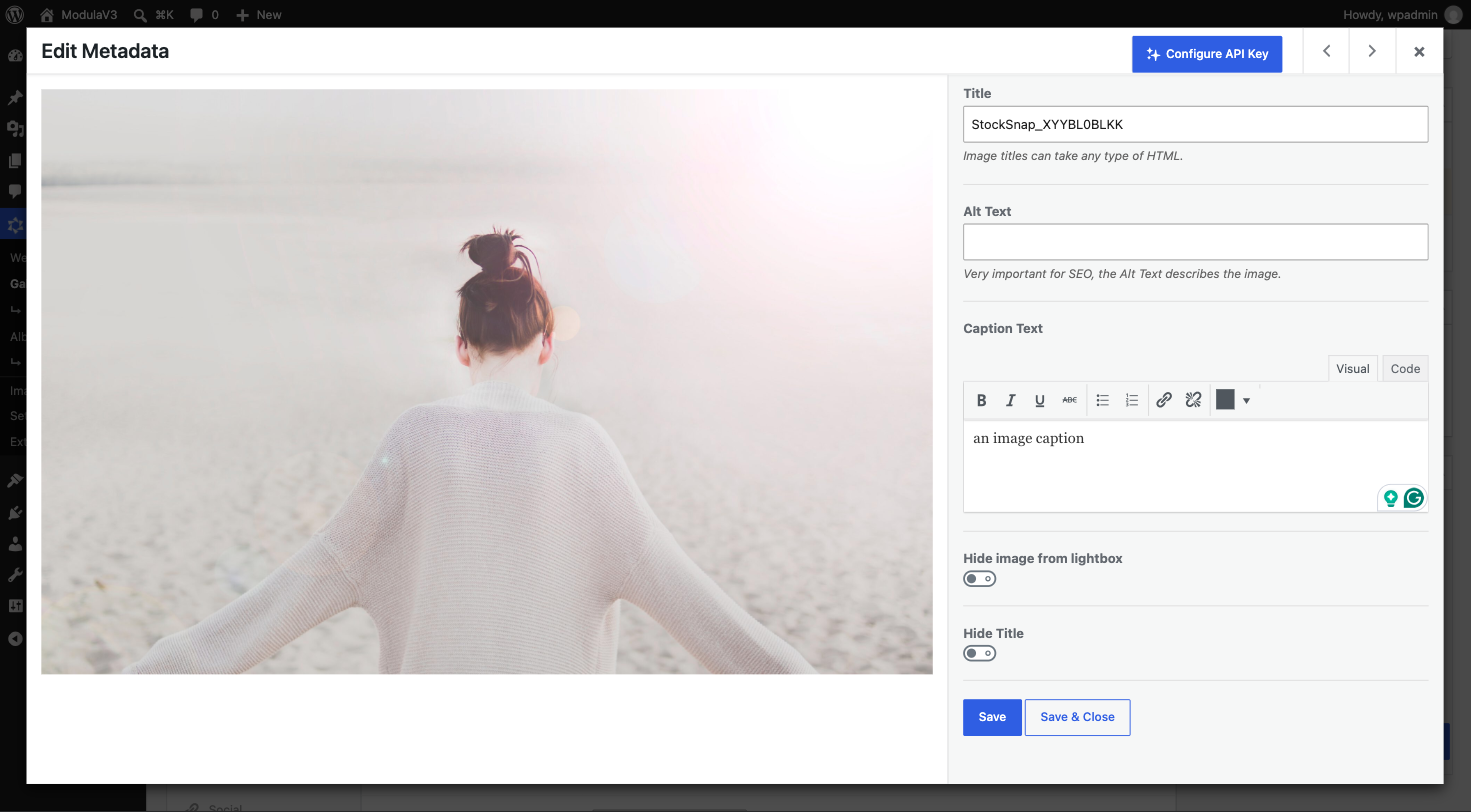
Pick photos, then do one thing to all of them
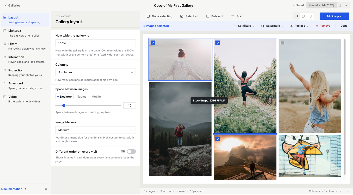
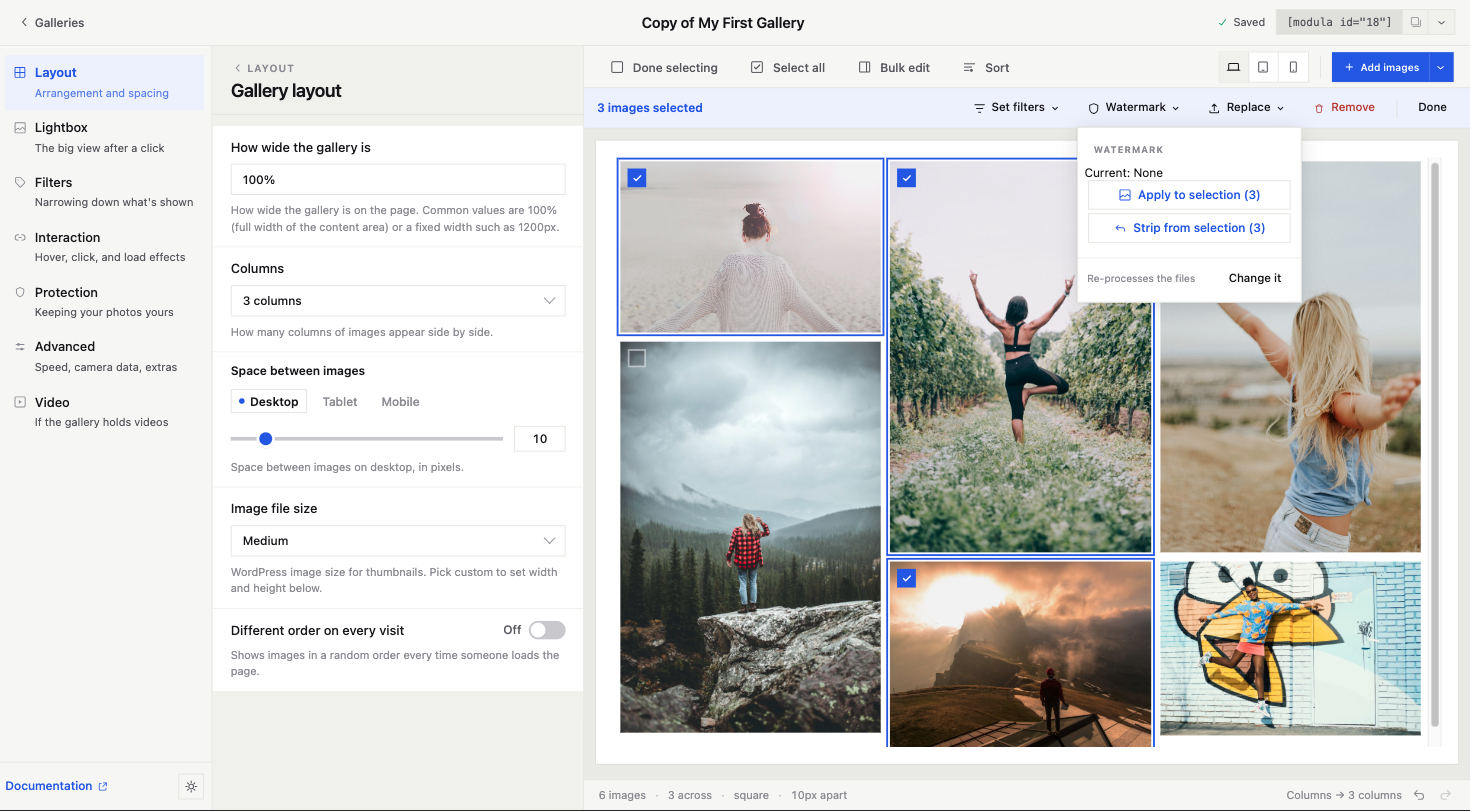
Click Select multiple. Boxes show up on the photos. Tick a few, or click Select all.
A bar shows up above the gallery. It says how many you picked, like 3 images selected. It shows what you can do:
- Set filters. Tag the photos for filtered galleries.
- Watermark. Add it to the photos, or take it back off. It tells you the current watermark and redoes the files.
- Replace. Swap the photos for new ones from your library. It warns you first that this clears captions and alt text.
- Remove. Take them out of the gallery.
Then click Done, and the boxes go away.
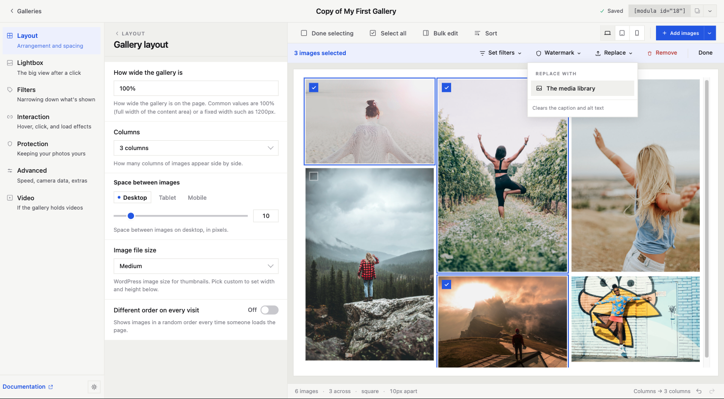
The bar does not take over the screen. The settings stay where they are. The gallery stays in view. You can leave this mode any time. No pop-up asks if you are sure.
Watermarks are worth a note. Before, it was a setting somewhere else that hit a whole gallery. If you wanted it on twelve of forty photos, you were stuck. Now you pick twelve photos and click once. Taking it off is one click too. People avoid watermarks because they fear they cannot undo them. Now they can.
None of this is fancy. That is the point. Photo apps have worked this way since about 2003. Modula just did not, until now.
Sorting is now inside the editor
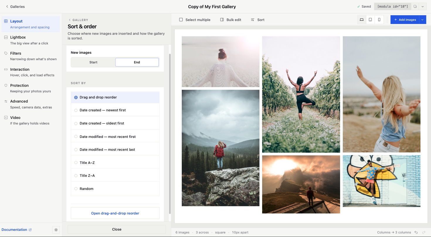
Sort sits in the top bar. It opens a panel with two questions.
First: where do new photos go, at the start or the end. Second: how is the gallery ordered. You can drag and drop, sort by date made, by date changed, by title A to Z or Z to A, or at random.
Drag and drop is the default. There is also a special view for reordering, for when you have forty photos and want the settings out of the way.
In the old editor, sorting sat in a box on the right. Mostly it was there to tell you sorting was a Pro feature. It is still a Pro feature. But now it is a normal part of the editor, in the same place as everything else. The upgrade note moved inside the panel.
The galleries list looks modern now
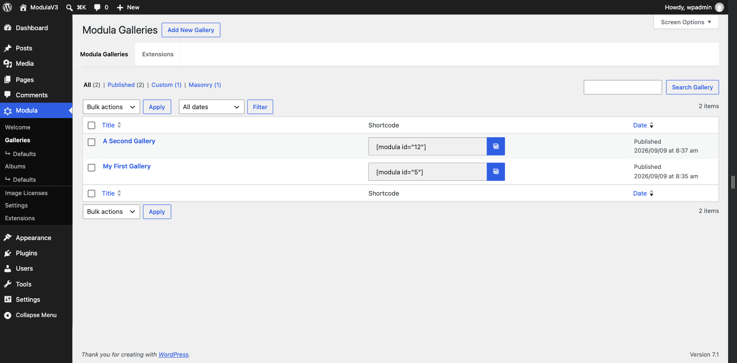
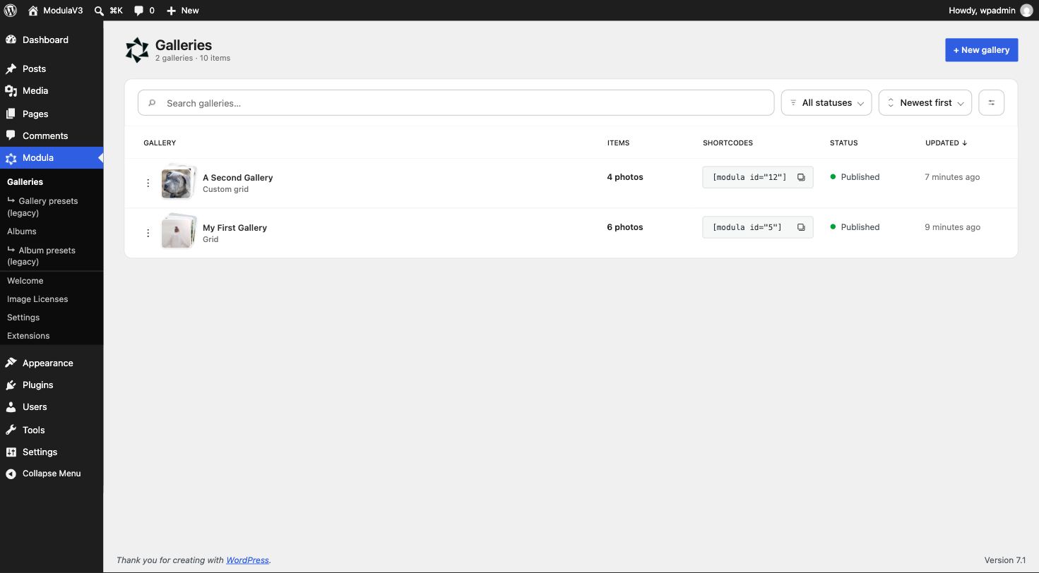
The old list was made in 2018 and looked like it. The new one has:
- Photos. You know a gallery by its photos, not just its name.
- Item count, status, and last update in plain words. 7 minutes ago is easier than 2026/09/09 at 8:37 am.
- Copy shortcode in one click, right in the row.
- Search, a status filter, and sort. The things any modern list has.
- The layout type under the name, like Masonry or Custom grid. So you do not open three galleries to find the right one.
Quick actions, without opening the gallery
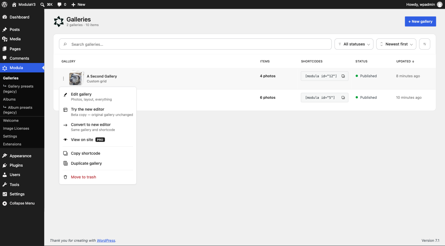
Every row has a menu. It holds everything you may want to do:
- Edit gallery. Photos, layout, all of it.
- View on site.
- Copy shortcode.
- Duplicate gallery.
- Move to trash.
Plus the two beta options below.
Before, to copy a gallery and change its name you had to open it, find the copy button, wait for the page, open the copy, and wait again. Five clicks and two page loads for one task. Now it is two clicks and no page load.
Same with the shortcode. You should not have to open a gallery just to copy it. Now you do not.
Try it on a copy. Your gallery stays the same.
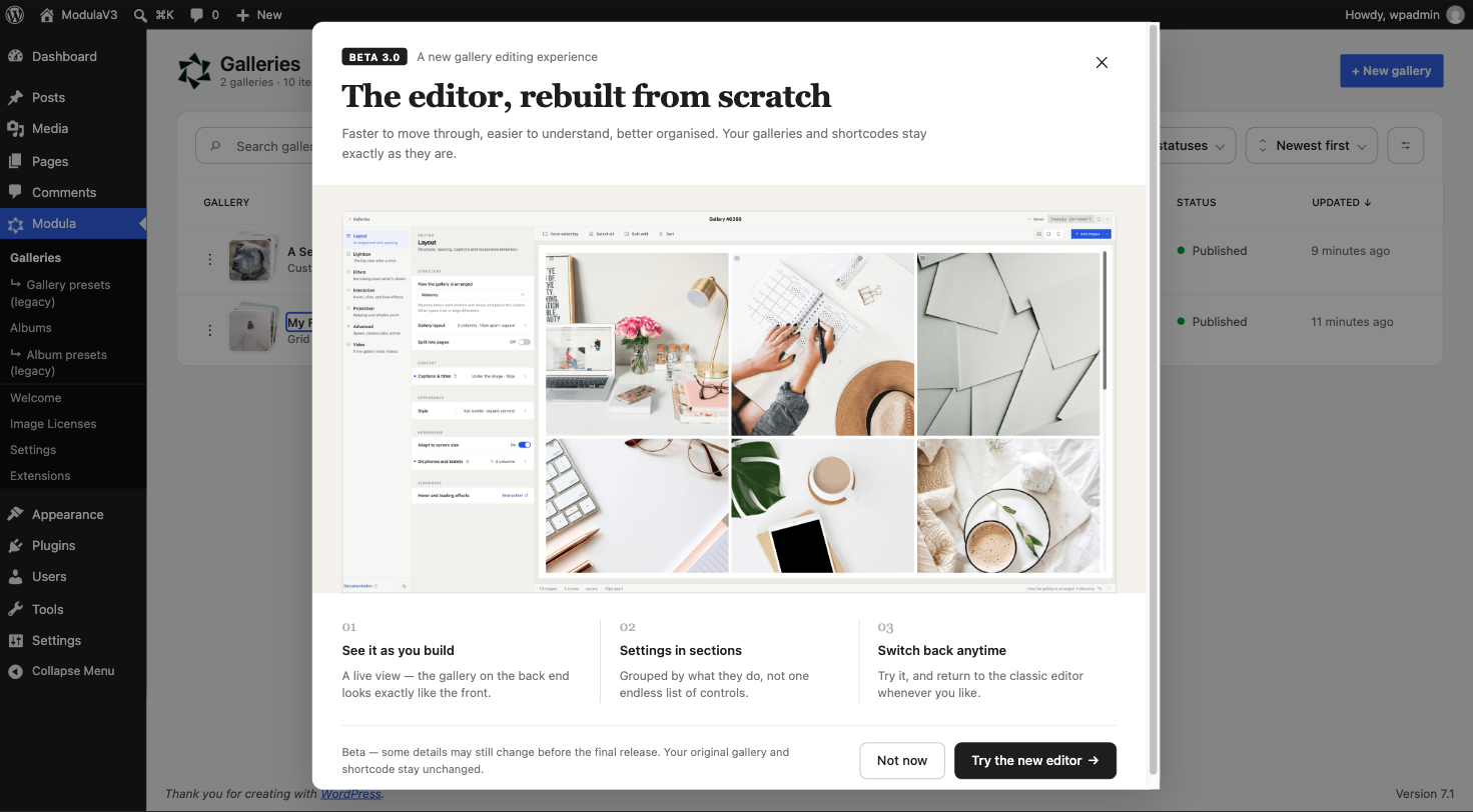
This is the part we spent the most time on. It decides whether people try the beta at all.
In the galleries list, each gallery has two beta options:
Try the new editor. This makes a copy and opens it in the new editor. The first gallery stays the same. The shortcode on your site still points to it. So you can play, break things, and delete the copy.
Convert to new editor. This uses the same gallery, same ID, same shortcode. Use it when you have made up your mind.
The old editor is still there too. If 3.0 does not fit how you work, go back. Nothing is changed either way.
We could have forced everyone into the new editor with an update. Some plugins do that. Then they spend a year on support tickets from people who did not want a new look on a Tuesday.
This is still a beta
Some things will change before 3.0 is done. Some parts are still rough. If you find a problem, tell us. Say what feels better, what is not clear, and what is broken.
Your feedback from the first beta is why this one looks the way it does. Look at the old post below and you can see what changed.
How to try it
Go to your account area and download the beta file. Install it over your current Modula, Lite or Pro. Then use the prompt on the Galleries screen, or the per-gallery menu, to try or convert a gallery.
Use a test site first if you have one.
Start with these guides:
- How to enable the Modula 3.0 Beta
- The new editor view
- Gallery types available in Beta
- Hover effects in the 3.0 Beta
Modula v3 BETA – RC1
We’re opening access to the Modula 3.0 Beta – a completely new experience, re-built from the ground up.
This release introduces a new gallery editing experience, updated gallery settings, clearer navigation, and a more focused way to build and preview galleries inside WordPress.
If you’ve used Modula before, the biggest change is the editor itself – it’s faster to move through, easier to understand, and better organized.
What’s New in Modula 3.0 Beta
Modula 3.0 Beta is built around a redesigned and completely overhauled editor experience, powered by React (the same stuff that’s powering the Gutenberg editor / Full Site Editing).
Instead of working through the older settings flow, you now get a cleaner interface with grouped settings, better structure, and a streamlined editing workflow.
Some of the biggest changes in this Beta include:
- a new editor view for gallery settings (this time, wysiwyg – meaning, what you see on the backend is a real-time rendering of the gallery as it will be displayed on the frontend).
- clearer section-based navigation
- a lot more gallery types (more on this below)
- improved hover effects workflow (as well as the ability to create your own hover effect)
- a lot more space to build galleries (this has been on my list for a long, long time)
- and of course, dark mode support (follows OS/browser settings)
This is not just a visual refresh. It changes how the product works & feels, in an out.
A Better Way to Work With Modula
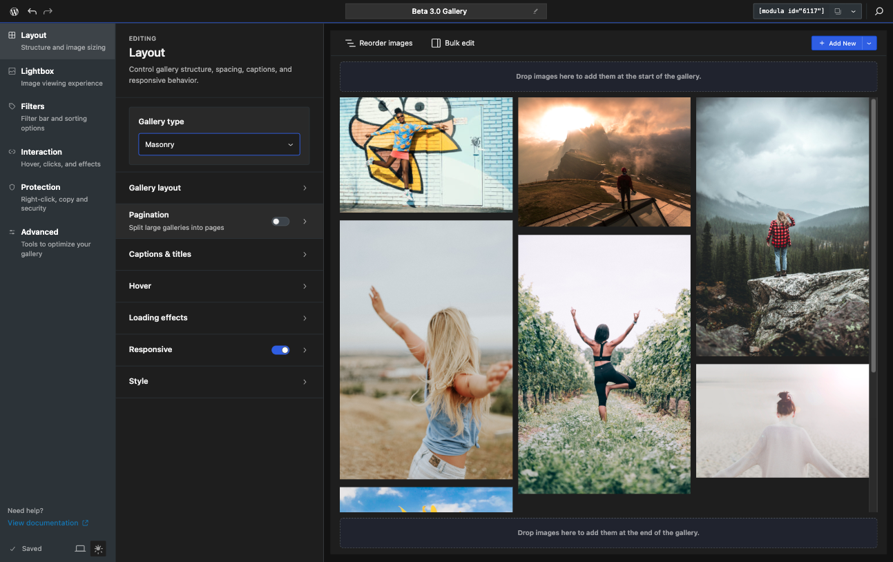
One of the main goals of Modula 3.0 is to make the gallery creation easier & faster. To that extent, we’ve addressed how we group settings – finding things is now a lot faster and easier.
Instead of digging through a long list of controls, you can move through the editor in a way that feels more predictable. This matters most when you are working on larger galleries or testing different layouts, captions, hover states, lightbox behavior, and presentation options – you know, the kind of workflow that fits photographers, real-estate agencies, hobbyists and anything in between.
More Gallery Types to choose from
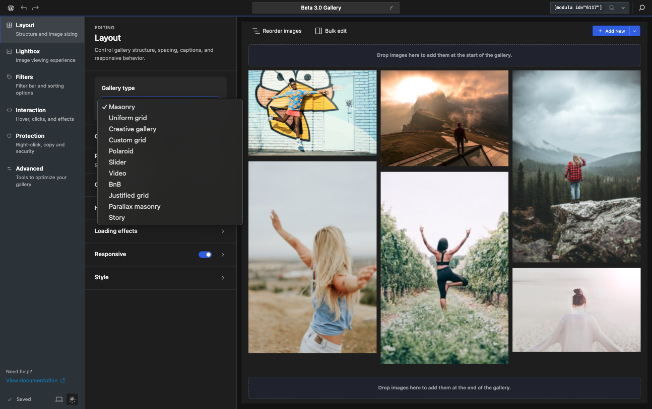
Another important part of the Beta is the updated gallery type experience.
Not just the increased number of gallery types, the selected gallery type now has a clearer relationship with the settings you see in the editor. That means the interface does a better job of showing relevant options and hiding settings that do not apply to the current layout.
Some of the new gallery types you can create with Modula are:
- Uniform grid: where all images are the same size (usually, square – see docs and layout)
- Polaroid – this one kind of speaks for itself, but if you’re reminescing for the old-school Polaroid look, that’s now just 1-click away. (see docs and layout)
- Parallax Masonry – or as we call it – infinite scrolling galleries (this one’s a stunner on a homepage and great for portfolio websites) (see docs and layout)
- Story – by now everyone’s seen a short – on YouTube, TikTok, Instagram – and we’ve brough the same video format into Modula. (see docs and layout)
Hover Effects Are a Bigger Part of the Experience
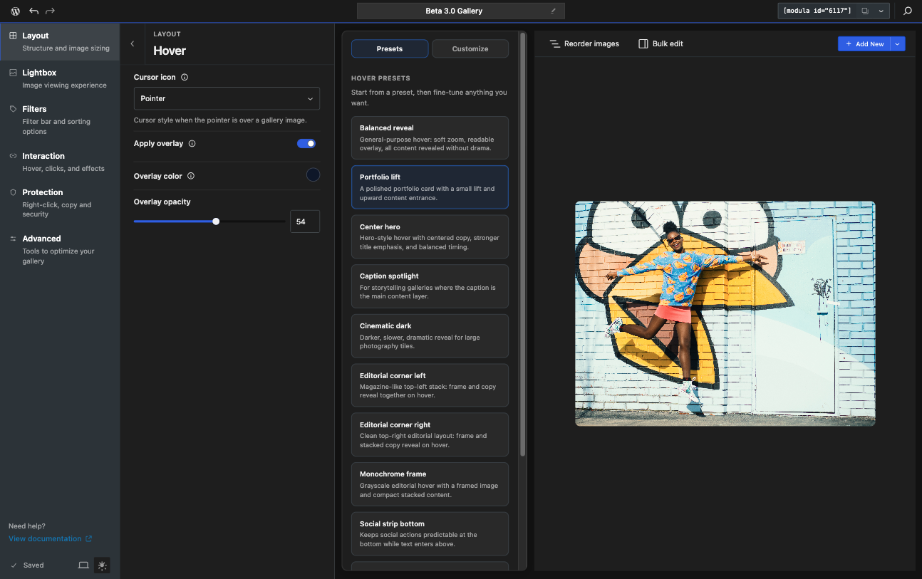
Hover Effects have also been completely re-designed.
We’ve added controls for each hover effect available so you can fine-tune them however you like. You can adjust colors, speeds, transition times and much more!
For many users, this will be one of the most noticeable upgrades in the new editor – and you can read more about hover effects in our docs here.
This Is a Beta Release
Because this is a Beta version, a few things are important to keep in mind:
- some details may still change before the final release
- some features may still have rough edges
- some settings may continue to evolve during the Beta period
That is exactly why we are opening it up now.
We want real feedback from users testing the new experience on real galleries.
How to Try Modula 3.0 Beta
Any user interested in this can download a separate Modula Beta archive from their account area on the Modula website.
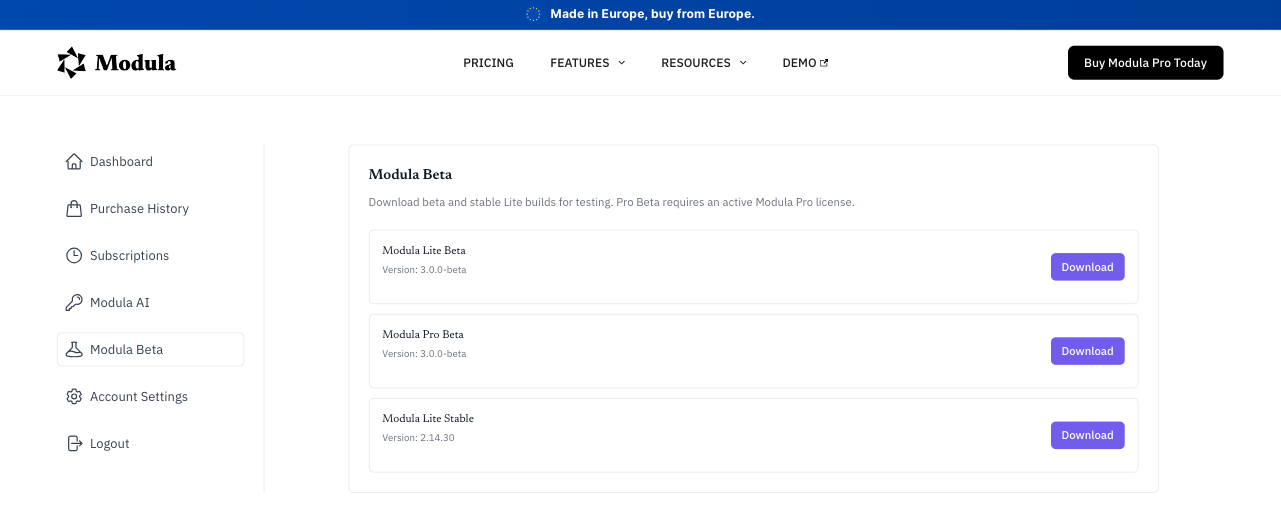
After that:
- update your current Modula version with the Beta build (both Lite and Pro)
- go to Modula > Settings
- make sure the Beta option is activated in the general plugin settings
- open a gallery and start testing the new editor
If possible, we recommend testing the Beta on a staging site first.
Start With These Articles
To make testing easier, we’ve also prepared a few help articles that cover the biggest changes in this release:
- how to enable the Modula 3.0 Beta version
- a general presentation of the new editor view
- gallery types available in Beta
- hover effects in the 3.0 Beta
These are the best place to start if you want a quick overview before diving in.
We’d Love Your Feedback
Modula 3.0 Beta is an important step forward, and this testing phase will help shape the final release.
If you try it, we’d love to hear what feels better, what feels unclear, and what still needs work.
That kind of feedback is exactly what helps us make the final version more solid.