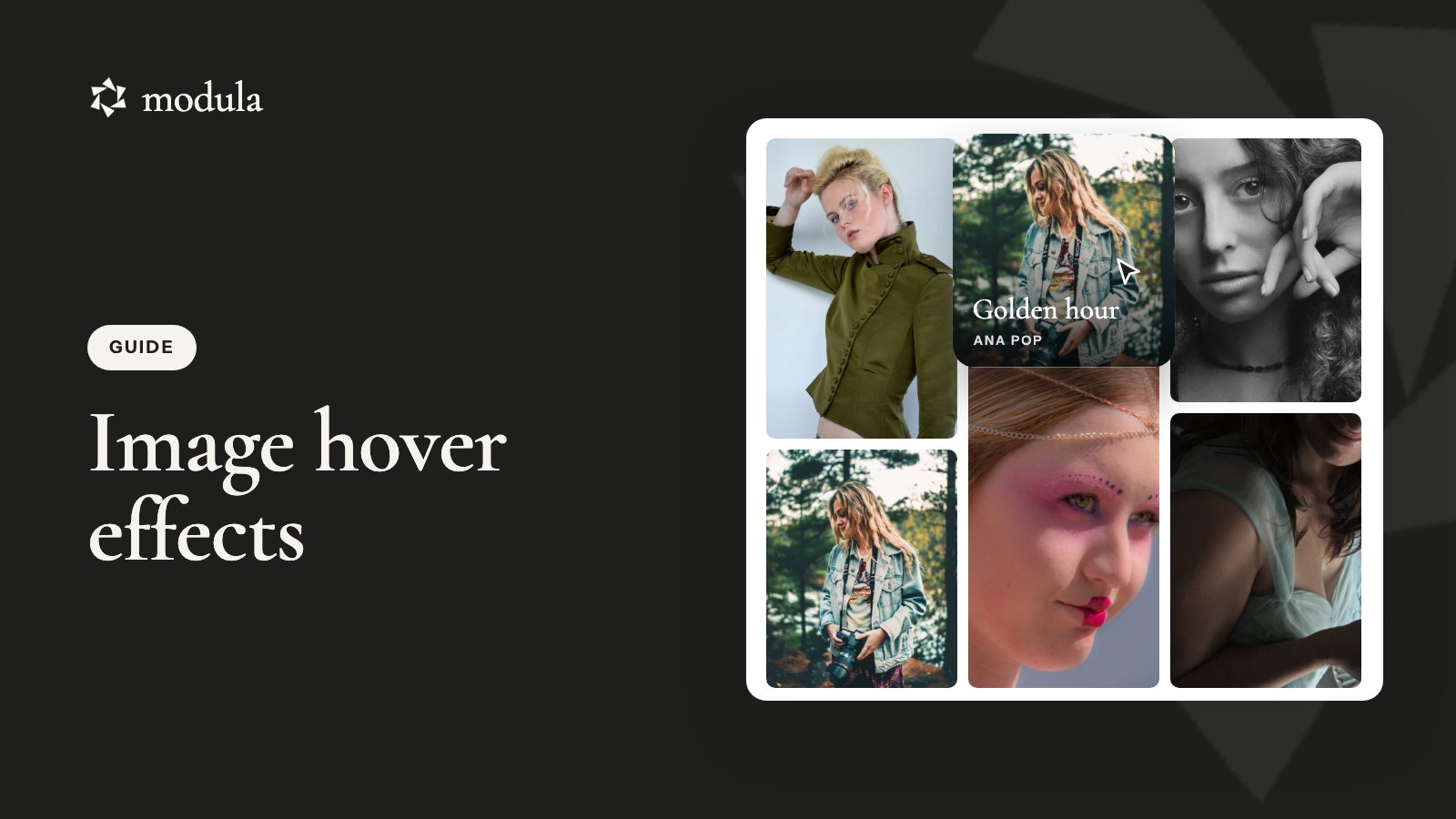
Rest your mouse on a photo in a good portfolio and something small happens. It zooms a touch, lifts, or a caption slides in. That’s a hover effect, and it makes a gallery feel alive.
You can add image hover effects in WordPress two ways. In a gallery plugin like Modula (we make it), you pick a preset under Motion → Hover, and five are free. Or you add a few lines of CSS to the core Gallery block.
Both are quick. The tricky part is what other guides skip: most visitors can’t hover. So you’ll also see how to keep captions readable for phone and keyboard users, and fix photos that go dark under the mouse.
What a hover effect does (and when to skip it)
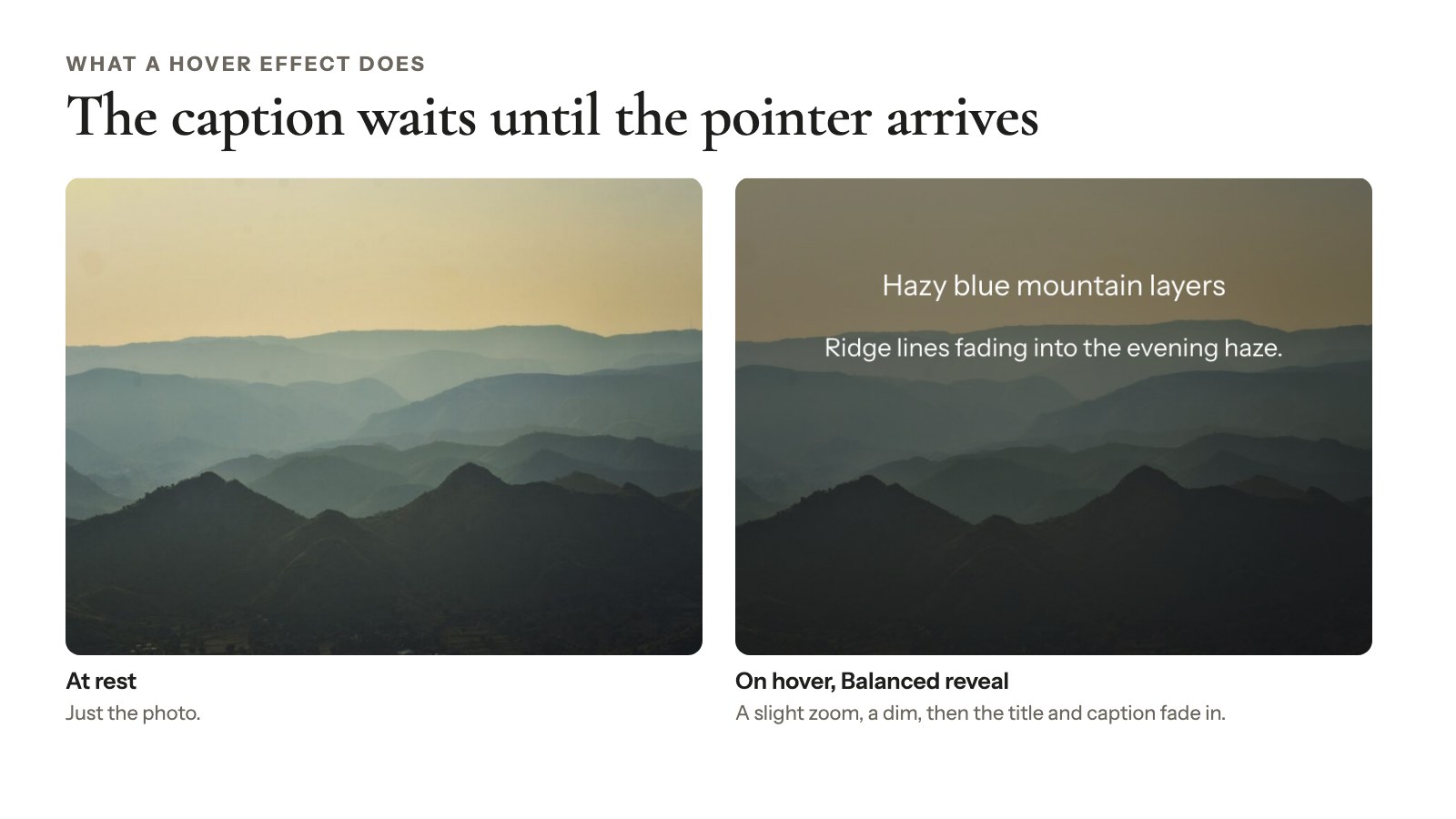
A hover effect is the change a photo makes while a mouse pointer rests on it: a zoom, a lift, a darker tint, a caption that fades in. In CSS that’s the :hover state, standard since CSS2 in 1998 (W3C). The effect does two jobs.
- It says “click me.” A photo that reacts tells visitors it opens bigger or leads somewhere.
- It hides text until it’s wanted. Forty wedding photos read as photos, not as forty labels.
Some galleries are better off without one:
- Proofing galleries. A client picking favorites from 300 proofs wants to compare, not watch tiles bounce.
- Pieces that need their details. A potter showing 12 bowls wants the name and size visible under every one.
- Mostly-phone audiences. If most of your visitors arrive on phones, few of them will ever see the effect.
For those, visible captions do more than any effect.
Choosing a hover effect for your photos
Pick hover effects for images by what the photo needs, not by how many effects a plugin lists. A mountain shot loves a slow zoom; a portrait with a name needs the caption more than motion.
| Effect | Good for | Watch out for | Try in Modula |
|---|---|---|---|
| Zoom | Landscapes, travel | Keep it inside the frame, or it spills over the next photo | Balanced reveal, Center hero (free) |
| Lift and shadow | Card-style grids, portfolios | Needs space between tiles | Lift (free), Cinematic dark (Pro) |
| Darken and caption | Captions on bright, busy photos | Too dark hides the photo | Balanced reveal (free), Caption spotlight (Pro) |
| Black and white switch | Moody, editorial sets | Phones barely see the switch | Monochrome (Pro) |
| Caption only, no motion | Galleries where words matter | Less playful | Captions only (free) |
Modula’s Monochrome goes black and white on hover. CSS snippet 3 below does the reverse.
Three rules of thumb:
- One effect per gallery. Mixed effects look like a mistake. One standout photo is the exception (see below).
- Keep it short. Modula’s presets run 180 to 420 milliseconds. Much slower feels sluggish.
- Never hide the only copy of important text. A name, a date or a photo credit needs to show some other way too.
How to add image hover effects in Modula
In Modula, WordPress hover effects take about a minute: open the gallery, go to Motion → Hover and pick a preset. Modula has 160,000+ active installations and a 4.7/5 rating on wordpress.org (checked October 2026).
Pick a hover effect
- Open your gallery from Modula → Content.
- Click Motion in the left rail.
- Open Hover and click through the presets, hovering the preview photos to see each one.
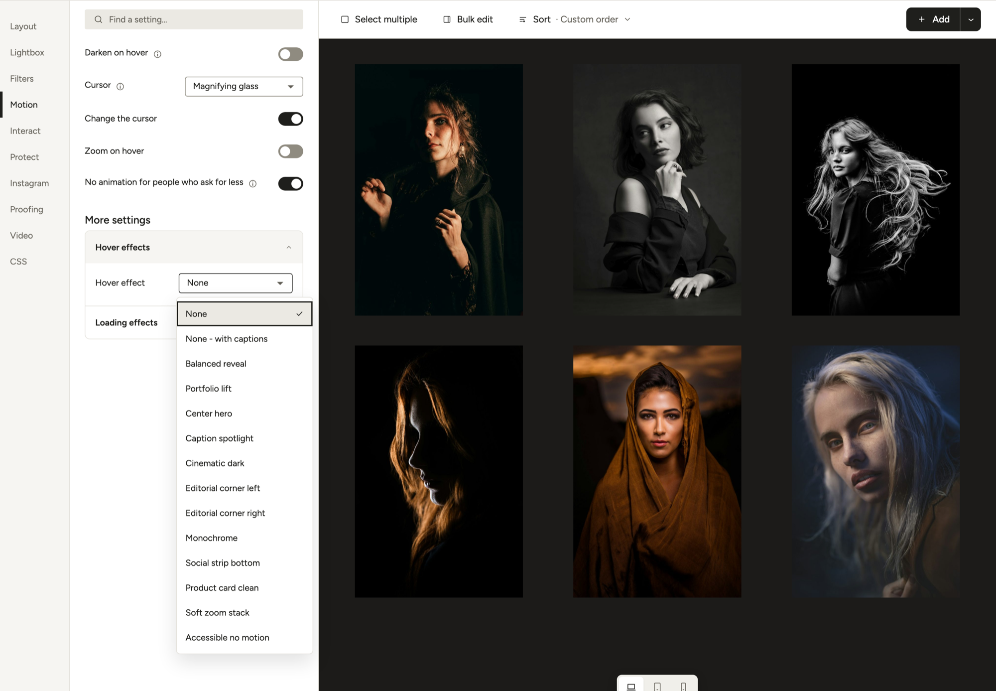
Slider, Story and Video galleries don’t use hover effects, so the list isn’t there.
Which presets are free
Modula 3.0 ships 14 hover presets. The first five are free; the other nine need Modula Pro, included in any paid plan from $39 for the first year ($78/year after; see plans).
| Preset | On hover | Plan |
|---|---|---|
| None | Nothing; text stays hidden | Free |
| Captions only (None – with captions in the plugin) | No motion; title and caption always visible | Free |
| Balanced reveal | Zoom and dim, text fades in | Free |
| Lift (Portfolio lift in the plugin) | Lift and dim, text slides up | Free |
| Center hero | Zoom and dim, title scales in | Free |
| Caption spotlight | Dim, title blurs in, caption slides up | Pro |
| Cinematic dark | Lift, darker and slower dim | Pro |
| Corner tag left / right | Dim, text slides in from the side | Pro |
| Monochrome | Black and white, plus dim | Pro |
| Social strip | Dim, share icons slide up | Pro |
| Product card | Dim, title fades, caption slides up | Pro |
| Soft zoom stack | Zoom and dim, blur-in title | Pro |
| Accessible no motion | Dim and text, no movement | Pro |
A few have longer names in the plugin (Editorial corner, Social strip bottom, Product card clean). In Lite, Pro presets show a badge and can’t be picked.
Darken on hover and Dim color
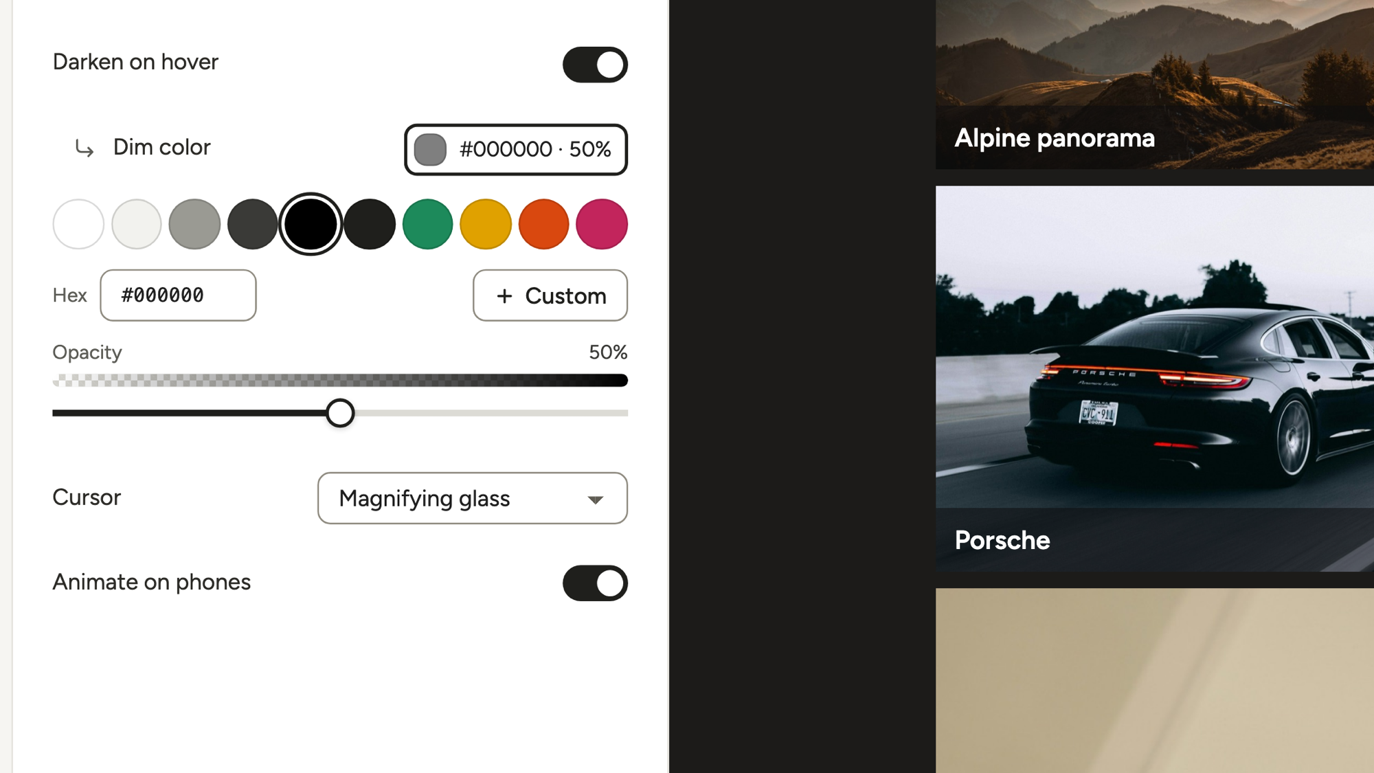
Darken on hover tints the photo under the pointer, so white caption text stays readable on a bright sky. Dim color picks the tint (black by default).
It’s off in a new gallery, but every preset except None and Captions only switches it on. That’s why photos often look darker right after you pick an effect.
Cursor
Cursor sets the pointer over your photos. The default, Magnifying glass, says “click to see it bigger,” which suits a lightbox. Use Pointer if photos link to other pages. Or choose Custom, then Upload cursor to add a small image from your media library, like a tiny camera icon.
Change one image’s hover effect
To change the image hover effect for a single photo, click it in the preview. Its settings open in the left panel, with a Hover effect field set to Gallery default. Pick any preset you have.
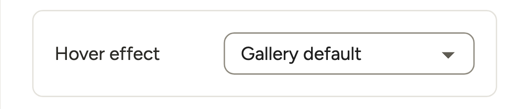
Great for a cover shot: give it Center hero, leave the other 23 on Captions only, and every eye goes there. Bulk edit for many photos needs Modula Pro.
Build your own (Pro)
Modula Pro adds a hover effect builder to the gallery editor. Pick what the photo does (Zoom image, Grayscale or Lift) and add a Frame or Diamond graphic. Choose whether the title, caption and share icons show on hover, stay visible or hide. Each layer gets its own entrance (Fade in, a slide, Blur in or Scale in), duration and stagger.
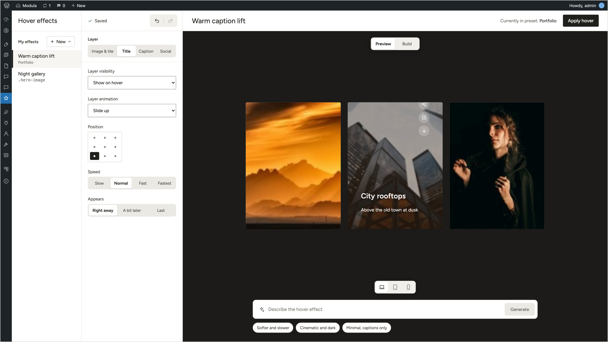
For entrance animations and slideshows, see how to create an animated image gallery.
Captions on hover or always visible?
Show captions on hover when they’re a bonus, and keep them visible when they carry information. Hover captions keep a laptop grid clean, but phone visitors barely see them. If captions name the people, the place or the photographer, don’t hide them.
Keep captions on the photo
Pick Captions only under Motion → Hover. Nothing moves, and the title and caption stay on the photo. It’s free.
Put captions under the photo
Go to Layout → Captions → Where it sits and choose Under the image. It’s free in 3.0 and works in Masonry and Justified grids too. The hover effect then plays on the photo alone, since the text isn’t on it anymore.
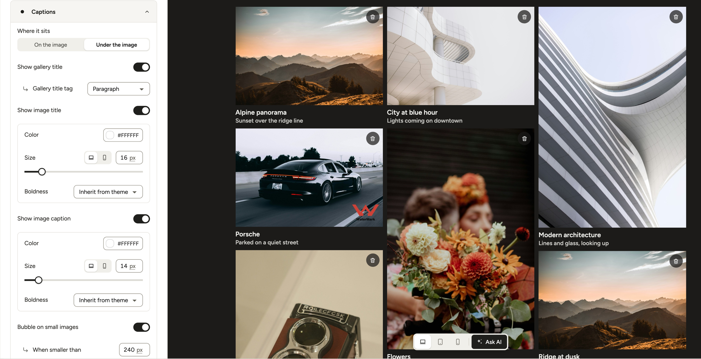
Full steps: titles and captions under the images.
Why captions vanish on small tiles
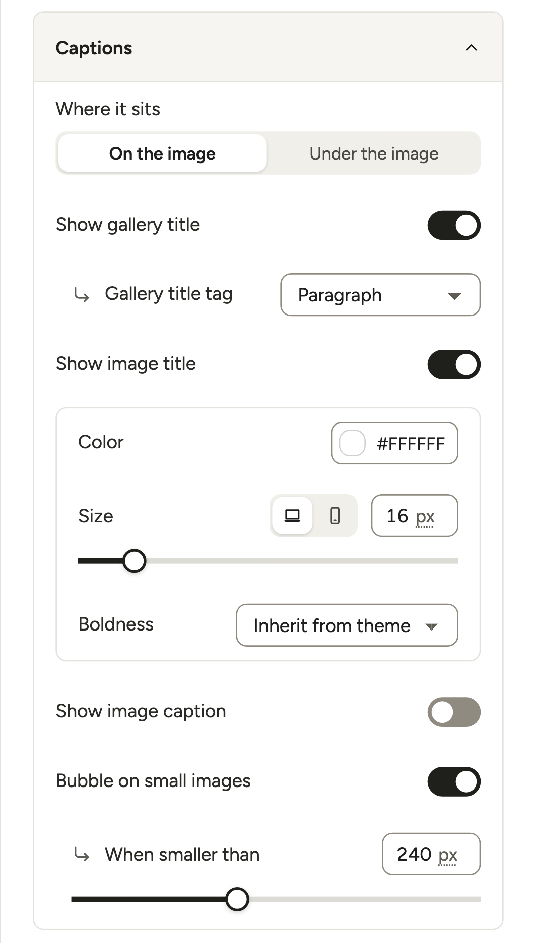
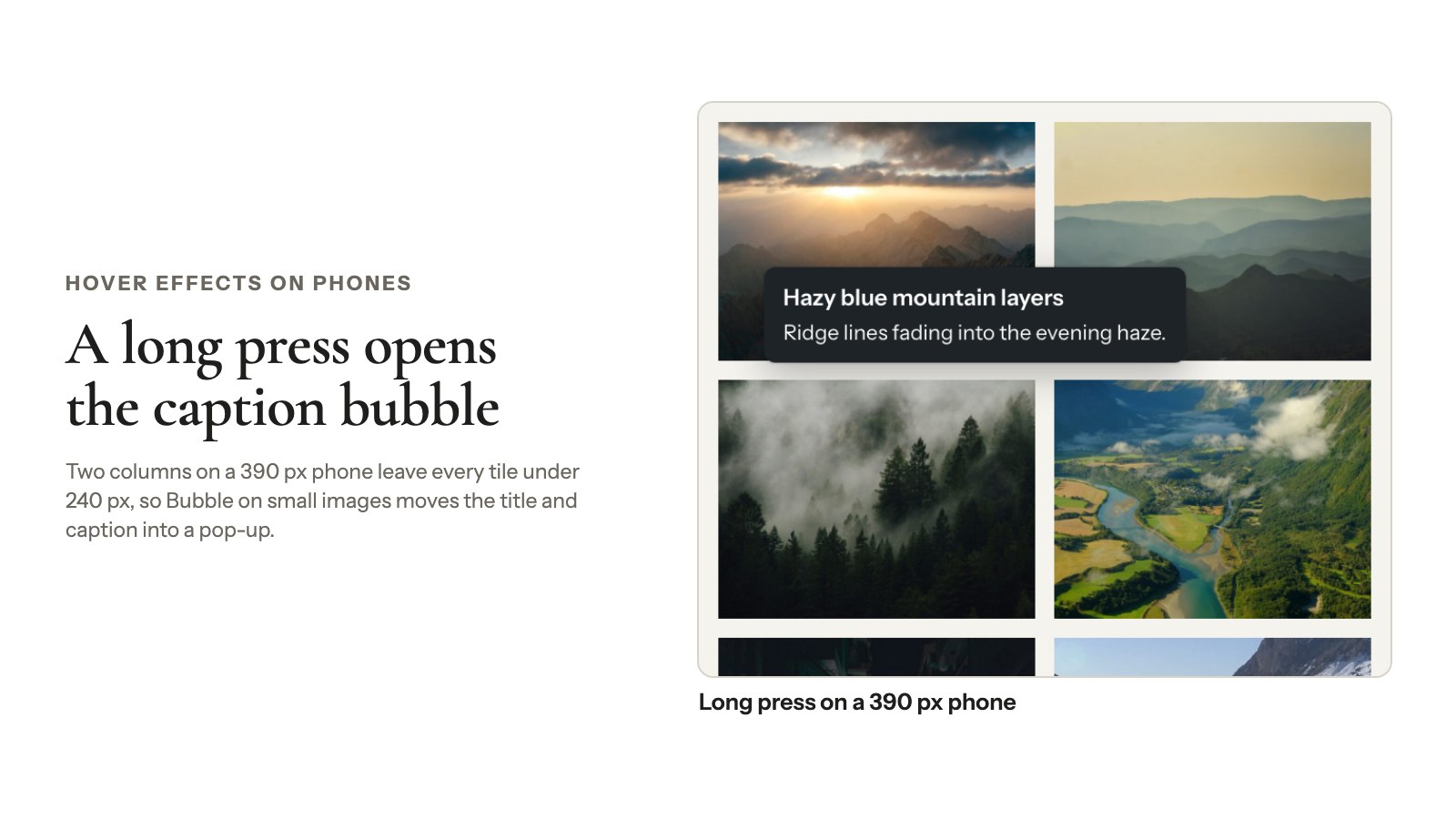
Bubble on small images is on by default. When a tile’s shortest side drops below When smaller than (240 px by default, 80 to 480), the title and caption move into a small pop-up. Visitors open it with a hover on a computer or a long press on a phone.
In our test, a 232 px tile swapped its on-photo caption for the bubble, and on a 390 px phone two columns leave every tile under 200 px. If captions seem to disappear, lower the number or turn the bubble off.
Titles on the grid, captions in the lightbox
Short titles on the grid and the longer story in the lightbox is a classic photographer setup. In Layout → Captions, turn Show image title on and Show image caption off. Choosing what the lightbox shows needs Modula Pro in 3.0.
More layouts: image galleries with titles and captions and the KB’s caption settings.
Hover effects on phones and tablets
Phones and tablets can’t show a hover effect the way a mouse does: nobody can hover on an image with a thumb. And phones brought 58.99% of page views worldwide in September 2026, with tablets adding 1.76% (StatCounter).
Many touch devices fake hover on a long press (MDN), some on a plain tap. In our test (a Modula 3.0 gallery, Chromium touch emulation), the first tap showed the hover and opened the lightbox at once. A hover-only caption flashed and was gone.
Real phones can differ: Apple’s older Safari guide says the first tap may only show the hover (Apple, archived). Either way, hover-only captions are easy to miss.
Tip
Try it with your thumb. Tap a photo on your phone. If you couldn’t read the caption, neither can your visitors.
These fixes work on any screen:
- Captions that matter: use Captions only or Under the image.
- Small tiles: keep Bubble on small images on, so a long press shows the caption.
- Your own CSS: wrap hover-only rules in
@media (hover: hover), which phones ignore, as snippets 2 and 3 below do.
For the rest of the phone layout, see how to make a mobile responsive gallery.
Make hover effects accessible
An accessible hover effect passes four checks: keyboard focus, reduced motion, readable captions and WCAG 2.2, the W3C’s accessibility guidelines.
- Keyboard focus shows the hover. Modula 3.0 shows the hover state when a tile gets keyboard focus (we checked with Tab). In your own CSS, pair every
:hoverwith:focus-within(focus anywhere inside the tile). - Reduced motion is respected. Modula galleries follow the visitor’s “reduce motion” setting by default: transitions switch off and the end state appears at once. People turn it on in Accessibility settings on iPhone, Mac, Android 9+ and Windows 11 (MDN).
- Captions stay readable. Darken on hover keeps white text legible on a bright beach shot. Turn it off, and the caption needs its own background (CSS below).
- Hover content follows WCAG 1.4.13. WCAG 2.2’s Content on Hover or Focus rule (level AA) says it must be dismissible, hoverable and persistent (W3C). A caption can’t vanish when the pointer moves onto it.
Captions inside their own tile handle that easily; pop-ups over neighboring photos need more care.
Fix: images fade or go dark when you hover
In Modula, photos that look washed out or dark under the mouse mean Darken on hover is on. To turn it off:
- Open the gallery and click Motion.
- Pick your preset first, since presets switch the dim back on.
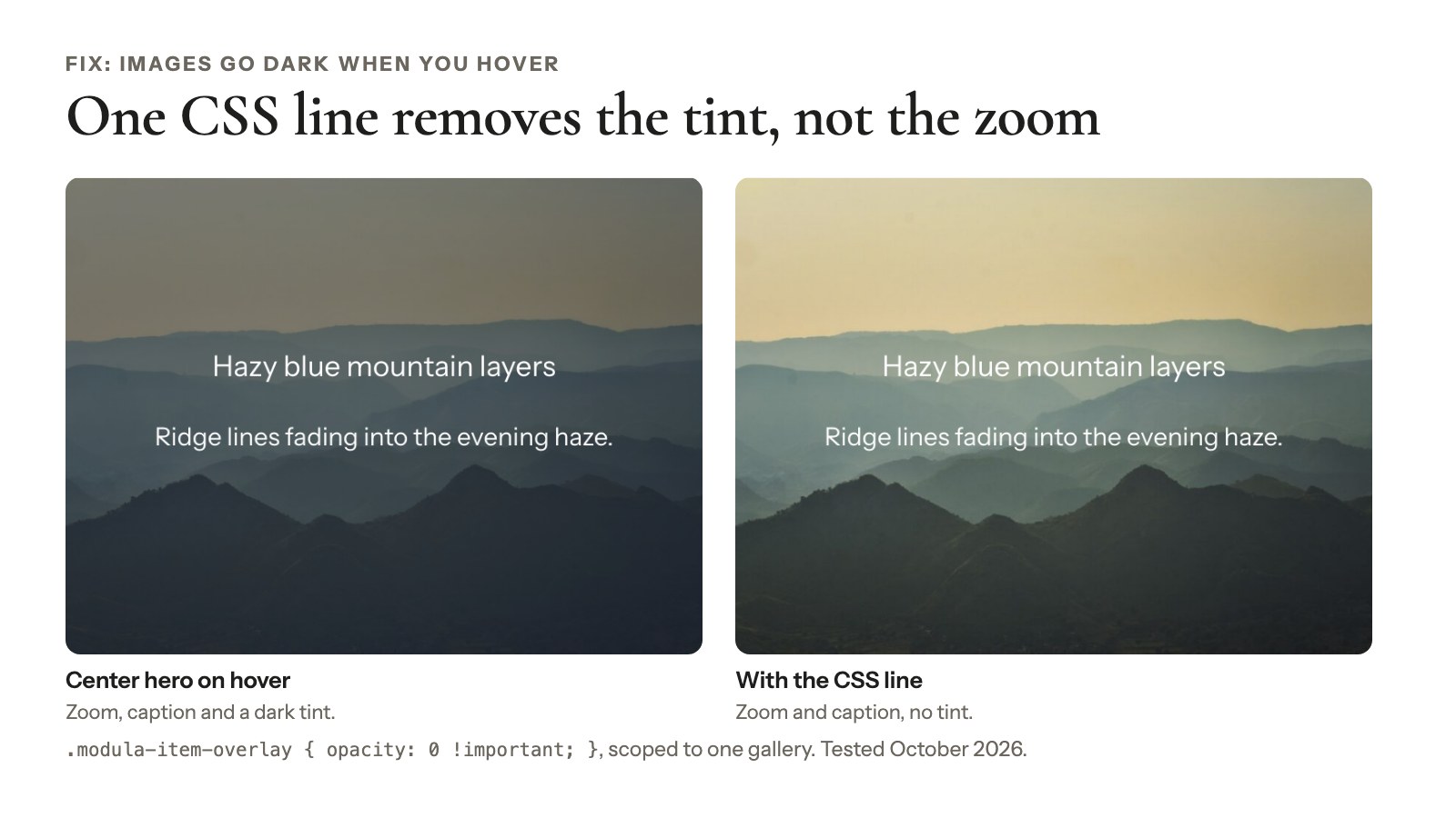
- Turn Darken on hover off. The zoom or lift stays; only the tint goes.
- Clear your caching plugin and CDN cache, or you’ll keep seeing the old version.
None and Captions only have no dim at all. If a tint still shows, paste this in the gallery’s CSS section, with your gallery’s selector in place of #modula-123:
#modula-123 .modula-item-overlay { opacity: 0 !important; }We tested it on a Center hero gallery in October 2026. The tint stayed off, and the zoom and caption still worked.
Style the hover caption with CSS
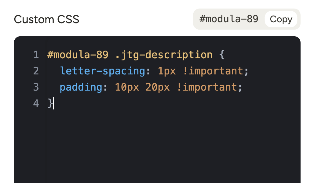
You can move and restyle Modula’s hover caption with a few lines of CSS. A common request: the caption in the bottom-right corner, off the subject’s face, with a dark background behind the text only.
#modula-123 .modula-item {
  --modula-hover-slot-caption-x: calc(100% - 24px) !important;
  --modula-hover-slot-caption-y: calc(100% - 28px) !important;
  --modula-hover-slot-anchor-caption: -100% !important;
  --modula-hover-slot-text-align-caption: right !important;
}
#modula-123 .modula-item .figc .jtg-description {
  background: rgba(0, 0, 0, 0.75);
  color: #fff;
  padding: 4px 8px;
  border-radius: 3px;
}
For every gallery, replace #modula-123 with .modula-gallery. We tested both: the caption moved to the bottom right, on a 75% black background, and still showed only on hover. Keep the 24 px; with 12 px it landed a pixel outside the tile.
Where to paste it:
- One gallery: the editor’s CSS section, which shows your gallery’s selector with a Copy button.
- All galleries, classic theme: Appearance → Customize → Additional CSS.
- All galleries, block theme: Appearance → Editor → Styles, then Additional CSS in the ⋮ menu at the top of the Styles panel (WordPress docs).
More examples: hover effect CSS changes and custom CSS.
Hover effects without a plugin: CSS for the Gallery block
To add an image hover effect using CSS to the core Gallery block, give the gallery a class and paste a few rules in Additional CSS. No theme files involved.
Set up the Gallery block
- Select the Gallery block and open Advanced in its settings.
- In Additional CSS class(es), type
hover-zoomor another class below. Separate several with a space. - Link the images to the media file or attachment page. Keyboard users need a link to tab to.
- Paste the CSS in Additional CSS (see the list in the previous section).
The tested CSS
These CSS hover effects on images only touch galleries with their class. We tested all four on 24 October 2026 on a core Gallery block in WordPress 7.1.3, in Chromium: mouse hover, Tab focus, reduced motion and touch emulation.
/* 1. Gentle zoom inside the frame */
.hover-zoom .wp-block-image {
  overflow: hidden;
}
.hover-zoom .wp-block-image img {
  transition: transform 0.3s ease;
}
.hover-zoom .wp-block-image:hover img,
.hover-zoom .wp-block-image:focus-within img {
  transform: scale(1.06);
}

/* 2. Captions that appear on hover, but stay visible on touch screens */
@media (hover: hover) {
  .hover-captions .wp-block-image figcaption {
    opacity: 0;
    transition: opacity 0.25s ease;
  }
  .hover-captions .wp-block-image:hover figcaption,
  .hover-captions .wp-block-image:focus-within figcaption {
    opacity: 1;
  }
}

/* 3. Black and white until the pointer arrives (color on touch screens) */
@media (hover: hover) {
  .hover-color .wp-block-image img {
    filter: grayscale(1);
    transition: filter 0.3s ease;
  }
  .hover-color .wp-block-image:hover img,
  .hover-color .wp-block-image:focus-within img {
    filter: none;
  }
}

/* 4. Lift with a soft shadow */
.hover-lift .wp-block-image {
  transition: transform 0.25s ease, box-shadow 0.25s ease;
}
.hover-lift .wp-block-image:hover,
.hover-lift .wp-block-image:focus-within {
  transform: translateY(-4px);
  box-shadow: 0 12px 24px rgba(0, 0, 0, 0.18);
}

/* Respect visitors who ask for less motion */
@media (prefers-reduced-motion: reduce) {
  .hover-zoom .wp-block-image img,
  .hover-captions .wp-block-image figcaption,
  .hover-color .wp-block-image img,
  .hover-lift .wp-block-image {
    transition: none;
  }
}
When CSS isn’t enough
CSS alone gives you no presets to switch between and no menu to give one photo its own effect. Additional CSS also stays with your theme, so switching themes leaves it behind. Once you want presets, captions under photos or a standout image, a plugin is less work.
Frequently asked questions
Yes, five of Modula 3.0’s 14 presets are free (None, Captions only, Balanced reveal, Lift, Center hero), plus Darken on hover, Dim color and Cursor. The other nine presets, the builder and Bulk edit need Modula Pro, from $39 for the first year ($78/year after; plans).
Not like with a mouse. Many phone browsers show the hover on a tap or long press, sometimes in the same tap that opens the photo. Keep important captions visible with Captions only or Under the image, and wrap hover-only CSS in @media (hover: hover).
Yes. Add a class to the core Gallery block under Advanced, then paste CSS in Additional CSS (Customizer or Styles). No theme files to edit, and we tested the four snippets above. Just know that switching themes leaves Additional CSS behind.
Not the ones here. They’re CSS transitions that run in the browser only while someone hovers. The four snippets above come to about 1.5 KB of CSS in total and load nothing else. Modula’s effects are part of its gallery CSS.
Yes, in Modula. Click the photo in the preview and set its Hover effect field; the rest keep the gallery’s preset. Lite offers the five free presets there, and the others need Modula Pro. With Pro, Bulk edit sets it for many photos at once.
Lower When smaller than or turn off Bubble on small images in Layout → Captions. By default, tiles under 240 px on their shortest side show captions in a pop-up. That happens a lot in two-column phone layouts, where tiles almost never reach that size.