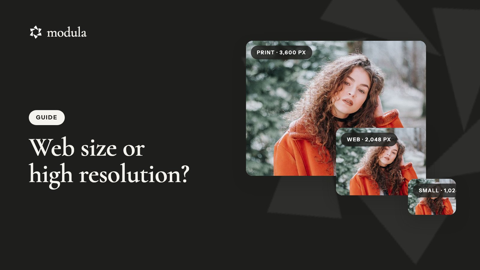
High resolution is the full-size photo: around 6,000 × 4,000 pixels from a 24-megapixel camera, made for prints, albums and your archive. Web size is a smaller copy, usually 1,024 to 2,048 pixels on the long edge, made for screens and social media. That’s the whole high resolution vs web size difference. Same photo, same edit, fewer pixels.
Choosing a download? Get the high resolution once, on a computer, and back it up. Share the web size.
Delivering photos? Give clients both. If the gallery lives on your WordPress site, upload the high-res files once: visitors see a light copy, and clients download the original.
High resolution vs web size at a glance
High resolution is for prints and anything you might crop later, and web size is for screens. Here’s the high res vs web size comparison for a typical client gallery:
| High resolution | Web size | |
|---|---|---|
| What it is | The original, or a copy of 3,600 px and up | A copy at 2,048, 1,024 or 640 px |
| File size (22 MP JPEG, our test) | 6.1 MB original, 2.6 MB at 3,600 px | 0.53 MB at 2,048 px, 0.09 MB at 1,024 px |
| Best for | Prints, albums, canvas, cropping, your archive | Websites, Instagram, Facebook, email, texting |
| Skip it for | Texting and Instagram (they shrink it anyway) | Prints bigger than 5×7 |
As of October 2026, Pixieset’s high resolution download is 3,600 px or the original, and its web size is 2,048, 1,024 or 640 px (Pixieset). Aftershoot uses the same steps (Aftershoot).
Resolution means pixels, not DPI
A photo’s resolution is its pixel dimensions. They decide both how big it prints and how sharp it looks on screen.
What makes a photo high resolution
Multiply width by height and you get megapixels: 6,000 × 4,000 is 24 million pixels, or 24 MP. Client-gallery platforms start “high resolution” at about 3,600 px on the long edge. That’s enough for a 12-inch print at 300 PPI (pixels per inch).
Why “72 DPI for the web” is a myth
Most pages on this topic still repeat it. It’s wrong.
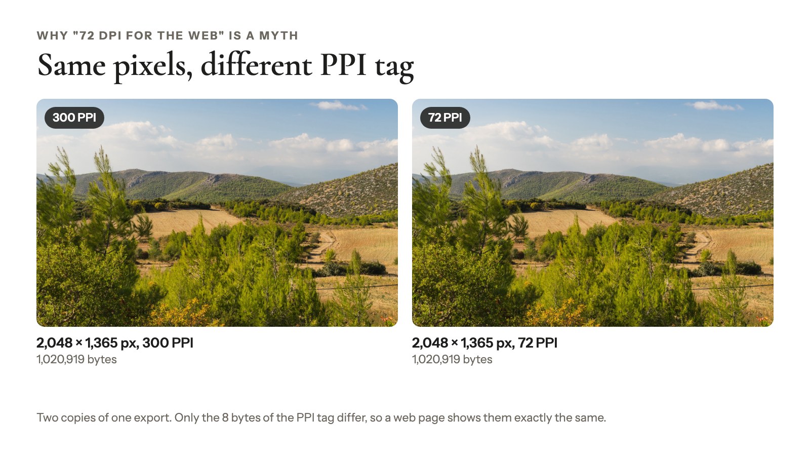
The DPI (or PPI) value in a file is just a tag, and web pages don’t size photos by it. They lay images out in CSS pixels, and the device pixel ratio says how many real pixels wide each CSS pixel is. That’s 1 on a classic 96 DPI display, 2 on a Retina screen and often more on phones (MDN, 2026).
Tip
Try it: In Photoshop, change a 2,048 px photo from 300 to 72 PPI with resampling off. Put both versions in a WordPress post. They look identical, because not a single pixel changed.
Where DPI does matter: print
On paper, PPI is pixels divided by inches. Print a file at 300 PPI and you get a crisp print. At 150 PPI the same file prints twice as wide, but softer up close.
How many pixels a print needs
A sharp print needs 300 pixels per inch of its size. A 4×6 needs 1,200 × 1,800 px, and an 8×10 needs 2,400 × 3,000 px (Pic-Time).
You can go lower. One lab asks for 300 DPI at print size but calls 150 DPI the practical minimum (Pro Lab, May 2026). Big prints, seen from farther back, get away with less.
| Print size (inches) | Pixels at 300 PPI | Pixels at 150 PPI |
|---|---|---|
| 4×6 | 1,200 × 1,800 | 600 × 900 |
| 5×7 | 1,500 × 2,100 | 750 × 1,050 |
| 8×10 | 2,400 × 3,000 | 1,200 × 1,500 |
| 11×14 | 3,300 × 4,200 | 1,650 × 2,100 |
| 16×20 | 4,800 × 6,000 | 2,400 × 3,000 |
Already have a file? Divide its long edge by 300 or 150 to see what it’ll print:
| Long edge of your file | Print’s long side at 300 PPI | At 150 PPI |
|---|---|---|
| 1,024 px | 3.4 in | 6.8 in |
| 2,048 px | 6.8 in | 13.7 in |
| 3,600 px | 12 in | 24 in |
| 6,000 px (24 MP) | 20 in | 40 in |
A 3:2 web copy at 2,048 × 1,365 px makes a great 4×6 (about 340 PPI) and a good 5×7 (about 270 PPI). At 8×10 it drops to roughly 170 PPI, just over the 150 floor. Anything bigger needs the high-res file.
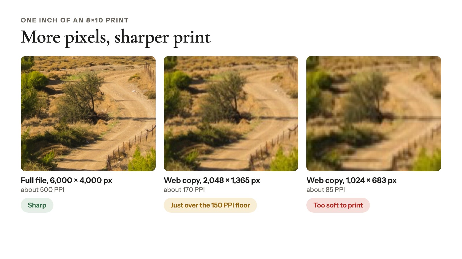
Cropping to 8×10 also trims the long side of a 3:2 frame, so start from the full file.
How many pixels a screen needs
About 2,048 px on the long edge covers most screens.
The best resolution for photos on a website
The best resolution for photos on a website is about 2,048 px on the long edge for full-width photos, and up to 2,560 px for edge-to-edge heroes on big monitors. Smaller gallery tiles need less, and responsive images handle that for you.
In the US, 1920×1080 is the most common desktop resolution at 27.13% of screens, and 2560×1440 has 4.10% (StatCounter, September 2026). A full-width photo about 400 CSS pixels wide, on a phone with a pixel ratio of 3, needs around 1,200 real pixels.
Why oversized photos slow your site
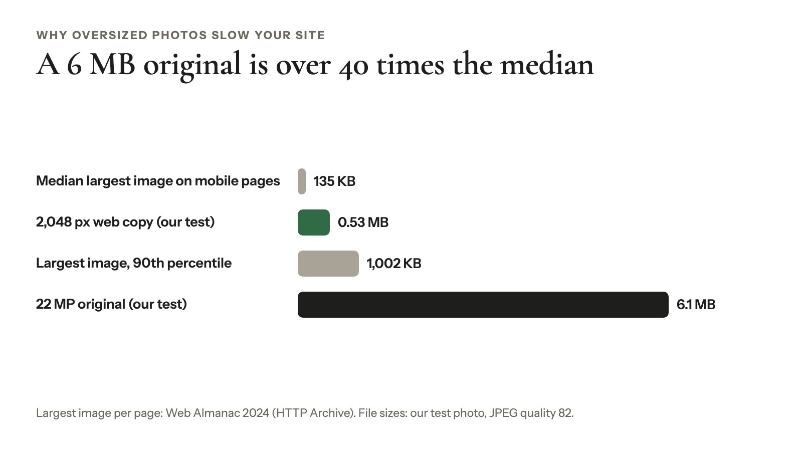
An image is the largest element on screen for 76% of mobile pages (Web Almanac 2025). The latest image weights, from 2024, put the median largest image at 135 KB on mobile and 1,002 KB at the 90th percentile (Web Almanac 2024). A 6 MB original in a gallery tile is over 40 times that median. Here’s how to speed up gallery images.
What social media does with your photo
Instagram keeps photos between 320 and 1,080 px wide at their original resolution and scales wider ones down to 1,080 px (Instagram Help). Facebook is commonly reported to store photos at up to 2,048 px on the long edge. Uploading the high-res file buys you nothing there.
Web size or high resolution: which should you download?
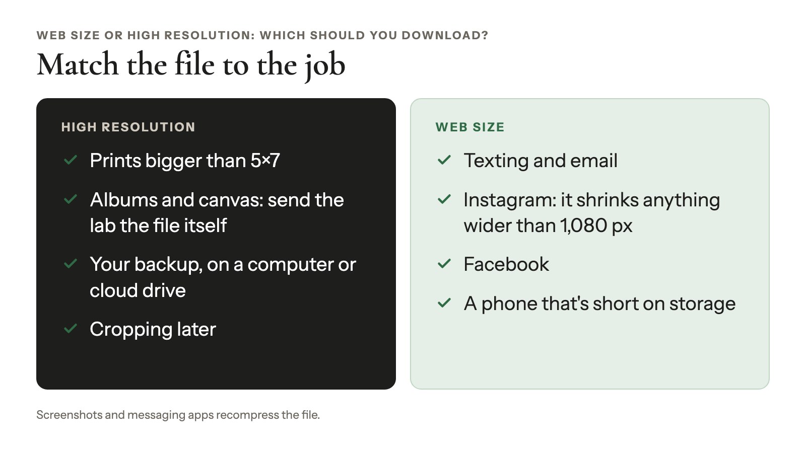
When a gallery offers web size vs high resolution downloads, get the high resolution once, on a computer, and back it up as your print copy. Use the web size for texting, Instagram, Facebook and email; Instagram shrinks anything wider than 1,080 px anyway.
Match the file to the job:
- Printing anything bigger than 5×7: high resolution.
- Phone short on storage: web size on the phone, high resolution on your computer or cloud drive.
- Ordering an album or a canvas: high resolution, and send the lab the file itself. Screenshots and messaging apps recompress it.
Can you turn a web-size photo back into high resolution? Not really. Upscaling tools guess the missing pixels; they don’t recover them. Ask your photographer for the original.
What photographers should export and deliver
Photographers need two exports of every photo: a full-resolution master and a 2,048 px web-size set.
Keep a full-resolution master
Export the edited photo at full size, in sRGB, as a high-quality JPEG. Pro Lab, for one, asks for sRGB JPEGs at the highest quality and no RAW files (Pro Lab). Weighing JPEG against WebP or TIFF? See the best image format for photos.
Make one web-size set at 2,048 px
2,048 px matches the largest web size Pixieset and Aftershoot hand out, and what Facebook reportedly keeps. Add a 1,024 px set only if you need files light enough for email.
What each size weighs
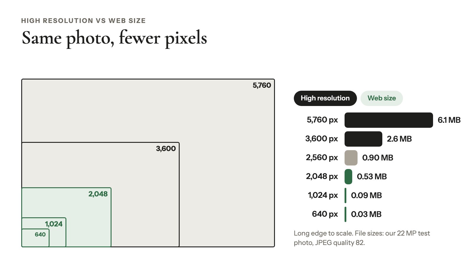
We resized a 22 MP photo (5,760 × 3,840 px) with macOS’s sips at JPEG quality 82, the default WordPress uses, on October 24, 2026:
| Long edge | File size |
|---|---|
| 5,760 px (original) | 6.1 MB |
| 3,600 px | 2.6 MB |
| 2,560 px | 0.90 MB |
| 2,048 px | 0.53 MB |
| 1,024 px | 0.09 MB |
| 640 px | 0.03 MB |
A second, smaller photo (3,709 × 2,473 px, 1.56 MB) gave 0.52 MB at 2,048 px. Two photos and one encoder make a rule of thumb, not a law. Still, the 2,048 px copy weighs less than a tenth of the 22 MP original.
Put the sizes in your contract
Write down what each package includes: full resolution plus web size, or web size only. For the hand-off itself, see our guide to delivering photos to clients.
What WordPress does with a full-size upload
WordPress keeps every original photo you upload. When you upload a photo wider or taller than 2,560 px, it also saves a copy capped at 2,560 px, with “-scaled” in the file name. That copy becomes the “full” size on your pages (WordPress, since version 5.3 in 2019).
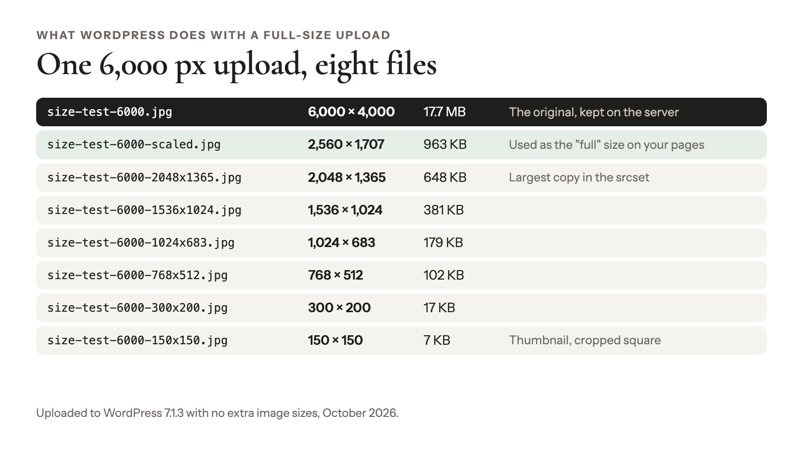
It also makes smaller copies, from a 150 px thumbnail up to 2,048 px, and lists them in a srcset so each browser can pick the one it needs. The image sizes guide has the full list.
So upload the full-resolution export once, not two versions. Your host’s upload limit is the only ceiling.
Good to know
Leave the 2,560 px limit on. A filter can turn it off, but then your pages and full-screen lightbox serve the full original.
Show web size, deliver high resolution with Modula
One Modula gallery can show visitors light files and hand clients the originals. We make Modula, a WordPress gallery plugin with 160,000+ active installations, and our support team suggests this setup for heavy gallery pages.
Upload your full-size JPEG or WebP exports once: in the gallery editor, click the arrow next to + Add, then Upload files (or A ZIP archive in Pro).
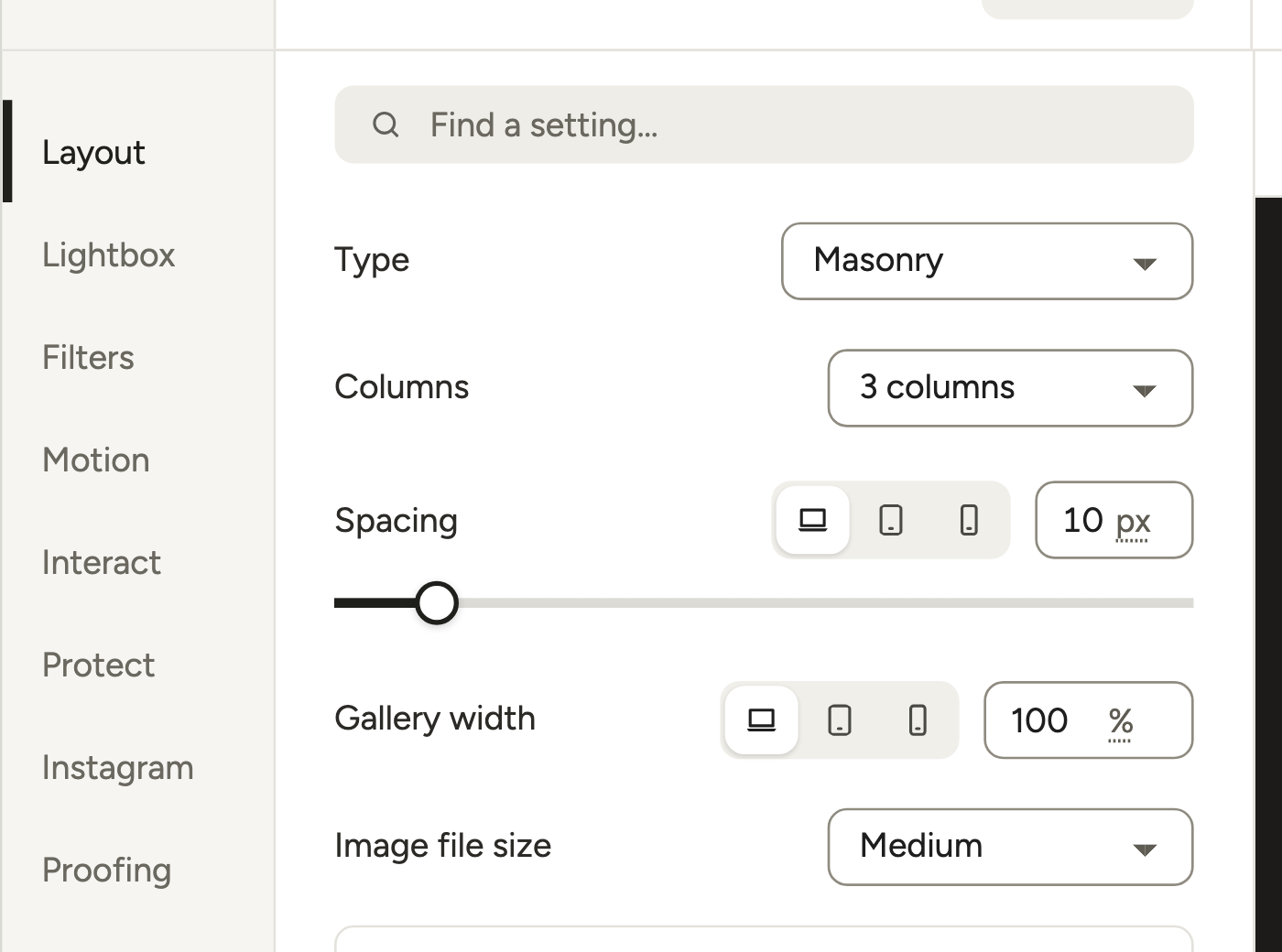
Leave Image file size on Medium
Layout → Image file size starts at Medium, and you can leave it there. Medium sounds small, but it’s only the fallback. Modula 3.0 gives each tile a srcset, so wide columns and Retina screens get a bigger file and small tiles on a phone get a small one. That’s in the free version too.
The lightbox opens WordPress’s full-size file. For big uploads, that’s the 2,560 px “-scaled” copy: sharp on any screen, and about 0.9 MB instead of 6.1 MB in our test.
Turn on full-size downloads
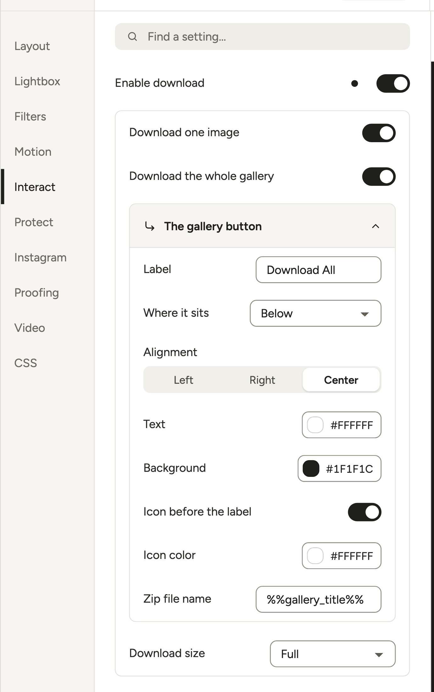
Open Interact and switch on Enable download. Turn on Download one image, Download the whole gallery or both, then set Download size to Full.
Good to know
Check this before you share: if Download size says Thumbnail, your clients get a 150 px square. Full gives them the untouched original you uploaded, not the 2,560 px copy.
Other sizes give that WordPress size, so Large (1,024 px by default) works as a web-size download. The ZIP needs PHP’s ZIP extension. Downloads are in the Business plan, and the downloadable gallery guide covers the rest.
Make the gallery copies lighter
Modula → Settings → Performance → Compression (Off, Lossless, Lossy or Glossy) shrinks the gallery and lightbox images and serves them from Modula’s image CDN. It’s in the Trio and Business plans and works only on a live site. The originals your clients download stay untouched (Speed Up docs).

Show detail without handing out the file
Lightbox zoom (Business) adds a magnifier for studying detail without downloading anything. Watermarks (Business) are burned into the image files, so watermark separate web-size proof copies and keep the finals clean.
The honest limit: one download size per gallery
Modula has one Download size per gallery (albums have their own). Clients can’t pick “web size or high resolution” in the same gallery the way Pixieset and Aftershoot allow. Either deliver Full and let Instagram and the rest do the shrinking, or add a second gallery with the same photos and Download size set to Large.
When sizes go wrong
Most Modula gallery size problems come from one wrong setting or from missing resized copies.
Your clients’ downloads are tiny
Download size is probably on Thumbnail. Set it to Full, then download one photo yourself and check its pixel dimensions before you resend the link.
The lightbox zooms way too far in
A click in the lightbox zooms the photo to the file’s natural size, so a huge file ends up mostly off screen. Modula has no setting to cap that zoom. In Pro, turn on Close when the image is clicked (Lightbox section) and a click closes the lightbox instead.
To keep the zoom but tame it, keep WordPress’s 2,560 px limit on, or export the gallery files smaller. With the limit on, Download size Full still hands out the originals.
A page with several galleries feels heavy
Leave Image file size on Medium, keep Load images as people scroll on, and turn on Compression (Trio and Business). Split long galleries with Pagination or a Load more button (Business). Keep Download size on Full.
Tiles look soft after an import
The srcset needs WordPress’s resized copies. Files brought in by FTP or some migration tools don’t have them, so Modula skips the srcset. Regenerate them with wp media regenerate (WP-CLI) or a regenerate-thumbnails plugin. A bigger Image file size only hides the problem.
Frequently asked questions
High resolution has more detail, but on a phone screen the two look the same. The high-res file just has more pixels, often 3,600 px or more against 2,048 px or less. The difference shows on paper, or when you crop.
On Pixieset, web size is 2,048, 1,024 or 640 px on the long edge. High resolution is 3,600 px or the original, and the original needs an upgraded Client Gallery or Suite plan (checked October 2026). Share the web size; print the high resolution.
Print needs 300 PPI at the print size, with 150 PPI as the practical minimum, so an 8×10 wants 2,400 × 3,000 px. On the web, only pixels count: about 2,048 px on the long edge covers most screens, whatever DPI the file says.
Check its pixel dimensions, not its DPI: Get Info on a Mac, or Properties → Details on Windows. Divide the long edge by 300 to see how many inches it prints at full quality. Client-gallery platforms call 3,600 px and up high resolution.
Yes, but only small. A 2,048 px web copy makes a great 4×6 and a good 5×7; a 1,024 px copy manages a 4×6 at about 170 PPI. A soft print usually came from a web or messaging-app copy, not the high-res file.