WordPress image sizes are simpler than most guides make them look. Upload your photos at about 2,000–2,560 px on the long edge, and WordPress turns each one into a set of smaller copies. Every visitor’s browser then downloads the copy that fits their screen.
Most bad advice on this comes from not knowing what those copies are. So here’s the full picture for WordPress 7.1: what it creates, how the browser picks a copy and what to upload. Then we’ll change the thumbnail size and get sizes right in a gallery.
Good to know
Quick answer: what size should images be for a website?
– Photos in posts and galleries: 2,000–2,560 px on the long edge. – Full-width hero or header: 2,560 px wide. – Featured or social image: 1,200 × 630 px. – Logo: SVG, or a PNG at twice the size it shows. – Anything over 2,560 px: only worth it for downloads and prints.
The default WordPress image sizes
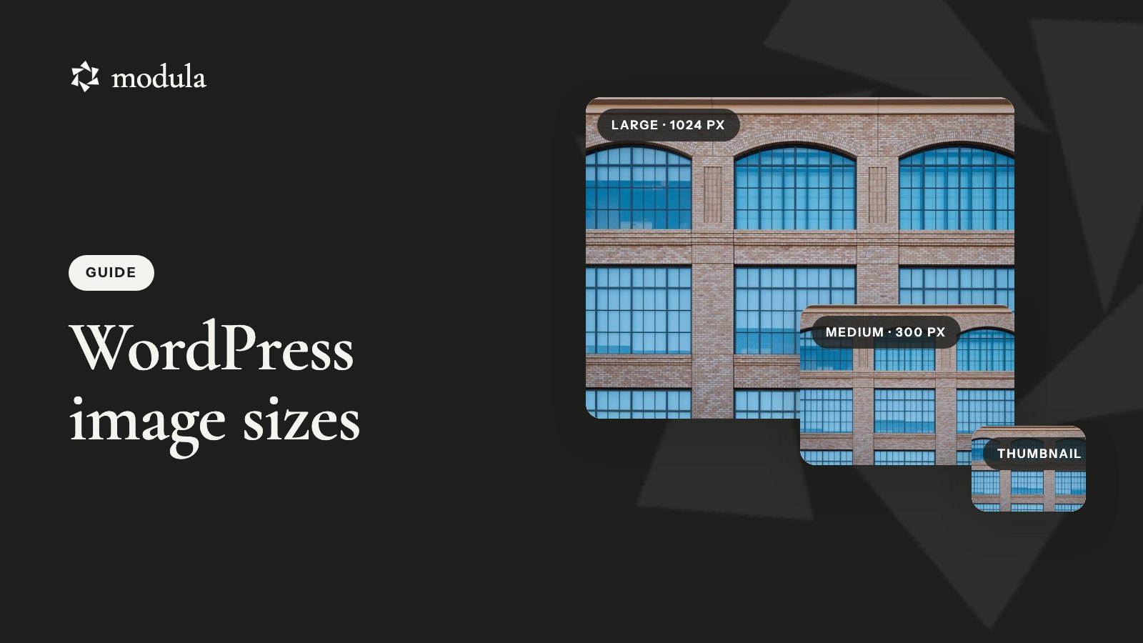
WordPress has six default image sizes, twice as many as the three you see in Settings → Media. One photo can turn into eight files on your server:
| Size (name in the code) | Default dimensions | Cropped? | Where you change it | In the editor’s Resolution menu? |
|---|---|---|---|---|
Thumbnail (thumbnail) | 150 × 150 | Yes | Settings → Media | Yes |
Medium (medium) | Fits in 300 × 300 | No | Settings → Media | Yes |
medium_large | 768 wide, any height | No | Code only | No |
Large (large) | Fits in 1024 × 1024 | No | Settings → Media | Yes |
1536x1536 | Fits in 1536 × 1536 | No | Code only | No |
2048x2048 | Fits in 2048 × 2048 | No | Code only | No |
| Full | Your upload, or a -scaled copy | No | – | Yes (“Full Size”) |
“Fits in” means the longer side shrinks to that number and the other side follows. A horizontal 3:2 photo’s Medium copy is 300 × 200, not a square.
The 1536 and 2048 sizes arrived in WordPress 5.3. Core’s own code comment says they’re meant for “larger, high-density devices”. Themes and plugins can add more with add_image_size().
What one upload looks like on your server
Here’s a real image size example. Upload a 6000 × 4000 px JPEG called photo.jpg, and your uploads folder gets this, plus any theme sizes:
photo.jpg              6000 × 4000   your original, kept
photo-scaled.jpg       2560 × 1707   used as "Full"
photo-2048x1365.jpg
photo-1536x1024.jpg
photo-1024x683.jpg
photo-768x512.jpg
photo-300x200.jpg
photo-150x150.jpg      cropped square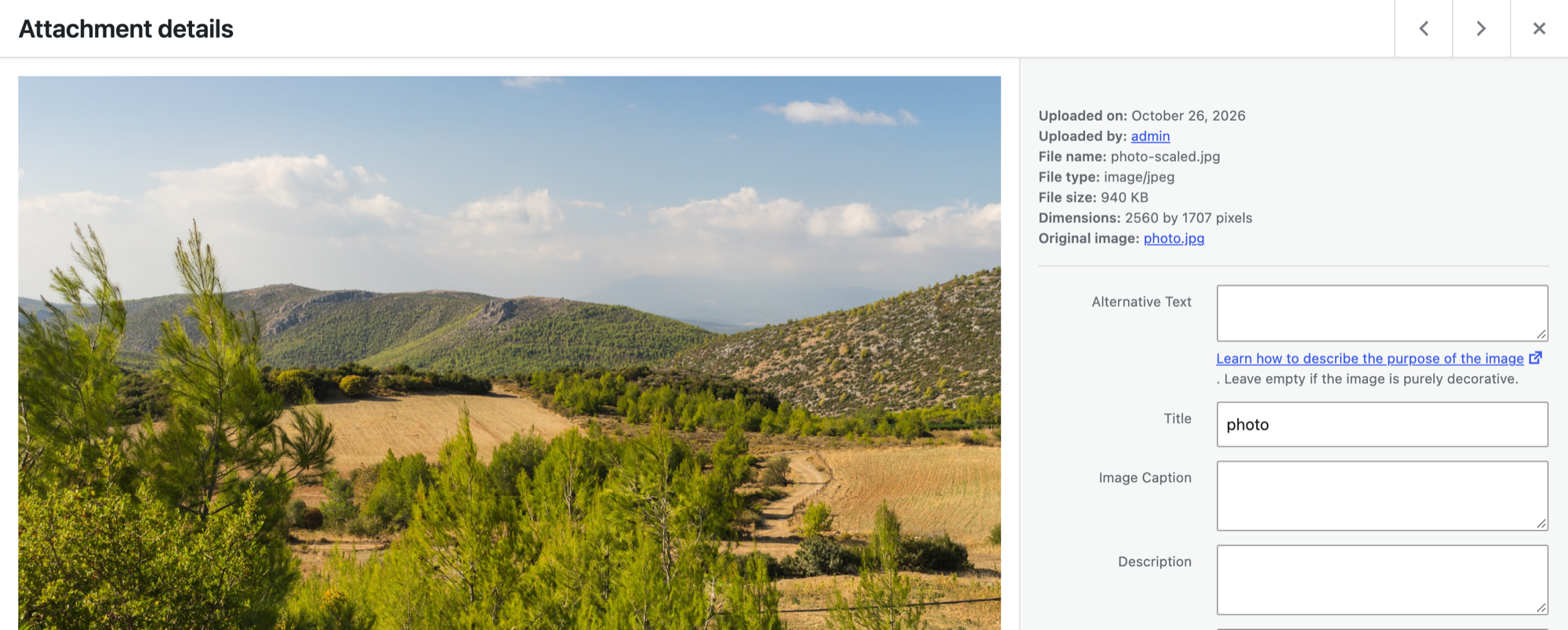
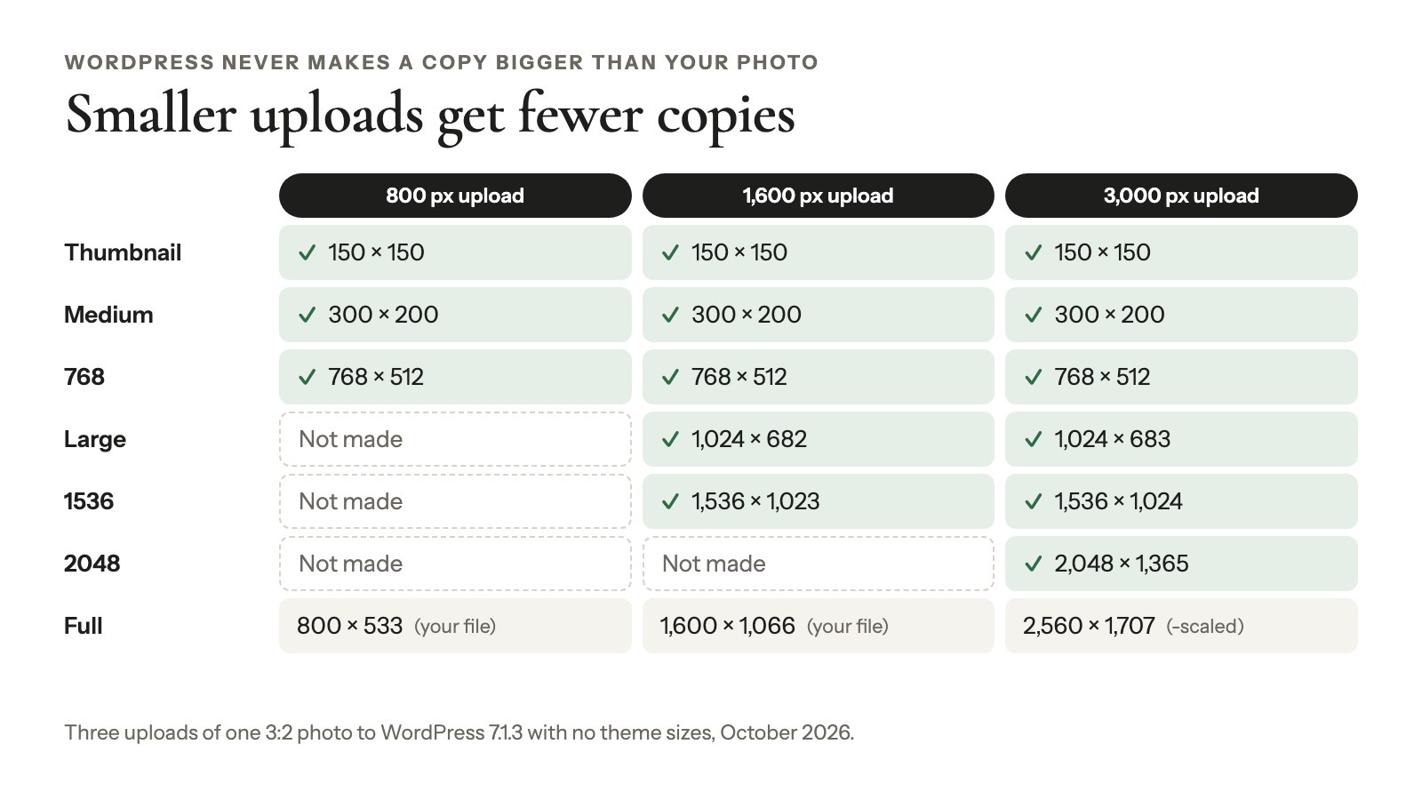
WordPress never makes a copy bigger than your photo
WordPress only shrinks. Upload a landscape photo 800 px wide and you get Thumbnail, Medium and the 768 copy, but no 1024, 1536 or 2048.
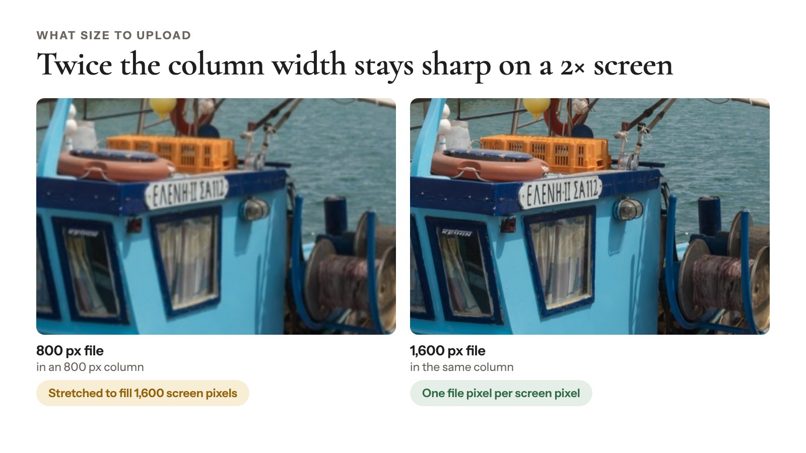
Put that photo in a 1,200 px wide spot and the browser has to stretch it. That’s one of the most common reasons photos look soft on big or high-density screens.
Big photos are scaled down to 2,560 px
If either side of your upload is over 2,560 px, WordPress makes a -scaled copy that fits in 2,560 × 2,560. That copy becomes the Full size for your whole site. Your original stays on the server, untouched.
Developers can raise that threshold or switch it off with the big_image_size_threshold filter (around since 5.3). For most sites, though, 2,560 px is plenty.
Good to know
New in WordPress 7.1: upload in the block editor on an HTTPS site, in Chrome or Edge 137 or later, and your browser makes these copies itself before anything reaches the server (Make WordPress Core). Same sizes, same 2,560 px rule. Other browsers, low-memory devices and uploads from the Media Library screen still go through the server.
How the browser picks the right image size
You don’t pick which copy of a WordPress image a visitor downloads: their browser does. WordPress lists every same-shape copy up to 2,048 px wide (wider only if it’s the file you inserted) in the image’s srcset, the menu of files a browser can choose from. A sizes hint says how wide the image will show.
The browser then grabs the smallest copy that covers display width × screen density. Screen density is device pixels per CSS pixel: 2 on a Retina screen (MDN), 2 or 3 on an iPhone (Apple). For example:
- A four-column gallery in a 1,200 px content area: each tile is about 290 px. A 2× laptop needs about 580 px, so it gets the 768 copy.
- The same gallery on a phone, in one column: 360 px × 3 is about 1,080 px, so it gets the 1536 copy.
- A full-width hero on a 1,440 px, 2× laptop: 2,880 px wanted, so it gets the biggest copy there is, 2,048 px or the 2,560 px scaled file.
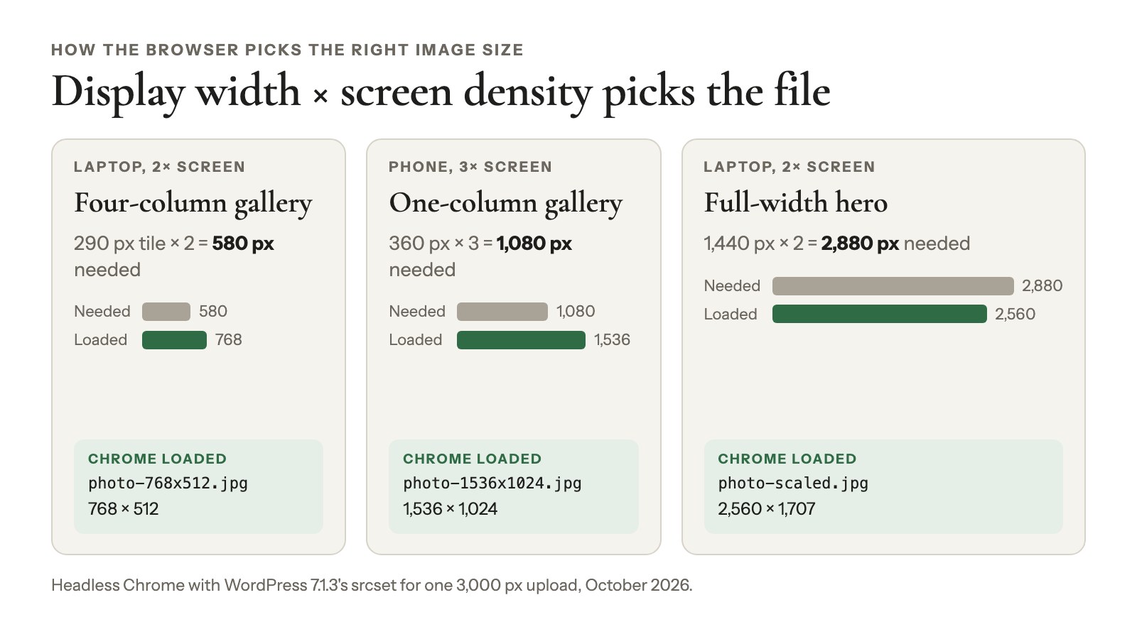
That last one is why uploading past 2,560 px adds nothing anyone can see.
Since WordPress 6.7, lazy-loaded images also get sizes="auto", so the browser uses the image’s real width in the layout. Chrome, Edge and Firefox support it, and Safari 27 does in part (caniuse, checked October 2026).
This markup is worth protecting. The 2024 Web Almanac found only 42% of mobile pages use srcset. On desktop, one in five sizes attributes is far enough off to make the browser pick a worse file. WordPress gets it right for you, as long as no plugin strips it out.
What size to upload for each type of website image
The best upload size for a website image is at least twice the width it fills, capped at about 2,560 px. That one rule covers most website image dimensions:
| Image | Upload this | Why |
|---|---|---|
| Photo in a blog post (700–800 px column) | 1,600–2,000 px wide | Twice the column stays sharp on 2× screens |
| Full-width hero, header or banner | 2,560 × 1,440 (16:9), or your theme’s ratio | The biggest file WordPress serves as Full |
| Featured image | At least 1,200 px wide; 1,200 × 630 for sharing | Facebook asks for at least 1200 × 630, close to 1.91:1; Google Discover wants 1,200 px wide |
| Gallery photos | 2,000–2,560 px on the long edge | Sharp tiles and a sharp full-screen lightbox |
| Thumbnails | Don’t make them | WordPress crops 150 × 150 copies for you |
| Logo | SVG, or PNG at 2× its display size | Crisp everywhere (SVG uploads need a plugin) |
| Product photo with zoom | Bigger than the zoomed view | Zoom shows the file’s real pixels |
| Photos clients download or print | Your full camera file | WordPress keeps your original anyway |
Say you’re a potter with 12 product photos for a shop page. Export them at 2,000 px and upload. WordPress makes the smaller copies, and nobody downloads more than their screen needs.
Pixels, not DPI
DPI doesn’t matter on the web. A 2,000 px photo saved at 72 DPI and at 300 DPI looks identical on screen, because browsers only read pixel dimensions.
Dimensions are how many pixels there are; file size is how many kilobytes they take. WordPress re-encodes its resized copies at quality 82 for JPEG and 86 for WebP by default, so they come out lighter than a high-quality upload.
That weight adds up: images are 911 KB of the median mobile home page’s 2,559 KB (Web Almanac 2025). For formats, see the best image format for photos; for client files, web size vs high resolution.
How to change the WordPress thumbnail size and other image sizes
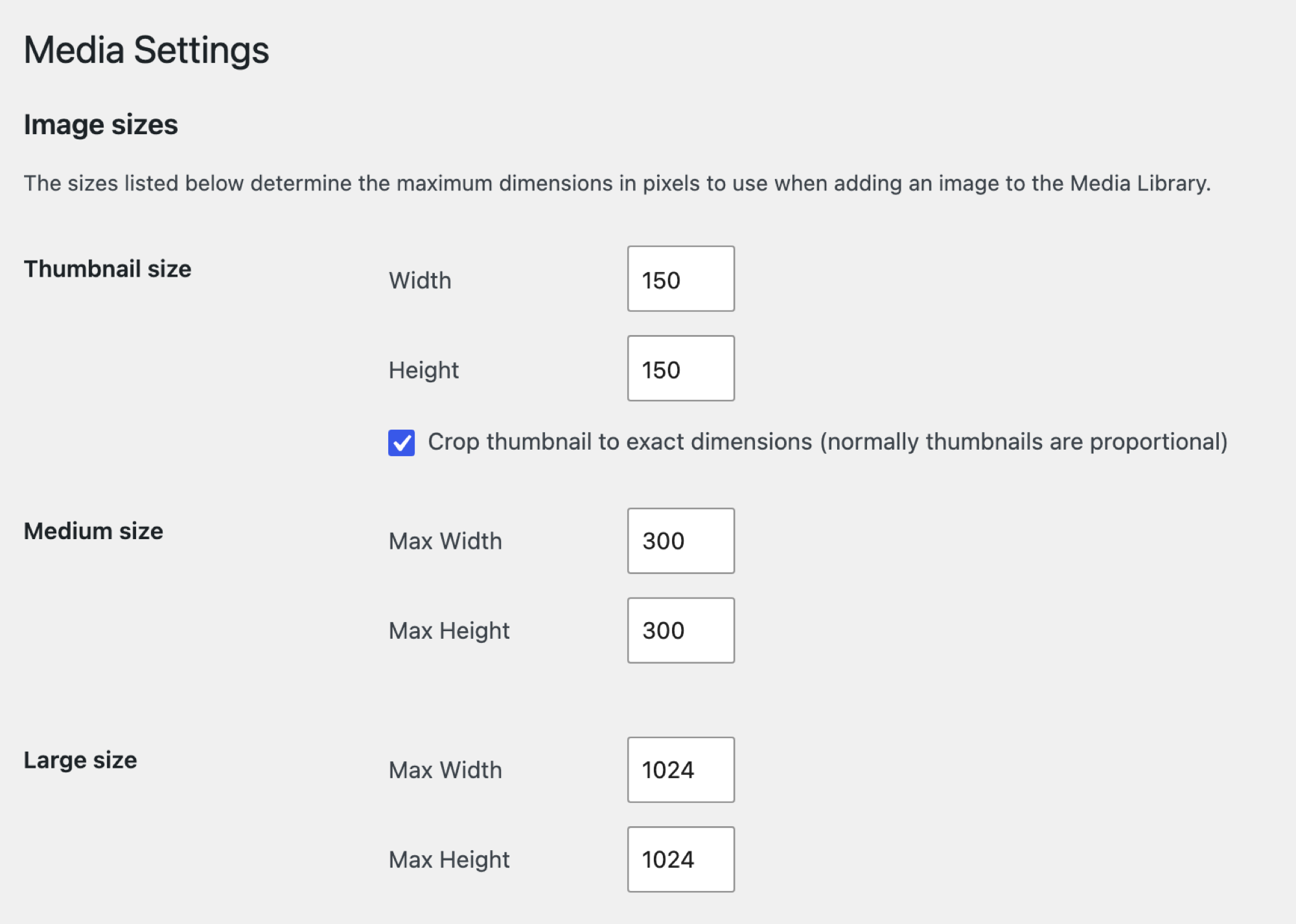
The default WordPress thumbnail size is 150 × 150 px, cropped square, and you change it in Settings → Media:
- Go to Settings → Media.
- Under Image sizes, set the Thumbnail size Width and Height.
- Keep Crop thumbnail to exact dimensions (normally thumbnails are proportional) checked for squares, or uncheck it to keep each photo’s shape.
- Change Medium size or Large size with Max Width and Max Height if you need to.
- Click Save Changes.
Don’t set both boxes of a size to 0. That switches the copy off, and WordPress falls back to the full-size file wherever that size was asked for. So a tiny spot downloads a big image.
Meant gallery thumbnails, the small previews that open a bigger photo? That’s a different job.
Your existing images keep their old sizes
New values only apply to new uploads. To rebuild older images:
- Regenerate Thumbnails: over a million installs, but its wordpress.org page warns it “hasn’t been tested with the latest 3 major releases of WordPress” (checked October 2026). Try it on staging first.
- WP-CLI (WordPress’s command line):
wp media regenerate --only-missingfills in missing sizes, and--image_size=thumbnailrebuilds just one (docs).
Back up your uploads folder before either.
Adding your own size (for developers)
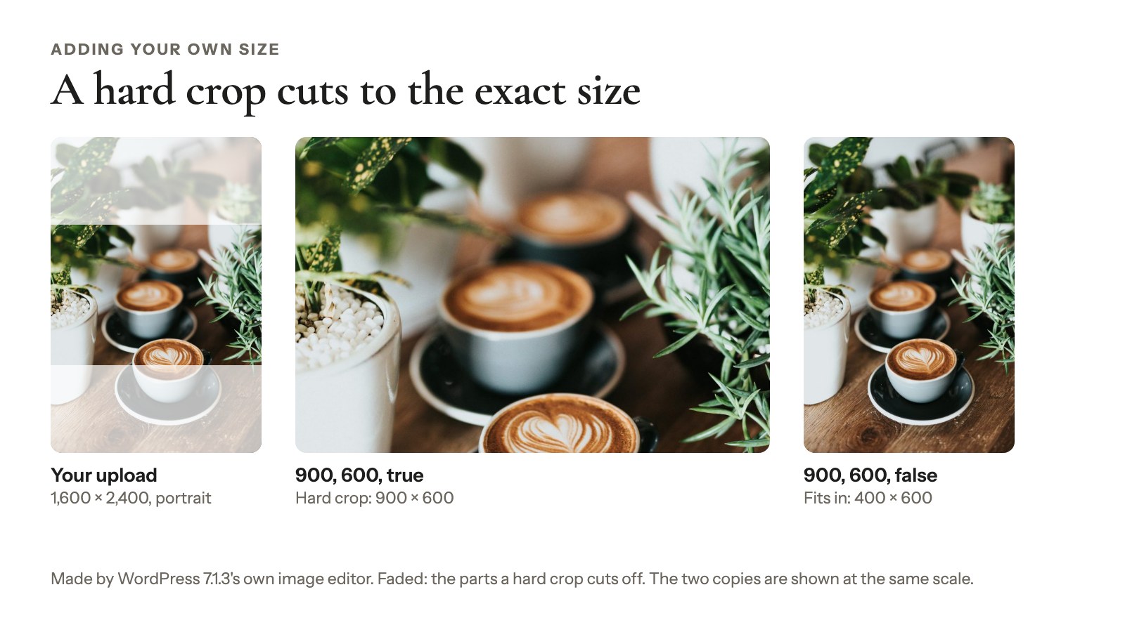
Need a 900 × 600 portfolio crop? Register it in a child theme or a snippets plugin. Never use the parent theme’s functions.php, because the next update wipes it:
add_image_size( 'portfolio-tile', 900, 600, true );true means hard crop: WordPress cuts the copy to exactly 900 × 600. Add it to the editor’s Resolution menu with the image_size_names_choose filter, then regenerate.
Should you remove sizes to save space?
Usually not. The 1536 and 2048 copies are what high-density phones and laptops download, and core’s own code says removing them “is not recommended”. Never delete sizes by editing theme code you don’t own.
How to resize one image in WordPress
Resizing a single image in WordPress comes down to one rule: picking a file and setting a display size are different things.
- In the Image block: Resolution picks the file: Thumbnail, Medium, Large or Full Size, if your original is big enough (Image block docs, updated October 2026). Width, height and aspect ratio only change how big it shows.
- In Media → Library → Edit Image: Scale and Crop save a new, edited file. Scale can’t go bigger than the original, and Restore original image brings the old version back.
Getting image sizes right in a Modula gallery
Image sizes in a Modula gallery come down to three things: which file loads, how big it shows, and what the lightbox and downloads hand out. We make Modula, a WordPress gallery plugin with 160,000+ active installations, so this part comes from its 3.0 code and from questions people send our support team.
What Image file size does (and doesn’t)
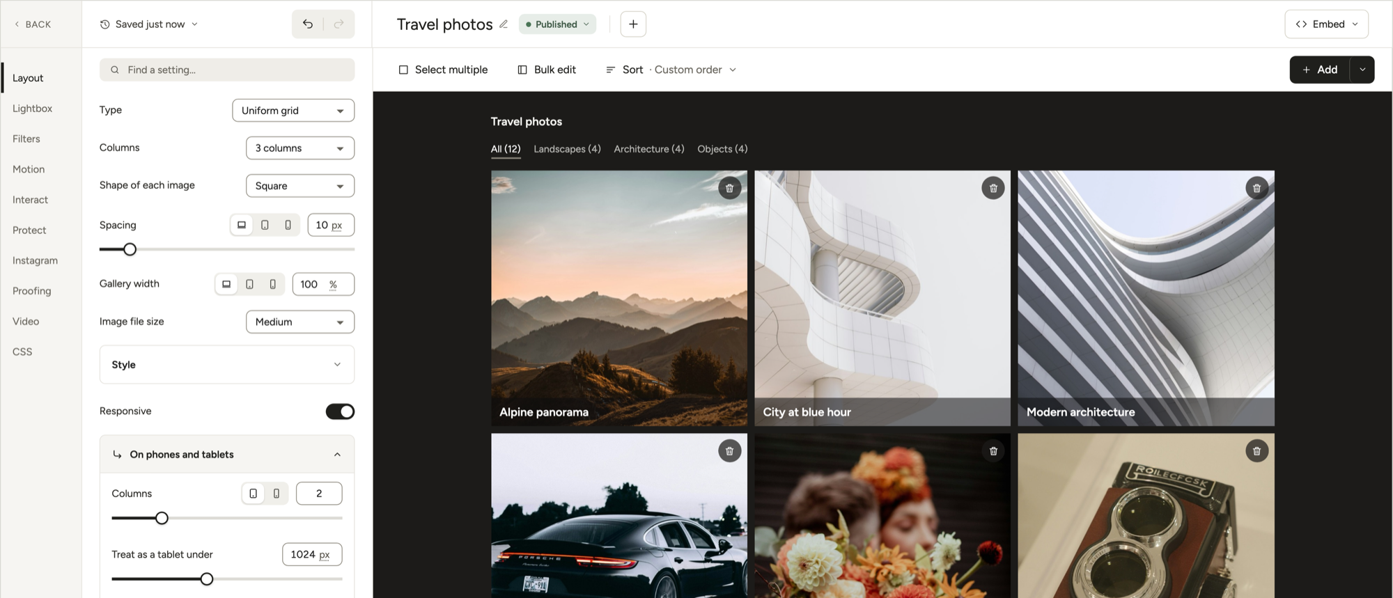
Image file size, in Layout, picks the WordPress copy a gallery starts from. Medium is the default, and it stays sharp. Modula adds a srcset with every same-shape copy WordPress made, up to the full-size file, plus a sizes hint. So the browser swaps in the 768, 1536 or 2048 copy when a tile or screen needs it.
With Load images as people scroll on (the default), each tile’s real width on the page decides which copy loads. You’ll find Image file size in Masonry, Uniform grid, Fit grid, Justified grid, Custom grid, Creative, Polaroid and Parallax; Slider has its own.
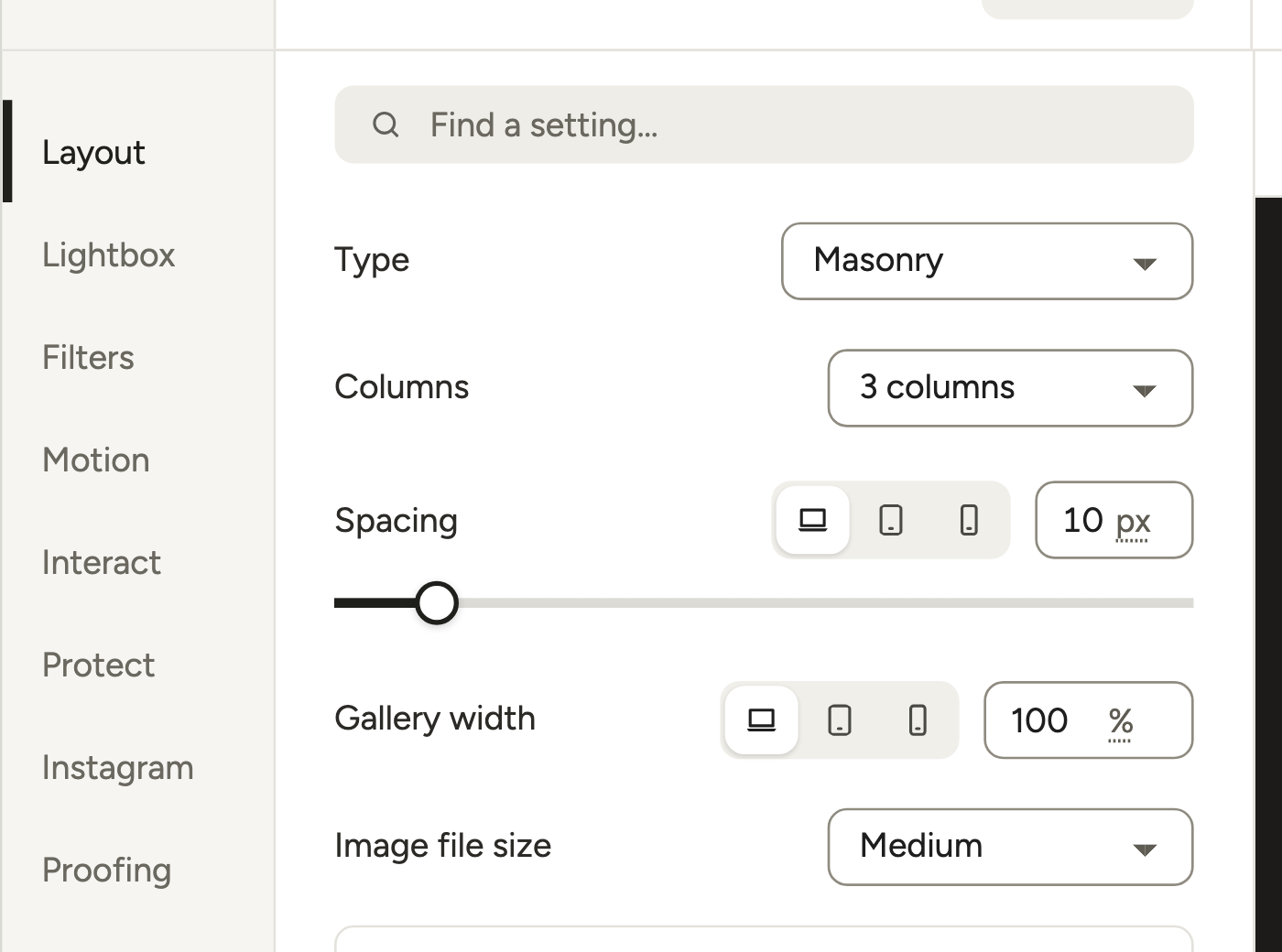
So a Medium gallery isn’t a low-quality gallery. Don’t switch to Large “to fix blur” before the checks below.
When to pick another setting
- Full, for animated GIFs: WordPress’s resized GIF copies don’t move. See how to add GIFs to a gallery.
- Thumbnail, rarely: it starts from WordPress’s 150 × 150 square crop, so your tiles may come out square. For squares on purpose, use Uniform grid, where Shape of each image is Square by default.
- Custom, for an exact shape: set Custom dimensions and turn on Crop images to fit. Modula makes its own crops, with extra sizes up to 1,600 px for sharp screens.
If the gallery still looks soft
Work through this before you touch Image file size:
- Is the original big enough? It needs at least twice the tile width. Check its pixels in Media → Library.
- Do the copies exist? Imported images, or sizes changed after upload, can be missing copies. Regenerate.
- Is a plugin stripping
srcset? Some cache or optimization plugins rewrite image tags. Pause yours and test. - Only if a plugin you need keeps stripping
srcset, pick Large.
Image file size doesn’t change how big photos look
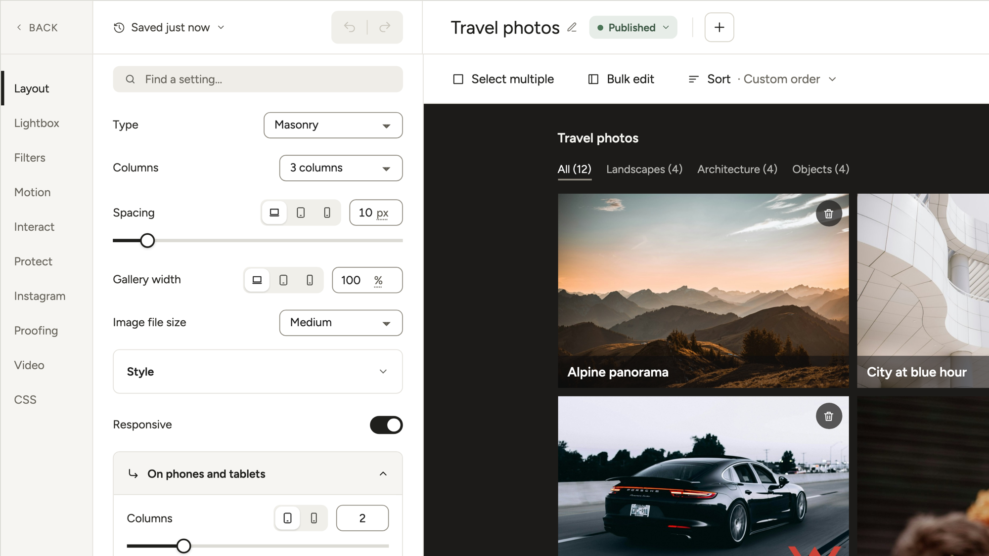
How big photos show depends on Columns, Spacing and Gallery width, all in Layout. Image file size only picks the file.
This trips people up in one-column galleries, where a tall portrait can fill the whole screen. Switching to Medium won’t shrink it, because the photo still fills the whole column. Set Gallery width to something like 75% or 900px instead. A narrower gallery stays centered by default in 3.0, so you don’t need custom CSS.
What the lightbox and downloads load
The lightbox opens the full-size file, whatever Image file size says. Modula 3.0 has no separate lightbox size and no setting to cap click-to-zoom. For any upload over 2,560 px, that full-size file is WordPress’s -scaled copy, so zoom never goes past 2,560 px. A bigger upload costs storage, not lightbox weight. The lightbox’s own Download button saves that same file.
Want small images on the page but the big file for visitors? Turn on Interact → Enable download and check that Download size says Full. Full hands out the untouched original, while the grid keeps loading small copies. Downloads come with the Business plan (see plans).
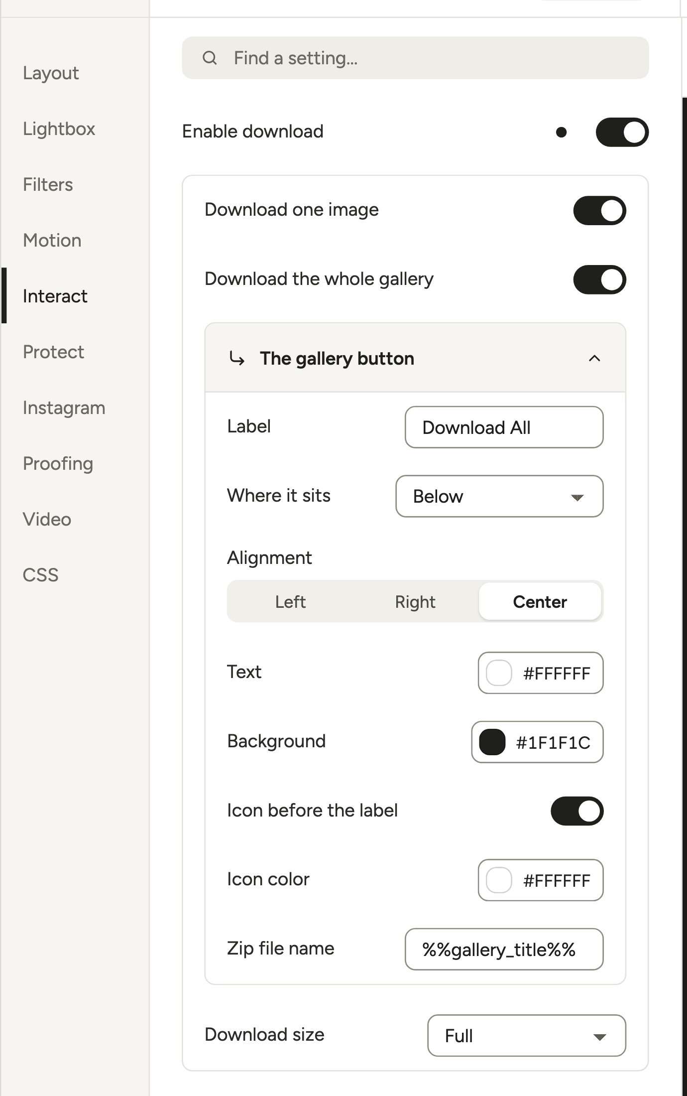
Picture a wedding photographer sharing 300 photos with a couple. The grid loads light copies, the lightbox opens the full-size file, and the download button hands over the original. More in the downloadable gallery guide, the download docs and what a lightbox is.
Make the files lighter
Lazy loading is free and on by default. Speed Up (Trio plan and up) adds site-wide compression in Settings → Performance: Off, Lossless, Lossy or Glossy.
Each gallery can override it with Thumbnail compression, Lightbox compression and Modern image files. Lightbox compression is the fix when the full-size lightbox file feels heavy.

The Speed Up docs and our guide to faster gallery loading cover the rest. Get the upload right once, about 2,560 px on the long edge, and WordPress, the browser and your gallery handle everything after that.
Frequently asked questions
For photos, upload 2,000–2,560 px on the long edge. That covers high-density screens in almost any layout, and WordPress scales anything bigger down to 2,560 px anyway. Use 1,200 × 630 px for a featured image that gets shared, and SVG for a logo.
WordPress has six: Thumbnail (150 × 150, cropped), Medium (fits in 300 × 300), medium_large (768 wide), Large (fits in 1024 × 1024), plus 1536 and 2048 copies for high-density screens. Full is your upload, or its 2,560 px scaled copy. Changes in Settings → Media only apply to new uploads, so regenerate older images.
Yes. WordPress makes smaller copies of every upload. If either side is over 2,560 px, it also makes a copy with “-scaled” in the file name and uses it as the Full size, while your original stays on the server. It never makes a copy bigger than your photo.
You don’t have to: WordPress scales anything over 2,560 px down by itself. Exporting at about 2,560 px still saves storage and upload time, and core WordPress never shows visitors a file bigger than the scaled copy. Keep the camera file if clients will download or print it.
At least 1,200 px wide, and 1,200 × 630 px if it gets shared. Facebook asks for at least 1200 × 630, and Google Discover wants images at least 1,200 px wide. WordPress has no featured image size setting of its own, so your theme decides the crop.
Usually the original is smaller than the spot it fills, and WordPress won’t make a copy bigger than your photo. Upload at least twice the display width for sharp 2× screens. Next, check for copies missing after an import or a size change, and for a plugin stripping srcset.
The upload limit comes from your server’s PHP settings, and the upload screen shows it as “Maximum upload file size”. The 2,560 px mark isn’t a limit. It’s the point where WordPress makes a scaled copy and keeps your original, and developers can move it with the big_image_size_threshold filter.
Leave Image file size on Medium, the default. Modula adds a srcset that goes up to the full-size file, so sharp screens and wide tiles still get bigger copies. Pick Full for animated GIFs, because WordPress’s resized GIF copies don’t move, and Custom when you need an exact crop.