Modula has 6 gallery types:
- Custom Grid
- Creative Gallery
- Masonry
- BnB
- Slider. You can read more about Modula Slider here.
- Video. You can read more about Modula Video here.
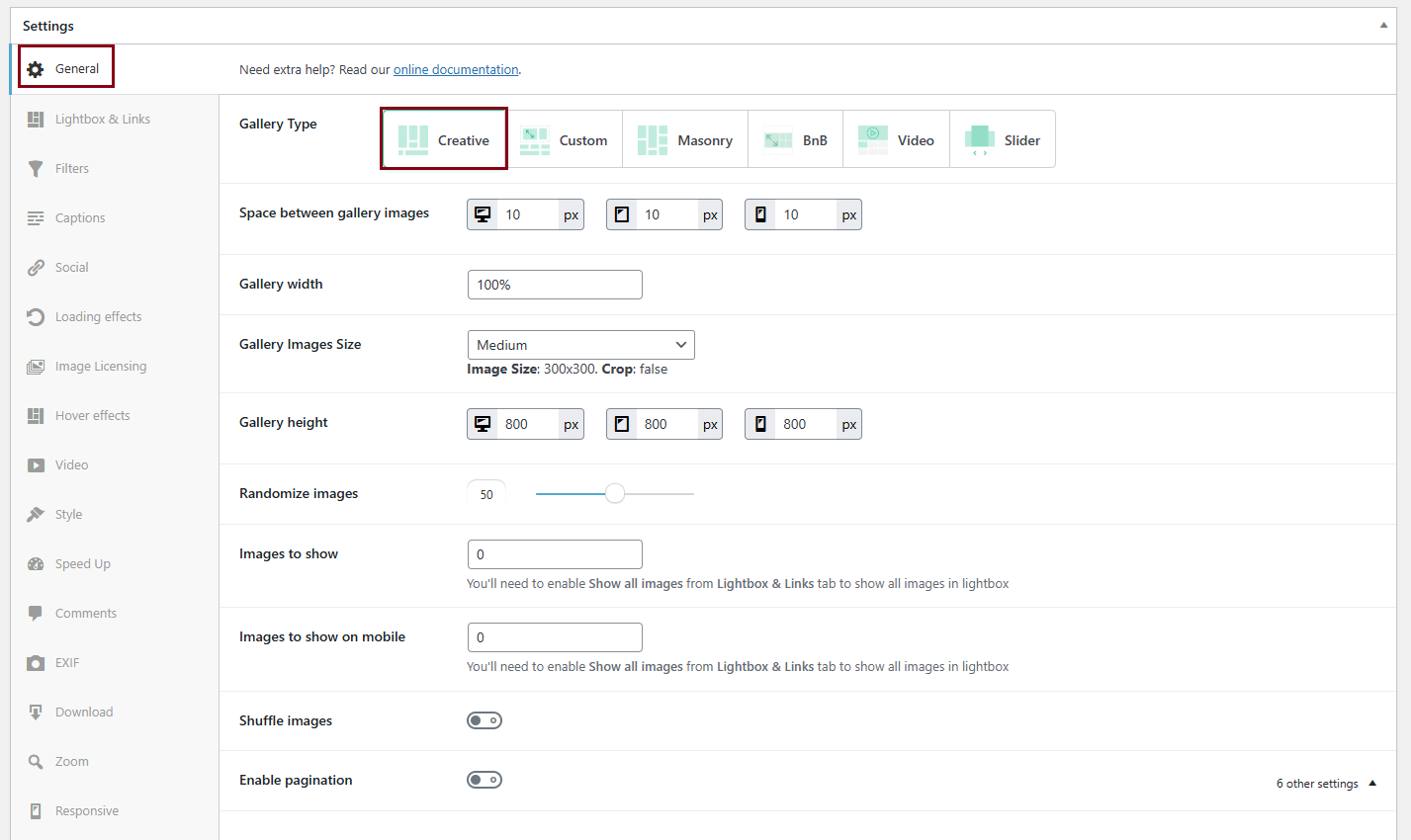
Creative Gallery
Modula’s creative gallery uses an intelligent algorithm that organizes and resizes thumbnails to occupy the available gallery space in the most advantageous way. In a way, you could say that our Creative Gallery algorithm has a “brain of its own”.
You can’t control the image sizes, shapes, or their arrangement in the grid. However, you can control the gallery’s height as well as the image thumbnail size so you can fine-tune to get super sharp and crisp-looking images.
The end result is a surprisingly great-looking gallery. Turn up the random factor to 100 as well as toggle “shuffle images” to ON for a maximum creative effect. On every page refresh, you’ll get a different-looking gallery.
See a live demo here.
-
Space between gallery images
Use this slider to adjust the spacing between images in your gallery. -
Gallery width
Can be in % or pixels. We recommend having it at 100%. Please note: if your theme doesn’t support full-width templates, setting this value to 100% will not force stretch your gallery beyond the theme’s container’s size. In simpler terms – make sure you can set the container width to 100% before trying to create a full-width gallery. -
Gallery Height
Set the height of the gallery in pixels. If the gallery thumbnails are too small increase the value here. We recommend at least 1200 px.
-
Gallery Images Size
The image size setting sets the minimum width/height of your images in pixels. We generally recommend setting this to a level of around 500 for the Creative Gallery for the best results. Setting the minimum image size to lower dimensions may reduce image quality.
When a gallery is set to creative gallery this option will as it suggests, define the smallest possible size that an image will be displayed at. For a landscape image, this means that when the image size is set to 500 px, the image will be 500 px wide. For a portrait image, this means that when the image size is set to 500 px the image will be 500 px tall. -
Randomize images
Toggle this to 0 to tune down the randomizing factor on Modula’s grid algorithm. -
Images to show
Using the images to show setting you can limit the number of images that you would like your gallery to display. If you want your gallery to display all of your images, then set this to 0. If set to ‘3’, for example, that will be the number of images displayed in the gallery. -
Shuffle images
Toggle this to ON to have the gallery shuffle on each page load.
Custom Grid
Modula’s custom grid gallery type allows users to freely resize images within your gallery’s container, controlling their heights, widths, and aspect ratio. You can create masonry layouts or columns and rows depending on your needs. See a live demo here.
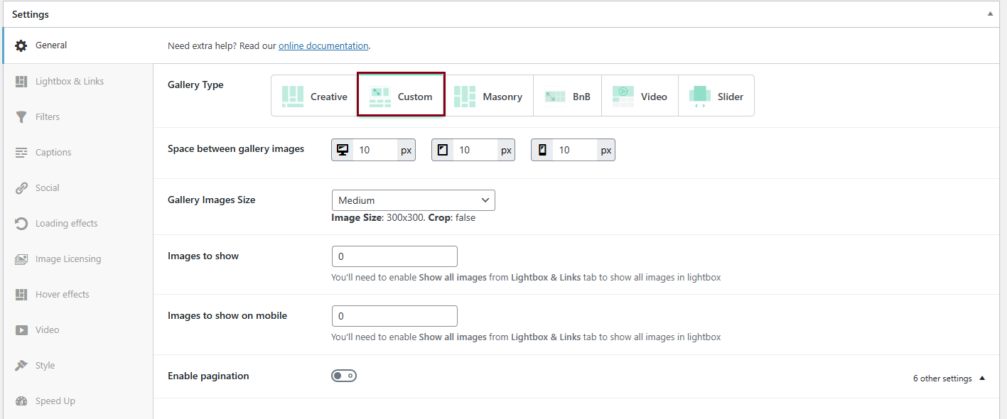
Settings you can find for this type of gallery:
-
Space between gallery images
Use this slider to adjust the spacing of images in your gallery. -
Gallery Images Size
Set the minimum width or height of the images in pixels. The recommended size for Custom Grid is 150.
When a gallery is set to custom grid, images added to your new gallery will (by default) occupy a 2 x 2 square which can be observed when the helper grid is enabled. In this case, the image size setting allows you to choose how big one individual square from the custom grid should be. For example, if you were to set the image size to 300 px and resize images in the custom grid to be as large as 4 x 4 squares, the image will be of size 1200 x 1200 px in size. -
Images to show
Using the images to show setting you can limit the number of images that you would like your gallery to display. If you want your gallery to display all of your images, then set this to 0. If set to ‘3’, for example, that will be the number of images displayed in the gallery. -
Images to show on mobile
You can limit the number of images that you would like your gallery to display on mobile phones.
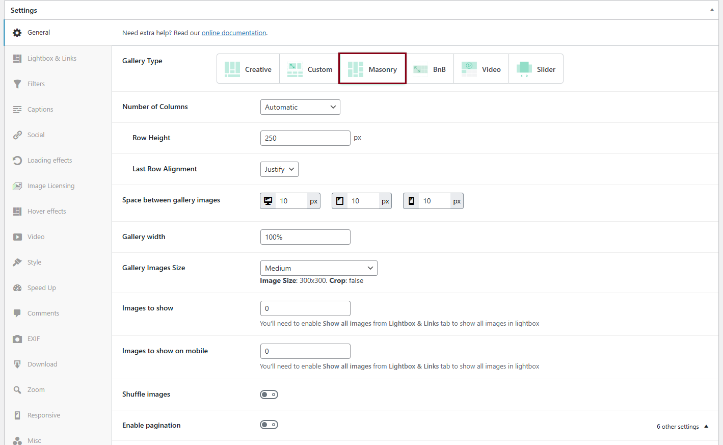
Masonry
-
Number of Columns
Select the grid type. You can choose between:
-> Automatic– will fully fill each row.-> 1 column
-> 2 columns
-> 3 columns
-> 4 columns
-> 5 columns
-> 6 columns.
-
Row Height
Set the height for each row (in pixels) – you can set this up only when you have Automatic as your column type -
Last Row Alignment
Useful when you have an odd number of images and the last row will have fewer images. You can set this up only when you have Automatic as your column type.
It can be:
-> Left-> Center
-> Right
-> Justify. By selecting justify, the last row of pictures will automatically be resized to be full width.
-
Space between gallery images
Use this slider to adjust the spacing of images in your gallery. You can add a different gutter for desktop, mobile, and tablet. -
Gallery width
Width of the gallery. Can be in % or pixels. -
Gallery Images Size
Select the size of your images. There are various options and you can also choose ‘Custom’ and enter the preferred image dimensions using ‘Width x Height‘.
-> Thumbnail– Image Size: 150×150. Crop: true-> Medium– Image Size: 300×300. Crop: false
-> Large– Image Size: 1024×1024. Crop: false
-> Custom– Add your own image size (Width & Height in pixels)
-> Full– uses the full image
-
Crop Images
If you enable this setting the images will be cropped to have the exact size defined in ‘Image dimensions‘. -
Images to show
Use 0 to show all images. -
Images to show on mobile
Use 0 to show all images on mobile. -
Shuffle images
Use this option to shuffle images on each page load.
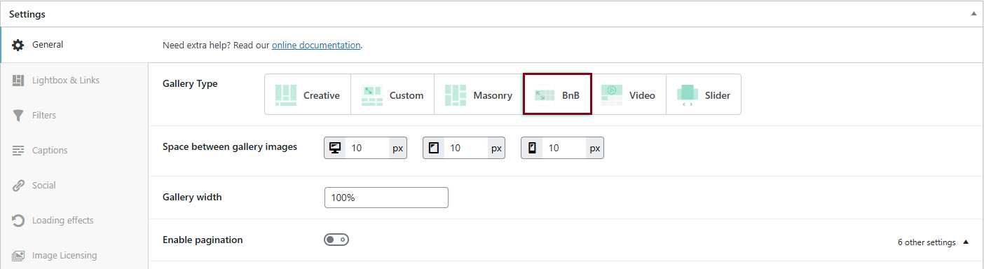
BnB
We’ve introduced a new gallery type called “BnB” which makes creating Airbnb-style galleries even easier. If you’re looking for a quick and effortless way to achieve this look, the “BnB” gallery is your go-to option.
-
Space between gallery images
Use this slider to adjust the spacing of images in your gallery. You can add a different gutter for desktop, mobile, and tablet. -
Gallery Width
Change the width of your gallery. It can be in percentages or pixels.