Modula empowers you to customize the number of columns for your images on both desktop and mobile or tablet devices. This guide will walk you through the simple steps to achieve this responsive layout customization.
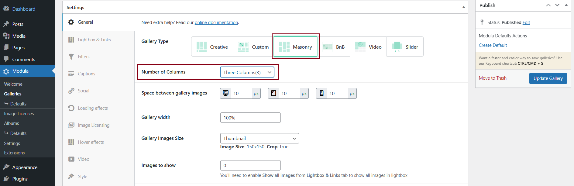
Setting the Number of Columns for Desktop
-> Access your WordPress dashboard > Modula > Galleries > Edit your gallery > General Settings > Gallery Type > Select either “Custom Grid” or “Masonry.”
Note: The feature to set the number of columns for mobile/tablet is available only for these gallery types.
-> If you select “Masonry” set the desired number of columns for desktop, or create your own grid and columns with the “Custom Grid” gallery type.
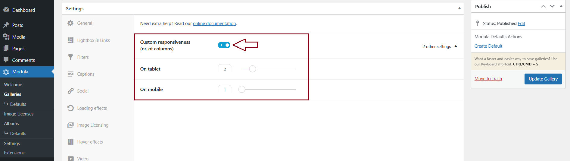
Configuring the Number of Columns for Mobile/Tablet
-> Scroll down to find the “Responsive” section > Turn ON the “Custom Responsiveness” option > Specify the number of columns you want for tablets and mobile devices.
With Modula’s responsive customization feature, you have the ability to display different numbers of columns on desktop and mobile/tablet devices, ensuring an optimal viewing experience for your audience.
If you require more information about our Responsive feature, you can explore additional details in our documentation article: Optimize galleries for mobile and tablet devices.