
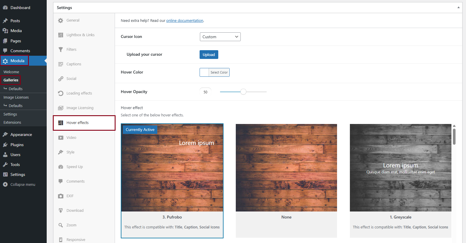
As you navigate to Modula Settings > Hover Effects, you’ll find a dynamic settings panel. This is where you can choose your gallery’s hover effect, which is essentially the animation or image behavior that users will experience when they hover their mouse over an image (without clicking).
The beauty of this process is that you can see the effect in action immediately.
For example, when you select the Seemo hover effect, you can instantly see its impact on the image below.
When accessing galleries on mobile devices, please note that the hover effects will not be visible. This is due to the fact that hover actions are not applicable to touchscreen devices. Touchscreen devices lack a mouse, and there is no method to hover without clicking.
Cursor icon
Select the cursor you want to have on hover. You can choose between:
- Pointer
- Magnifying glass
- Loading
- Cell
- Crosshair
- Resize 1
- Resize 2
- Custom (you can upload your own icon).
Hover effect
Choose your preferred effect. There are over 40 options, and they are compatible with certain elements: Title, Description, and Social icons.
Hover color
Select the background color on hover.
Hover Opacity
With this option, you can decrease/increase the opacity.