If your photo galleries have a lot of images, it’s helpful to let visitors sort through them easily. With Modula, you can do this effortlessly using the built-in filter feature. At the end of this article, you’ll find settings options and demos to guide you through each one.
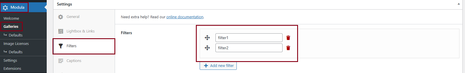
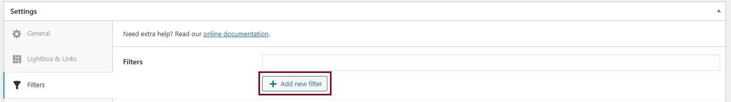
To create filters simply use the edit area above and click add new filters as required until you’ve added all of the filters that you wish to use for this gallery.
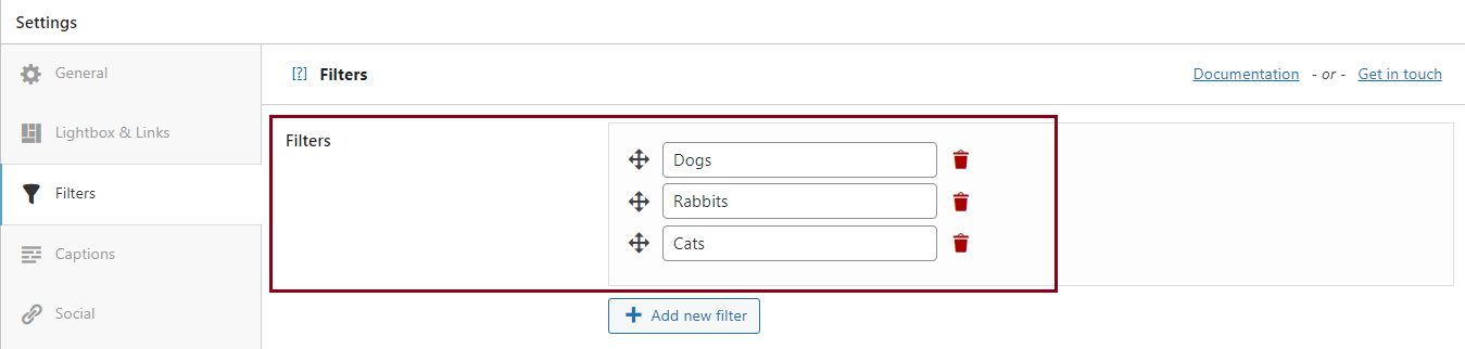
Let’s use ‘dogs’, ‘rabbits’, and ‘cats’ as an example of three filters. Now, as you can see above, we’ve already created the filters, but we haven’t assigned any images to them so they’ll still appear empty at the moment.
How to assign filters to individual images
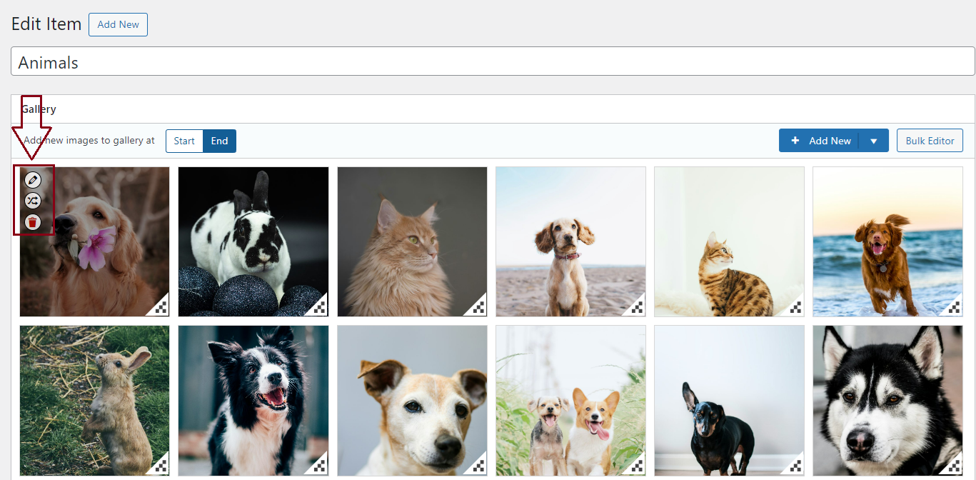
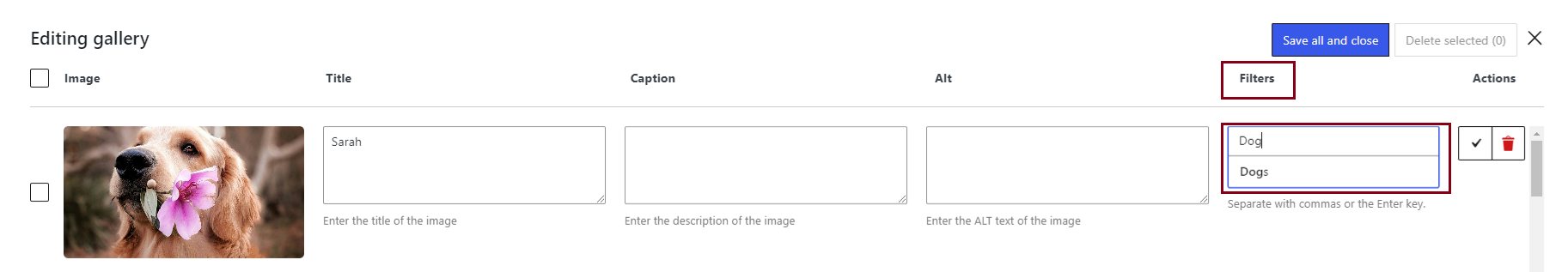
To assign a filter to an image all you need to do is click the edit icon to the left of the image delete button and then scroll all the way down to the Filters section.
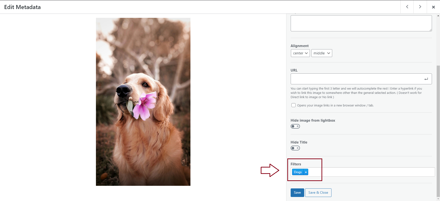
You can add as many filters or no filters to an image. If you do not add a filter to an image then it will only appear in the ‘All’ filter on your website’s front-end view of your Modula gallery.
As you can see, now when we click ‘Dogs’ on the front end of our website, Modula will only display the images that have been assigned with that filter respectively.
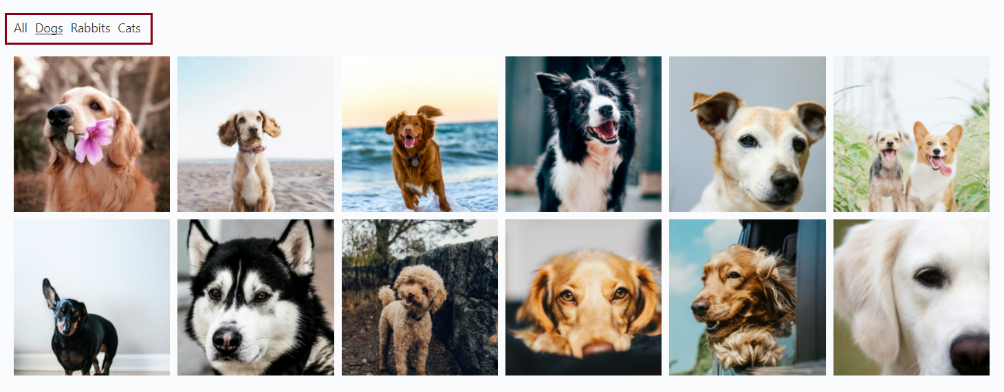
You can control the default filter applied to your gallery on the initial load with the help of a parameter, for example: [modula id=”your-gallery-id” default_active_filter=”Dogs”].
How to add filters to multiple images (using the bulk edit option)
You may find Modula’s bulk editor option easier when you’re trying to add filters to a large number of images at the same time – here’s how!
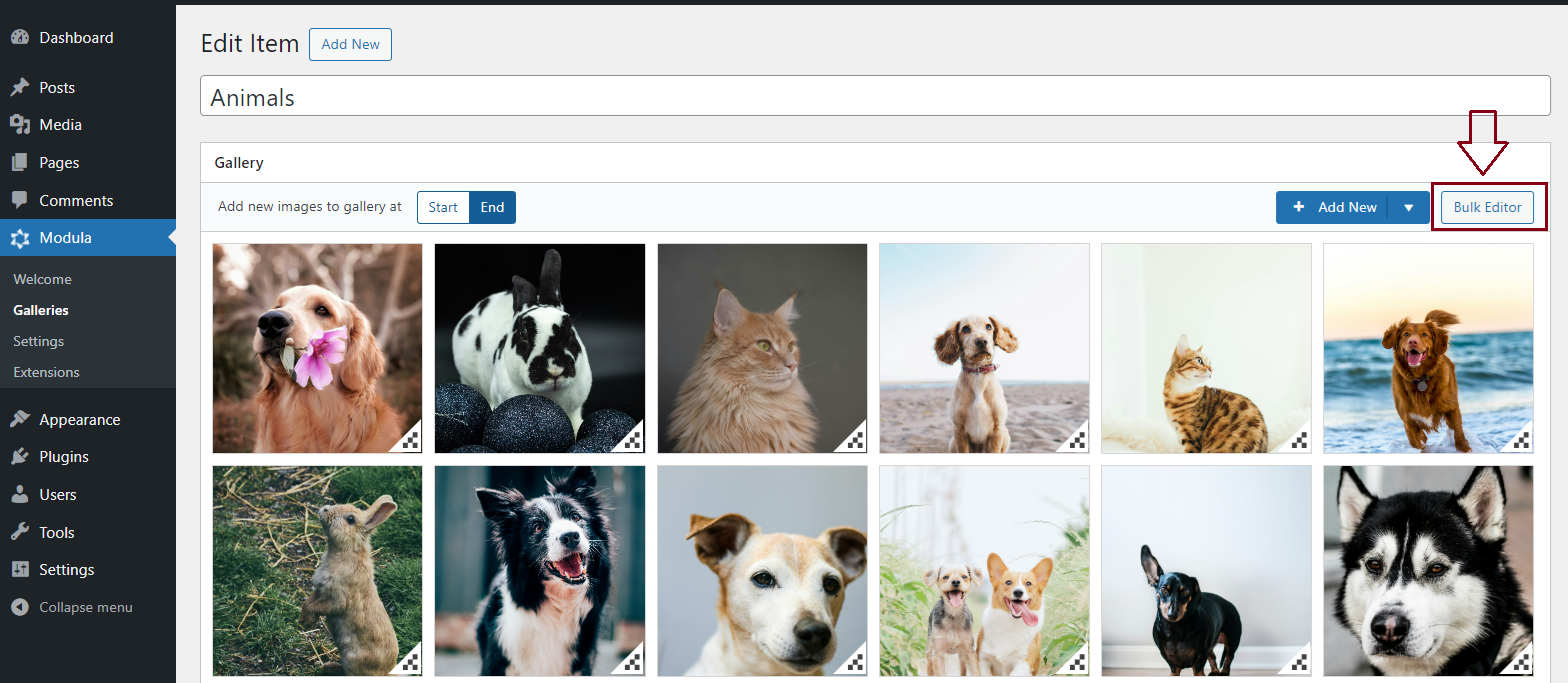
When you click the Bulk Editor button, you’ll be taken to the screen shown below:
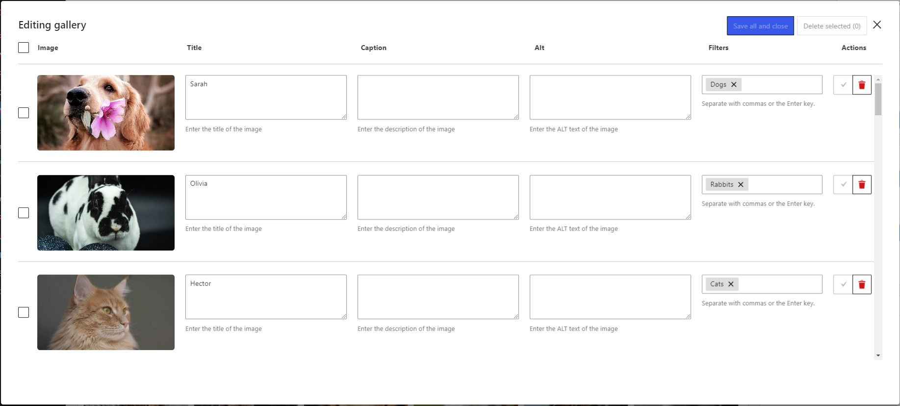
Here you can easily go to the Filters section of each image and start entering the filter’s name.
Last but not least do not forget to click on ‘Save all and close’ so the changes are saved!
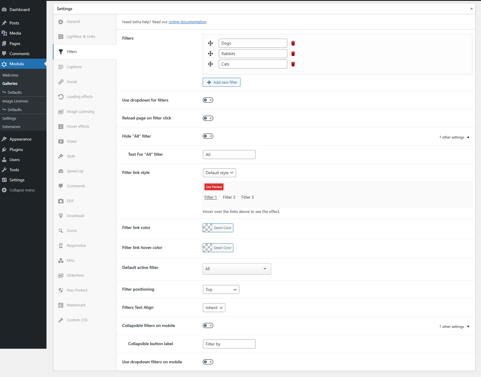
Filters Settings
-
If turned on it will display filters on the page as a drop-down menu.
-
When turned on it will reload the page on each filter click.
-
Turn this on to hide the ‘All’ filter that displays before your first filter. The ‘All’ filter displays all images.
-
Enter here the text you want to replace ‘All’ with.
-
Filter link style
Over 20 filter styles to replace the default one. You can hover over the live preview to see the new style in action. The filter styles are:
-> Antonio
-> Ariel
-> Caliban
-> Ceres
-> Cordelia
-> Ferdinand
-> Francisco
-> Horatio
-> Invulner
-> Iris
-> Juno
-> Luce
-> Maria
-> Miranda
-> Prospero
-> Sebastian
-> Shylock
-> Stephano
-> Tantalid
-> Trinculo
-> Valentine
-> Viola -
Change the color of the filter text/link
-
The color the filter has on hover
-
This is the filter that will be active when the gallery is loaded on the page. It’s by default set to ‘All’ so visitors can see all images. It can be switched to another filter and then the gallery will load filtered by the select option.
Keep in mind that it should not contain “,” , “.” -
Filter positioning
From here you select the position of your filters. They can be:
-> Left
-> Top
-> Bottom
-> Right
-> Top and bottom
-> Left and right -
Filters Text Align
The alignment of the filter text. It can be:
Inherit will retrieve alignment from the theme.
-
If turned on will collapse filters (works only on mobile). You can also change the collapsible action text from the default one: filter by.
-
Use dropdown filters on mobile
Check to enable Dropdown Filters on mobile only.