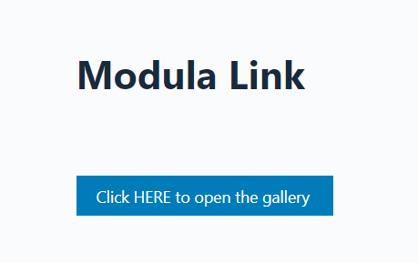
Using Modula Link you will be able to create buttons or links for your galleries. You can use the shortcode or the Gutenberg Modula Link block to directly open a gallery in Lightbox view by clicking on it.
The button is also fully customizable – with various control types ranging from font size to button size.
Modula Link Block
-
Go to your dashboard > edit the page where you want to add it to > and click on the ‘+’ sign to add a block > search for Modula Link > and select your gallery.

-
Add the text for the button.
After you add the text you can go ahead and customize it. Below are the settings available.
-
Preset size: the size of the text inside the button. It can be:
-> Small
-> Medium
-> Big
-> Default (16px)
-> Custom – you can enter the size in pixels. -
Button size: the size of the button. You can select from:
-> Small
-> Medium
-> Large
-> Extra large -
Button text color: choose the text color by entering the color’s value in hexadecimal or using the color picker. If you want to add the color’s value in RGB or HSL, click the arrow next to the fields.
-
Background color: choose the color for the button’s background. You can enter the color’s value in hexadecimal or use the color picker. If you want to add the color’s value in RGB or HSL, click the arrow next to the fields.
-
Hover text color: enter the text’s color, which is shown only on hover.
-
Hover background color: choose the background color for the hover – when a visitor hovers over the button, it will change to the one entered here.
-
Border type: select the type of border the button will have. Options are:
-> Solid
-> Double
-> Ridged
-> Dotted -
Border width: use the slider to choose a border width or enter it manually in the field (pixels).
-
Border color: choose the color for the button’s border. You can enter the color’s value in hexadecimal or use the color picker. If you want to add the color’s value in RGB or HSL, click the arrow next to the fields.
-
Border radius: use the slider to choose a border radius or enter it manually in the field (pixels).
Modula Link Shortcode
-
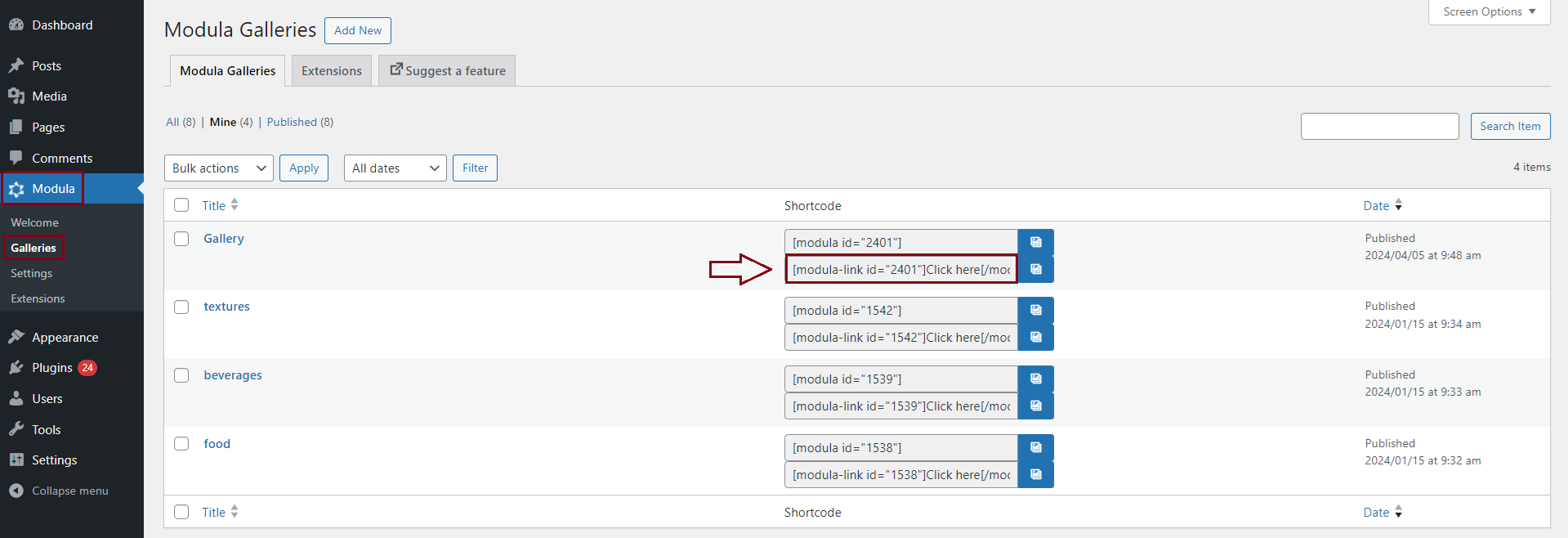
Go to your dashboard > Modula > Galleries > and copy the link shortcode.
-
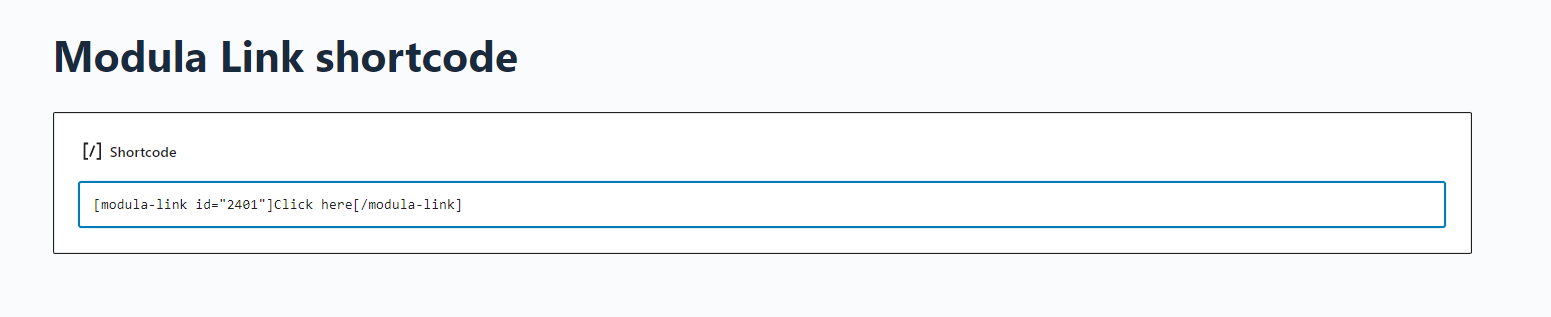
Go to Pages > edit the page where you want to add it to > and click on the ‘+’ sign to add a block > search for the shortcode block > and paste the shortcode there.
Click on an image to open the lightbox
Usually, this shortcode acts as a button to open a lightbox, but you can add a <img> tag inside the shortcode to display an image, and then when you click on it it will open the lightbox.
For example: [modula-link id="GALLERY_ID_HERE"]<img src="IMAGE_URL_HERE">[/modula-link]
For a more detailed tutorial on how to make an image to open the lightbox when you click on it, go to our dedicated knowledge base article.