With Modula Slider, you will enable a new gallery type that will allow you to display your gallery images in a slider format.
The slider gallery provides a lot of configuration options in order to ensure you can achieve the best output for your scenario. The first set of configuration options will allow you to control the size of the slider and images.
Click here to see a demo with Modula Slider. Each image from the slider can be opened in the lightbox if you choose to.
How can the extension be installed?
Please follow the instructions from our article on how to install extensions on your site.
Settings explained
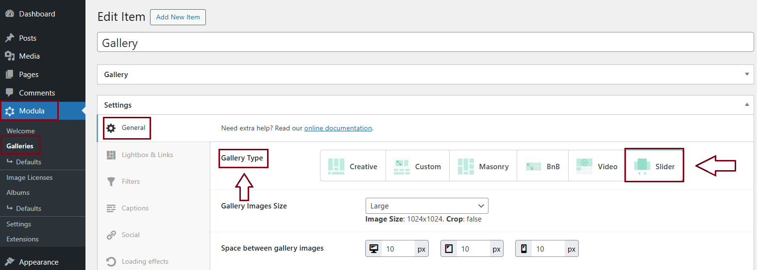
You will see the Slider options when you go to your WordPress dashboard > Modula > Galleries > Edit a gallery > Gallery type > ‘Slider‘.
Below you can find each feature/option Modula Slider has, including a demo for each one. Just click on the feature’s name and it will take you to a demo page. Each feature is linked to a demo page.
-
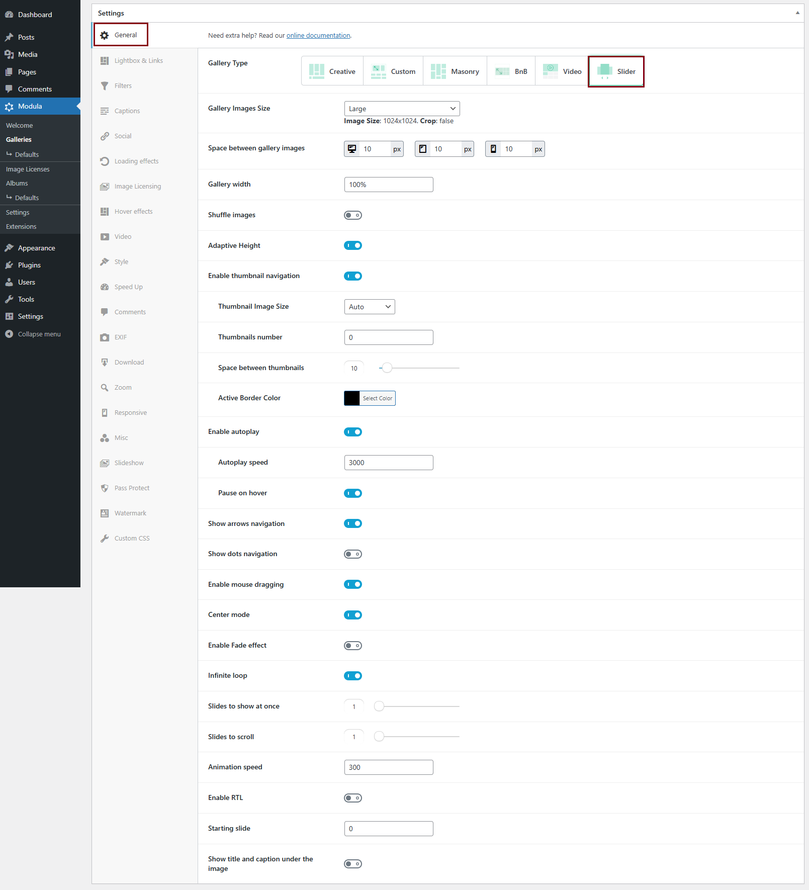
Gallery Images size
Select the image sizes for the slider from a selection of options. Select Custom if you want to enter the sizes yourself. The options are:
~ Thumbnail – Image Size: 150×150. Crop: true
~ Medium – Image Size: 300×300. Crop: false
~ Large – Image Size: 1024×1024. Crop: false
~ Full – Uses the full image
~ Custom – Add your own image size (Width & Height in pixels) > Image dimensions – adjust the width and height according to your needs. ‘Image dimensions’ appear only when you select ‘Custom’ as your image size. You can also enable Crop Images which will force images to match the sizes defined in Image Dimensions. If disabled, images will be resized to maintain their aspect ratio. -
Use this slider to adjust the spacing of images in your slider.
-
This controls the overall size of the slider. Even if set to 100% please keep in mind that the slider will take the full width of the container it’s in. If your page is full-width, then the slider will also be full-width.
The width can be in percentages, pixels, or “Auto” for slider dimensions. If it is set to Auto, it will snap the navigation arrows to the dimensions of your images.
-
Shuffle images
Toggle this to ON so that your gallery shuffles with each page load.
-
Only available for single-slide horizontal carousels, this will allow the height of the slides to be conditioned by the original image.
-
Enable thumbnail navigation
Toggling this will enable thumbnail navigation for the slider. It works only for single slides. It will also activate settings specific to thumbnail navigation:
-> Thumbnail Image size: select the image sizes for the thumbnail navigator from a selection of options. Select Custom if you want to enter the sizes yourself. Options are:
~ Auto
~Thumbnail
~ Medium
~ Large
~ Full
~ Custom – Add your own image size.-> Thumbnails number: define the number of thumbnails shown in the navigator. If it is set to ‘0’, it will display all of your thumbnails.
-> Space between thumbnails: define the distance you want between each thumbnail in your navigator.
-> Active border color: select the border color for the active thumbnail navigator slide -
Enable autoplay
It enables Autoplay for the slider.
-> Autoplay speed: the time each slide will be displayed before moving to a different one;
-> Pause on hover: this will stop the automatic switching of the displayed slide if the user hovers over the image. -
This will enable the arrow navigation functionality for your slider.
-
This will enable a second, dotted navigation under the slides.
-
This is the third navigation option available, you only need to drag the images to switch the displayed slide.
-
This will display a small preview of the next and previous images. This option will only work if the ‘Fade’ option is disabled.
Enabling this will also enable ‘Center Padding‘ which you can use to add a side padding when in center mode (px or %) – it will show more or less of the next and previous images. -
If enabled, this will change the animation for changing slides to a fade effect. This option will only work if the number of slides to show is 1 and thumbnail navigation is on.
-
Once enabled, when the last slide is shown to the user, the slider will start over automatically, otherwise, the slider will stop on the last slide.
-
You can control the number of slides that will be displayed at the same time in the slider.
-
When changing the displayed slide, this option will allow you to skip over a fixed number of slides.
-
The speed of your configured animation.
-
If you have an RTL template, this option will align the slider functionality with your overall orientation.
-
here you can control the image your slider will start with. Simply enter the number of the image in the gallery. For example, if you want to start the slider with the 3rd image from your gallery enter the number 3.
-
Show title and caption under the image
Display the image title and the caption under the image.