The Modula Image Gallery plugin makes it easy to optimize your galleries for mobile and tablet devices, ensuring a smooth and visually appealing experience on all screen sizes. This guide will walk you through how to access and use the responsive settings for your Modula galleries.
Configure Responsive Gallery Settings
To make sure your galleries look great on mobile and tablet devices, just follow these simple steps:
-
Access Modula Gallery Settings
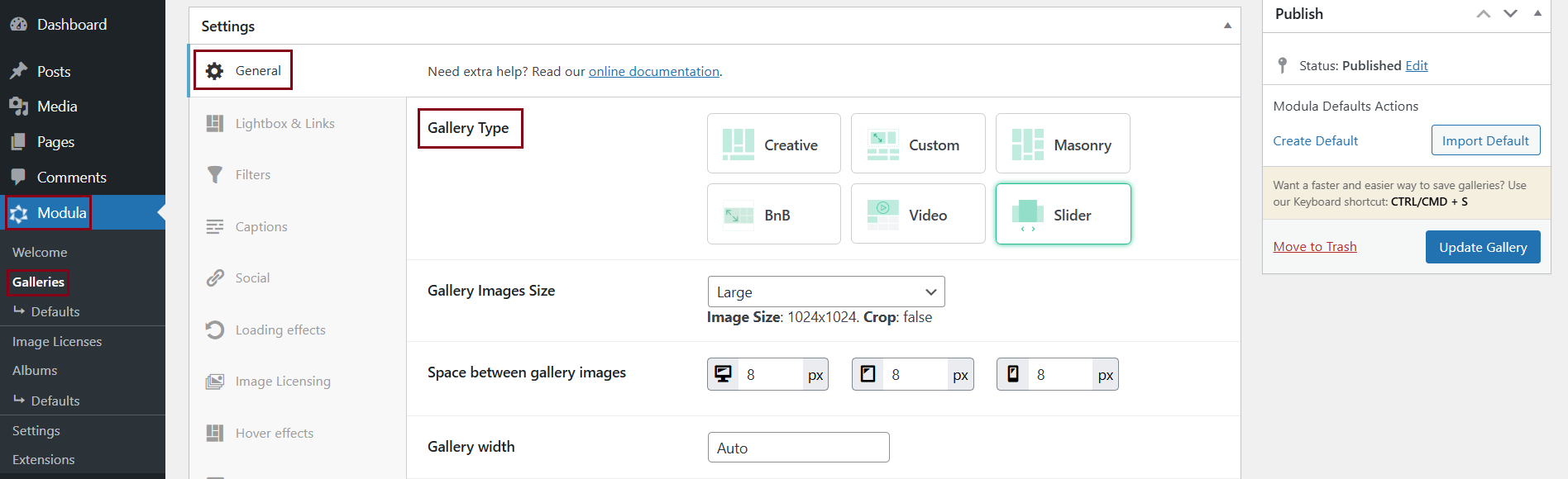
Go to your WordPress dashboard > Modula > Galleries > Edit your gallery > Settings. In the General tab, you will find settings for the type of gallery you want.
Please keep in mind that the Creative Gallery is responsive by default.
-
Choose the gallery type
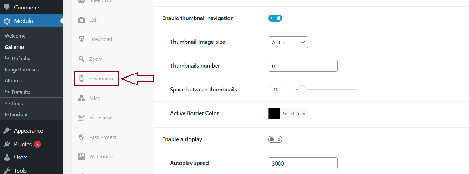
For other gallery types (Custom Grid, Masonry, or Slider), access the separate Responsive tab on the left side of the Settings menu.
The Responsive tab only displays when you select one of these gallery types.
-
Click on the Responsive Settings Tab
Access the Responsive settings tab to customize the responsiveness of your gallery.
-
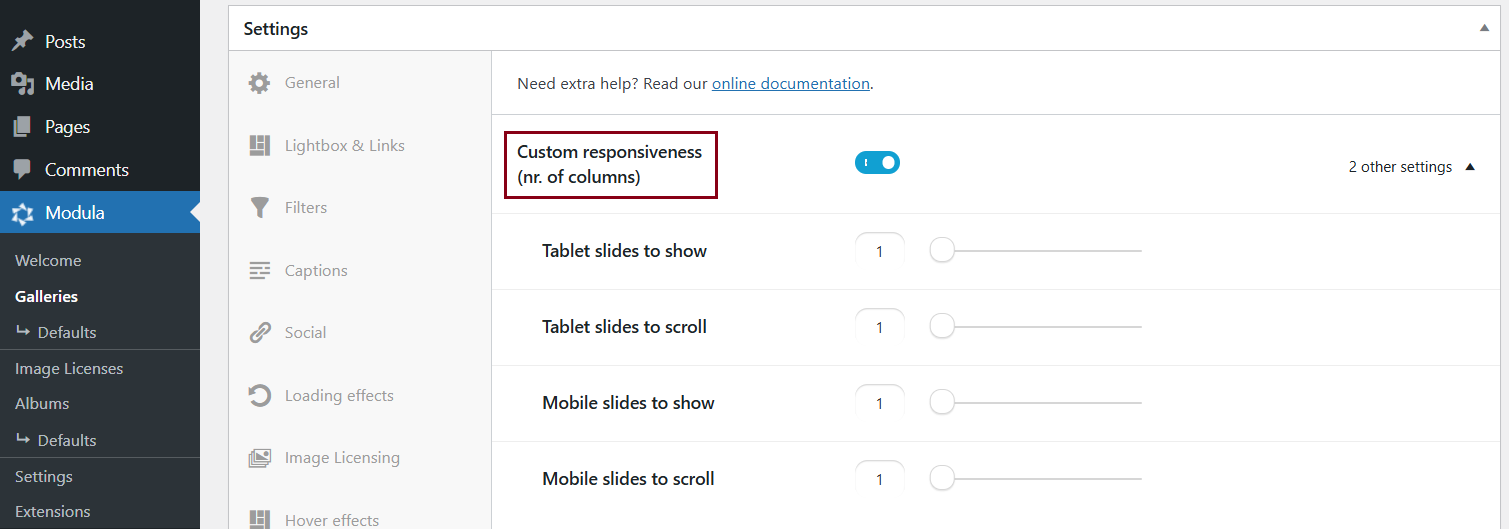
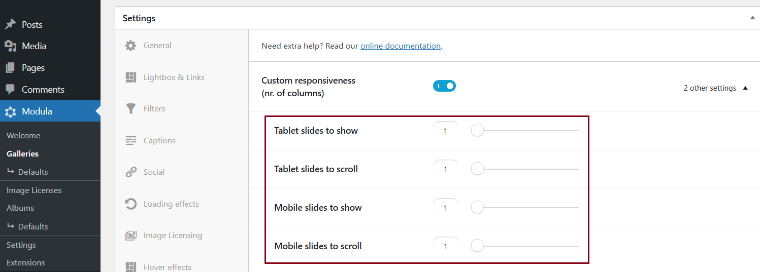
Enable Custom Responsiveness
Toggle the Custom Responsiveness option .
-
Adjust Columns for Tablet and Mobile Devices
Use the sliders provided to adjust the number of columns your gallery will have on tablet and mobile devices.
-
Save Changes
Ensure to save your changes after customizing the responsiveness settings.
This feature lets you control how your galleries look across different devices, ensuring a consistent and appealing experience on desktop, tablet, and mobile.
By following this guide, you can easily adjust the responsive settings for your Modula galleries, making sure they look stunning on all screen sizes.