Modula Albums is an extension that helps you display multiple galleries on a page and organize them into albums.
Let’s say that we have more galleries and we’d like to display one next to the other on the same page. When a visitor to the website wants to see the whole album, they can just click on the “cover” image. Then all the pictures will be displayed in a Lightbox with the settings you selected.
Where can I buy the extension?
The prices and packages that Modula – Albums come with can be found here, starting with the “Trio” package. In order to meet all our client’s expectations, we offer the option to get a full refund within 14 days of purchasing the extension, should anyone not be satisfied with its options.
How can the extension be installed?
Please follow the instructions from our article on how to install extensions on your site.
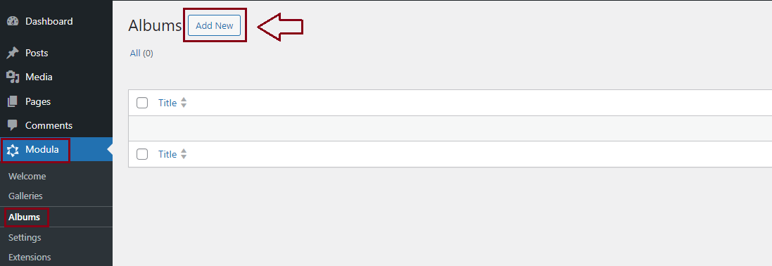
How to add an album
-
First, you need to make sure you have created galleries. Please follow the steps here on how to create galleries.
-
Go to your WordPress dashboard > Modula > Albums > Add new.
-
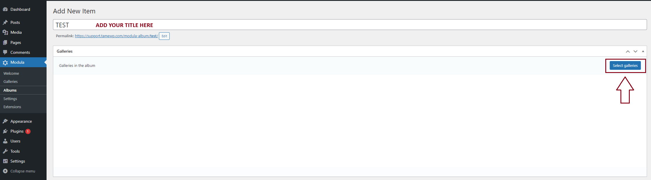
Add a title and click on the ‘Select Galleries‘ button. There you will see the galleries that you created with the Modula plugin.
-
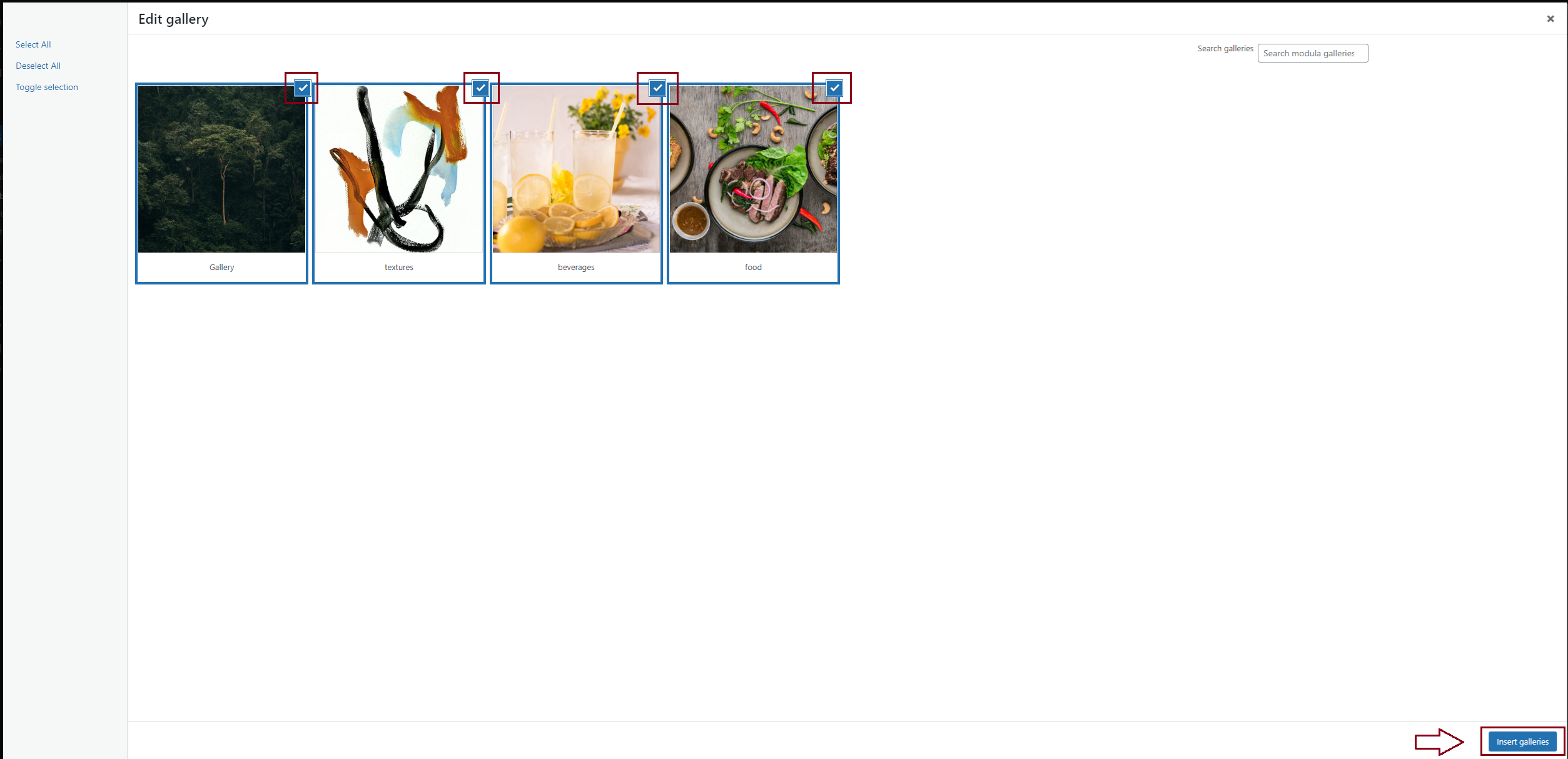
Select which galleries you want to display in your album and then click on the ‘Insert Galleries‘ button.
-
To add the album to a page, you need to go to your WordPress dashboard > Pages > Add New.
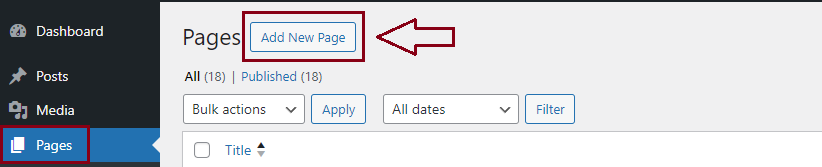
-
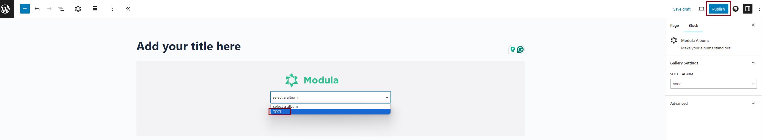
You will see a space where you can add a title and also a ‘+‘ icon to add a block. Click on the icon and choose from the list ‘Modula Albums‘.
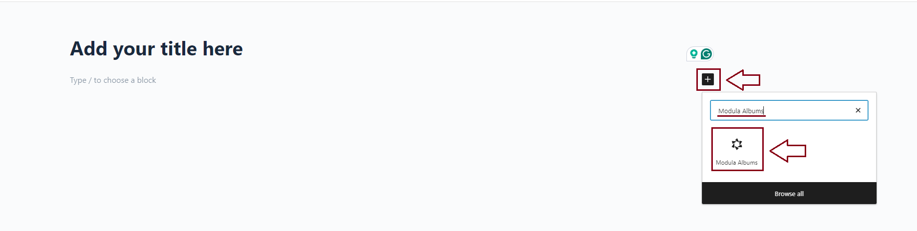
-
Select an album from the list and click on ‘Publish‘
General Settings
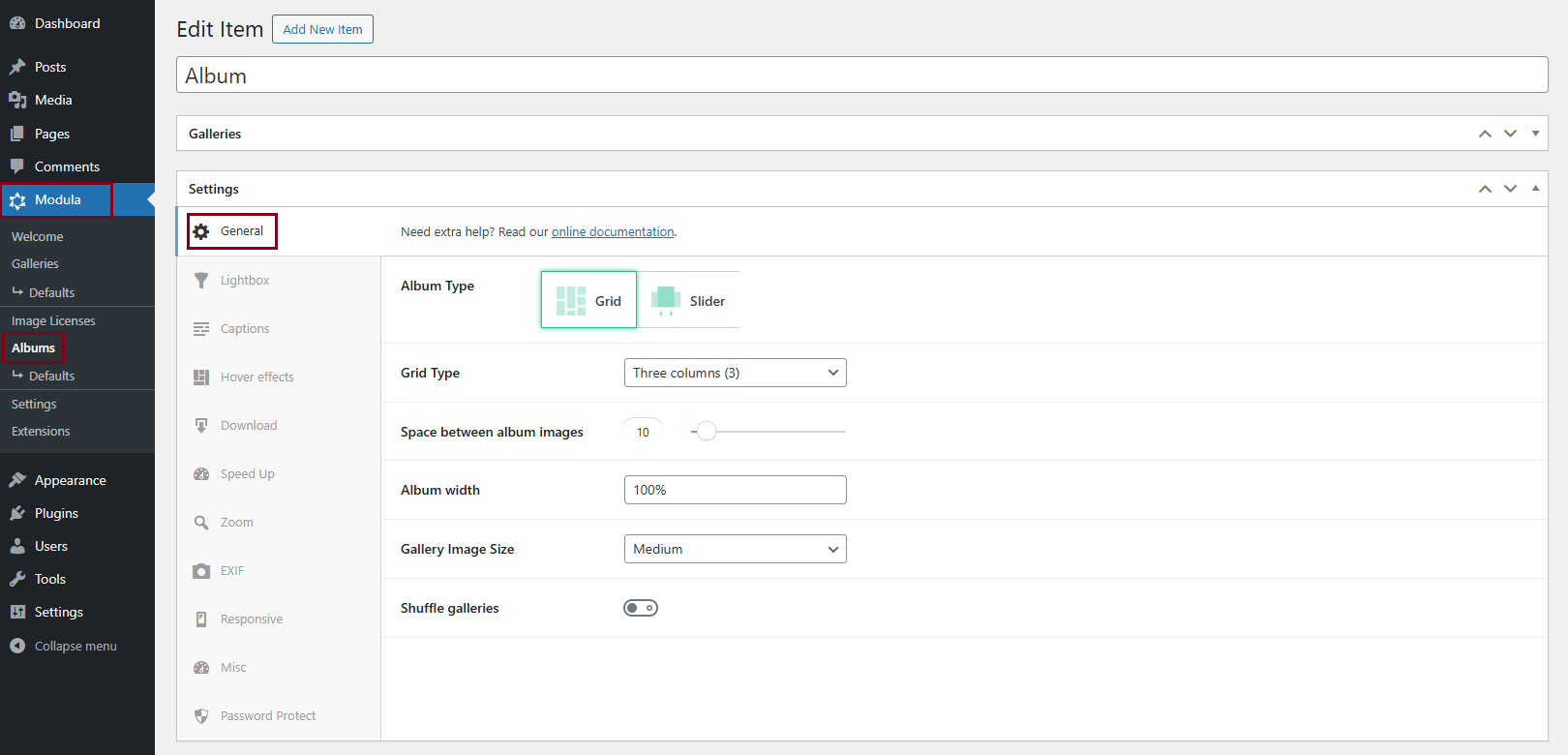
From the General Settings panel, you can choose the grid type for your albums, the width the grid will occupy on the page, and the image size used for the albums’ featured image/cover.
-
Grid Type
Can be set up in a certain number of columns automatically or users can use the Custom Grid option to design the grid themselves. To learn more about columns and custom grids and see demos please click here. Your album grid type can be:
-> One column
-> 2 Columns
-> 3 Columns
-> 4 Columns
-> 5 Columns
-> 6 Columns
-> Custom Grid -
Space between album images
Move the slider to adjust the spacing between the galleries in your album. Demo here with a gutter of 36px.
-
Gallery Image Size
You can choose from preset values or choose the Custom option to add the values yourself. Options are:
-> Thumbnail – Image Size: 150×150. Crop: true
-> Medium – Image Size: 300×300. Crop: false
-> Large – Image Size: 1024×1024. Crop: false
-> Full – uses the full image
-> Custom – Add your own image size (Width & Height in pixels) > Width x Height– you should adjust these dimensions based on the number of columns in your album. Appears only when you select ‘Custom’ as your image size. You can also enable Crop Images which will force images to match the sizes defined in Image Dimensions. If disabled, images will be resized to maintain their aspect ratio. -
Album width
It represents the width of the album. Can be set up in % or pixels. Click here to see a demo with a width of 100%.
-
Shuffle galleries
Turning this on will shuffle galleries around on each page load. Click here to see a demo – make sure to refresh the page to see it in action.
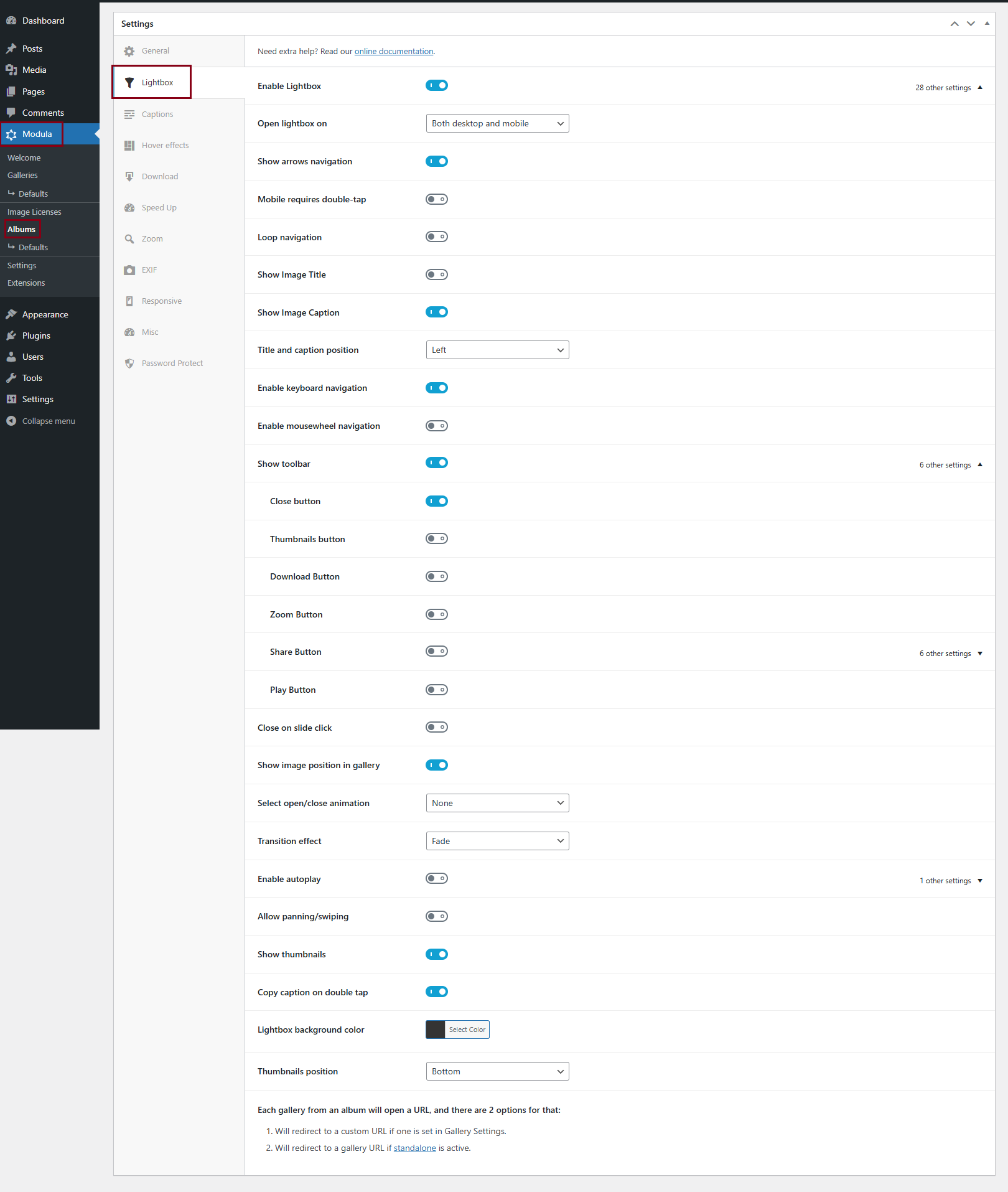
Lightbox Settings
If you choose to use a lightbox you can select between different open and close animation and transition effects, and set up their duration. You can also turn on/off the buttons displayed in the lightbox: fullscreen, download, as well as navigation arrows, and thumbnails.
-
It shows the name of the image below it, inside the lightbox.
-
It shows the image’s description under it, in the lightbox.
-
Select open/close animation
Apply different effects when you open/close the lightbox. Animation types are:
-> Fade
-> Zoom
-> Zoom-in-out
-> None -
Transition effect
Apply different effects when transitioning between images. Effects are:
-
If this is enabled the images will slide automatically one after the other in the lightbox. You can also choose how long each image stays on until it slides to the next one by increasing or decreasing the Time between slides.
-
If toggled on, the right side of the lightbox will display thumbnails with all the gallery’s images.
-
If turned on, in the lightbox (top right corner) you will have a download button to download images.
-
It offers you the possibility to share the gallery on the following social networks: LinkedIn, WhatsApp, Pinterest, Twitter, Facebook, E-mail.
-
If turned on, in Lightbox you will have a zoom-in button.
-
If toggled on, the right side of the lightbox will display a play button to start the slideshow.
-
This option allows you to navigate through images in lightbox mode using left and right arrows.
-
Mobile requires double-tap
Users must double-tap on mobile to interact with the lightbox.
-
Loop navigation
Allows continuous scrolling through images without stopping at the last one
-
Title and caption position
Choose to display the title and caption on the left, right, or center.
-
Enable keyboard navigation
Navigate images using the keyboard arrow keys.
-
Enable mousewheel navigation
Scroll through images using the mouse wheel.
-
Close on slide click
Clicking on the image closes the lightbox.
-
Show image position in gallery
Displays the current image number within the total gallery.
-
Allow panning/swiping
Enables touch gestures for swiping and panning images.
-
Copy caption on double tap
Double-tap to copy the image caption.
-
Lightbox background color
Select a custom background color for the lightbox
-
Thumbnails position
Choose to display thumbnails on the left, bottom, or right.
If you turn the lightbox OFF, each gallery from an album will open a URL, and there are 2 options for that:
- It will redirect the visitor to a custom URL if one is set in Gallery Settings.
For example here – clicking on any gallery will lead to google.com. To add links for each gallery go to your dashboard > Modula > Albums > edit the album in question > click on a featured image > scroll down to ‘Custom URL‘ > enter it there > save and repeat for all images.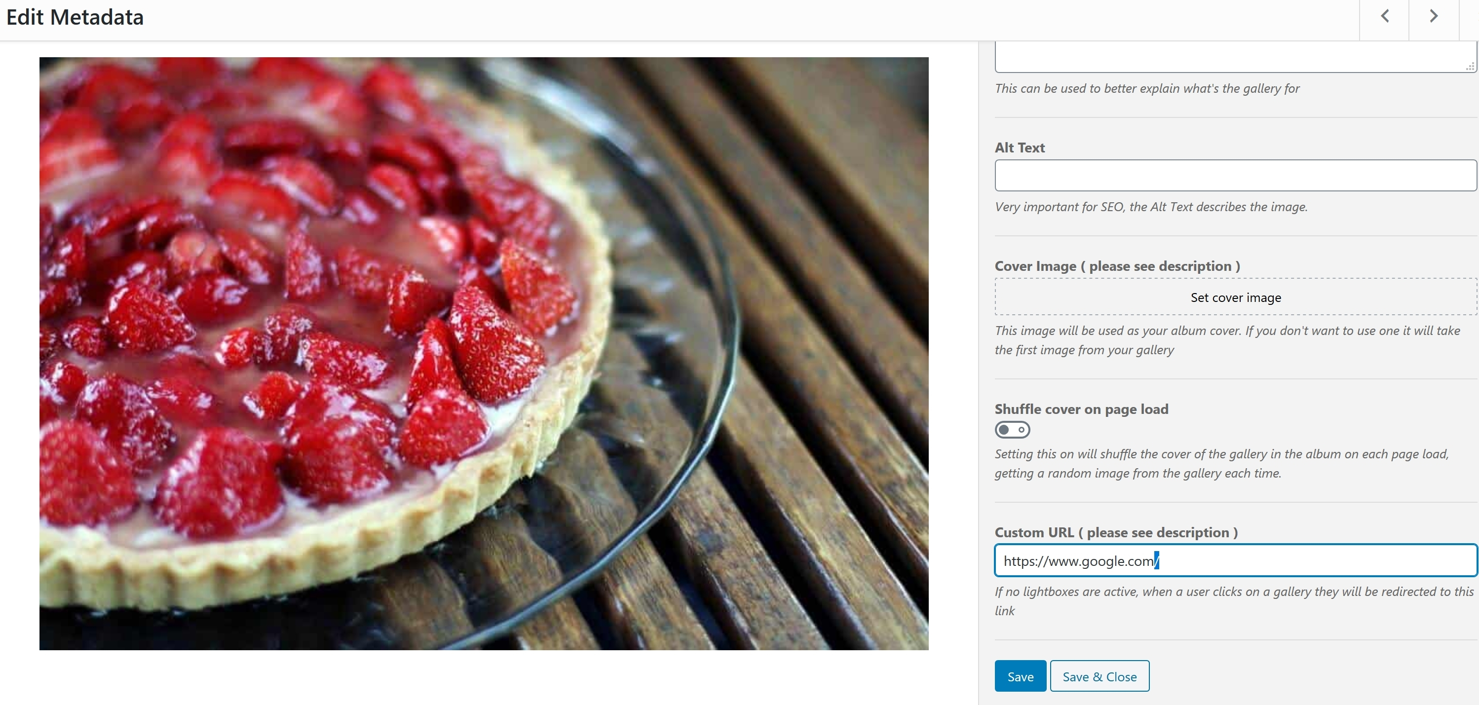
-> Title: add titles for your gallery
-> Caption: add descriptions for your gallery
-> Alt Text: add here a small description for your image. It is very important for SEO.
-> Cover Image: this image will be used as your album cover. If you don’t want to use one it will take the first image from your gallery
-> Shuffle cover on page load: turn this on to shuffle the cover of the gallery in the album on each page load, getting a random image from the gallery each time. Click here to see a demo.
-> Custom URL: if ‘open in a lightbox’ is not active, when a user clicks on a gallery they will be redirected to the link added there. - It will redirect to a gallery URL if standalone is active. This option can be found in Modula > Settings.
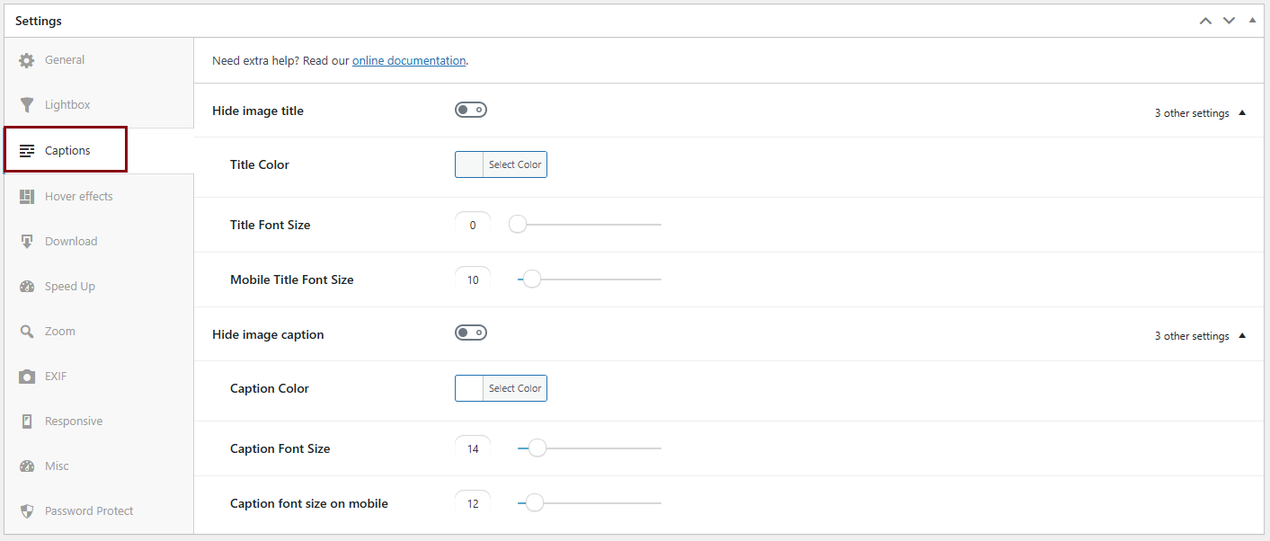
Caption Settings
From the Caption panel, you can control the title and caption settings of the album’s cover.
-
Turn on to hide the title from your album covers. If it’s off then it will display the title.
-> Title color: set the color of the title.
-> Title font size: set the title’s font size.
-> Mobile title font size: set the title’s mobile font size. -
Turn on to hide the caption/description from your album covers. If it’s off then it will display the caption.
-> Caption color: set the color of the caption.
-> Caption font size: set the caption’s font size.
-> Caption font size on mobile: set the caption’s mobile font size.
For a demo with both the title and caption turned on click here.
Hover Effects
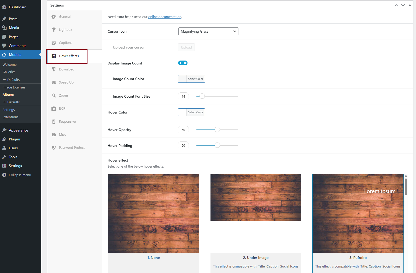
From the Hover Effects panel, you can choose the hover effect that will apply to the galleries’ cover images.
Each hover effect represents a different animation or image behavior that users will experience when hovering their mouse’s cursor over that image.
NOTE: Please keep in mind that these hover effects are not visible when you view galleries on mobile devices – the reason for this is that it is not possible to determine what is classified as a hover on touchscreen devices as there is no mouse and no apparent way to hover over a touchscreen without clicking.
-
Cursor Icon
Select the cursor you want to have on hover. You can choose between:
-> Pointer
-> Magnifying glass
-> Loading
-> Cell
-> Crosshair
-> Resize 1
-> Resize 2
-> Custom (you can upload your own icon). -
Hover effect
Choose your preferred effect. There are over 40 options and are compatible with certain elements: Title, Description, and Social icons. You can see demos with all hover effects here.
-
Turn on to display the number of images in each gallery. It will be displayed next to the gallery’s title.
-> Image Count Color: set the color for the image count number.
-> Image Count Font Size: the image count font size in pixels (set to 0 to use theme defaults). -
Select the background color on hover.
-> Hover Opacity: with this option, you can decrease/increase the opacity. This setting affects the opacity of the image and not the overlay element.
-> Hover Padding: use the slider to adjust the padding of your chosen hover effect.
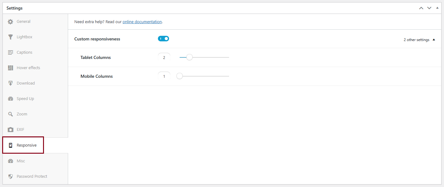
Responsive
The Modula Albums extension empowers you to also optimize your albums for mobile and tablet devices, ensuring a seamless and visually pleasing experience across different screen sizes. Enable the ‘Custom responsiveness‘ option and set the number of columns for an album on tablets/mobiles.