 Made in Europe, buy from Europe.
You can create photo albums in WordPress with Modula Albums. An album groups several galleries into one collection, so you don’t embed them one by one. A click on a gallery cover opens that gallery in a lightbox (a window over the page) or goes to a custom URL.
Plans that include Modula Albums
The Albums extension is part of Modula Pro. It is included in the Trio plan and above. You can see all available plans on the pricing page.
Install the Albums extension
Follow the general guide to installing extensions. After that, you are ready to make your first album.
Create a photo album in WordPress
- Go to Modula → Galleries and click the Albums tab.
-
Click New album at the top right.

- Click the pencil next to the name and add a title for your album.
- Click Add galleries. If the album already holds galleries, click Add first, then Add galleries.
-
Choose one or more galleries.
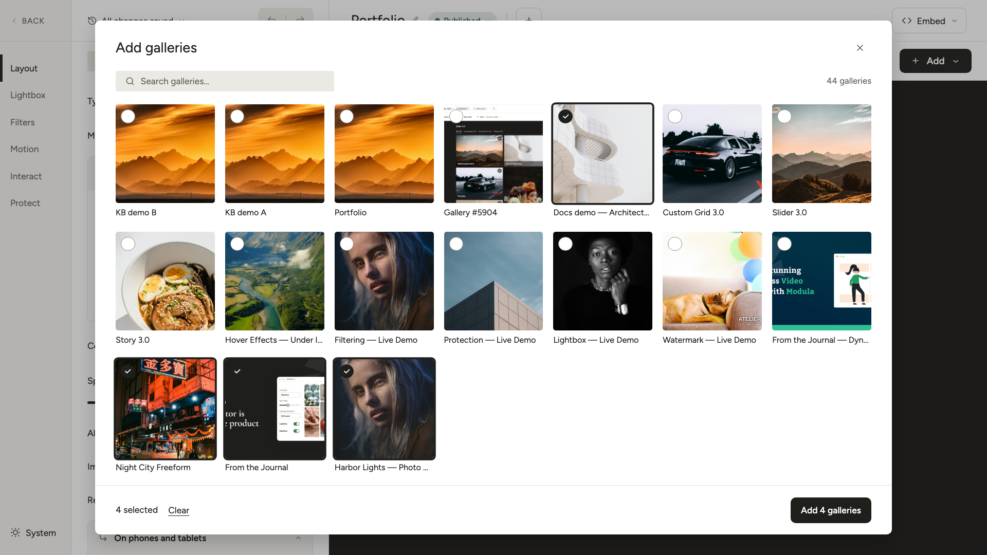
- Click the button at the bottom of the window, for example Add 4 galleries. The galleries you chose are now in the album.
- If you like, add sub-albums to your album too. See Multi-level albums below.
The changes are saved on their own.
Show the album on a page
When the album is ready, you can add it to a page in two ways: with a block or with a shortcode.
Use the Modula Albums block
- Open the page where you want the album, or create a new one.
- Add a block and choose Modula Albums from the block list.
- Pick your album.
- Save or publish the page.
Use the album shortcode
A shortcode is a short tag that WordPress replaces with your album. Each album has a unique ID. You can use that ID to embed the album anywhere:
[modula-album id="YOUR_ALBUM_ID"]
To find the album ID, open the album in the editor and look at the URL in your browser. The number after post= is the ID.
You can also click Embed in the album editor and copy the shortcode from there.
Multi-level albums
An album can hold galleries and also other albums, called sub-albums. You can nest sub-albums inside albums, next to galleries. This helps you put a large collection in an order that is simple to browse.
To add a sub-album, open the album and click Add. Then click Add albums and pick the albums.
Here is an example:
-
Portfolio (album)
-
2024 Projects (sub-album)
- Weddings (gallery)
- Commercial (gallery)
-
2025 Projects (sub-album)
- Editorial (gallery)
-
When visitors open an album with sub-albums, they can go down into each sub-album. From there, they can open the individual galleries.
When an album sits inside another album, Modula also adds links to the albums on the same level. Visitors don’t have to go back to the parent album.
Merge galleries and albums, in the Layout section, decides how the two kinds show.
When it is off, the albums come first as one group. The galleries follow as a second group. When it is on, albums and galleries show together in the same grid.
Album layout settings
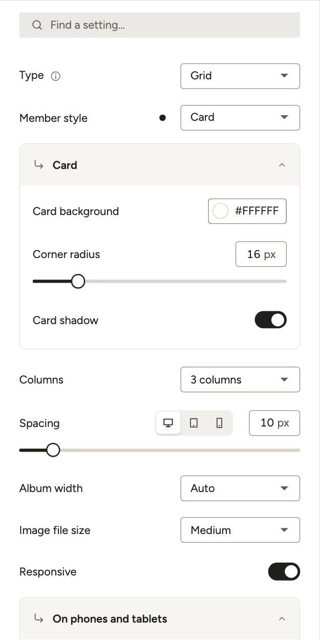
Open the album and click Layout in the left rail. These settings control the overall layout and behavior of the album.
-
Type: Choose how the album covers are arranged. The options are:
- Grid: Galleries show in a fixed number of equal columns.
- Custom grid: Drag and drop the cover images to set their individual sizes, like the Modula gallery Custom grid layout.
- Slider: Galleries and sub-albums show in a horizontal slider.
-
Member style: How the album shows its galleries and sub-albums, in Grid and Custom grid albums. Classic shows each one as a cover tile. Card shows it as a card with the cover on top and the title, caption and counts under it.
New albums start on Card. See Album cards below.
- Columns: Sets the number of columns for the cover images in the Grid type listing.
- Spacing: A slider that sets the gap, in pixels, between cover images in the album grid.
- Album width: Sets the total width of the album on the page. Pick Auto, Full or Custom. With Custom, you can use pixels or a percentage.
- Image file size: Sets the size of the cover image for each gallery or sub-album.
Galleries, albums and navigation
Further down are the Galleries and albums and Album navigation settings.
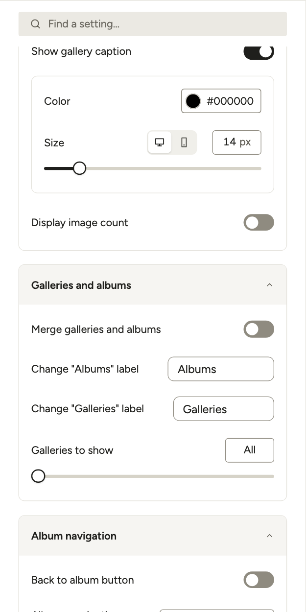
- Merge galleries and albums: Shows the galleries and sub-albums you selected in one grid.
- Change “Albums” label and Change “Galleries” label: Control the labels used for galleries and sub-albums when they show separately.
- Galleries to show: Limits how many galleries the album shows. At 0, it shows all of them.
- Shuffle galleries and albums: When this is on, the order of the cover images is random on every page load.
- Back to album button: This is for albums with the lightbox off, where galleries open by URL. It adds a visible “Back to album” button on the gallery page, so visitors can return to the album.
- Albums navigation position: Sets where the navigation links for your albums show.
- Lazy load: Images load only when a visitor is about to see them. You find this under More settings.
Album cards
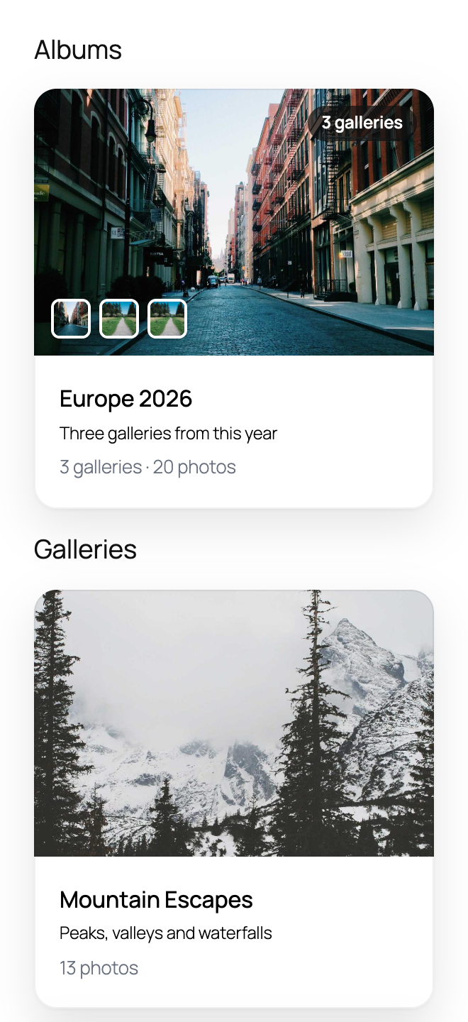
With Member style set to Card, every gallery and sub-album in the album shows as a card. The cover image is on top. Under it are the title, the caption and how many galleries and photos it holds. Cards are available for Grid and Custom grid albums.
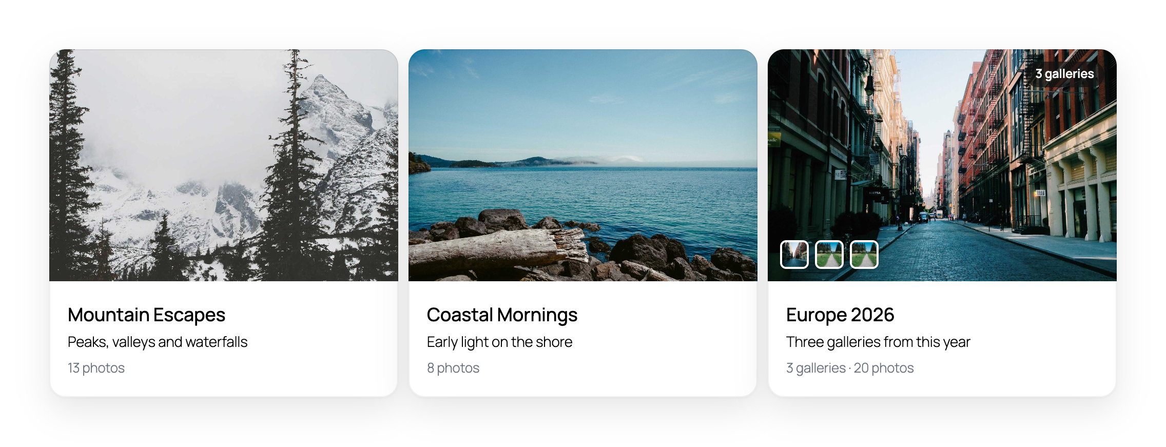
To switch an album to cards, follow these steps:
- Open the album.
- Go to Layout.
-
Set Member style to Card. The preview now shows the cards.
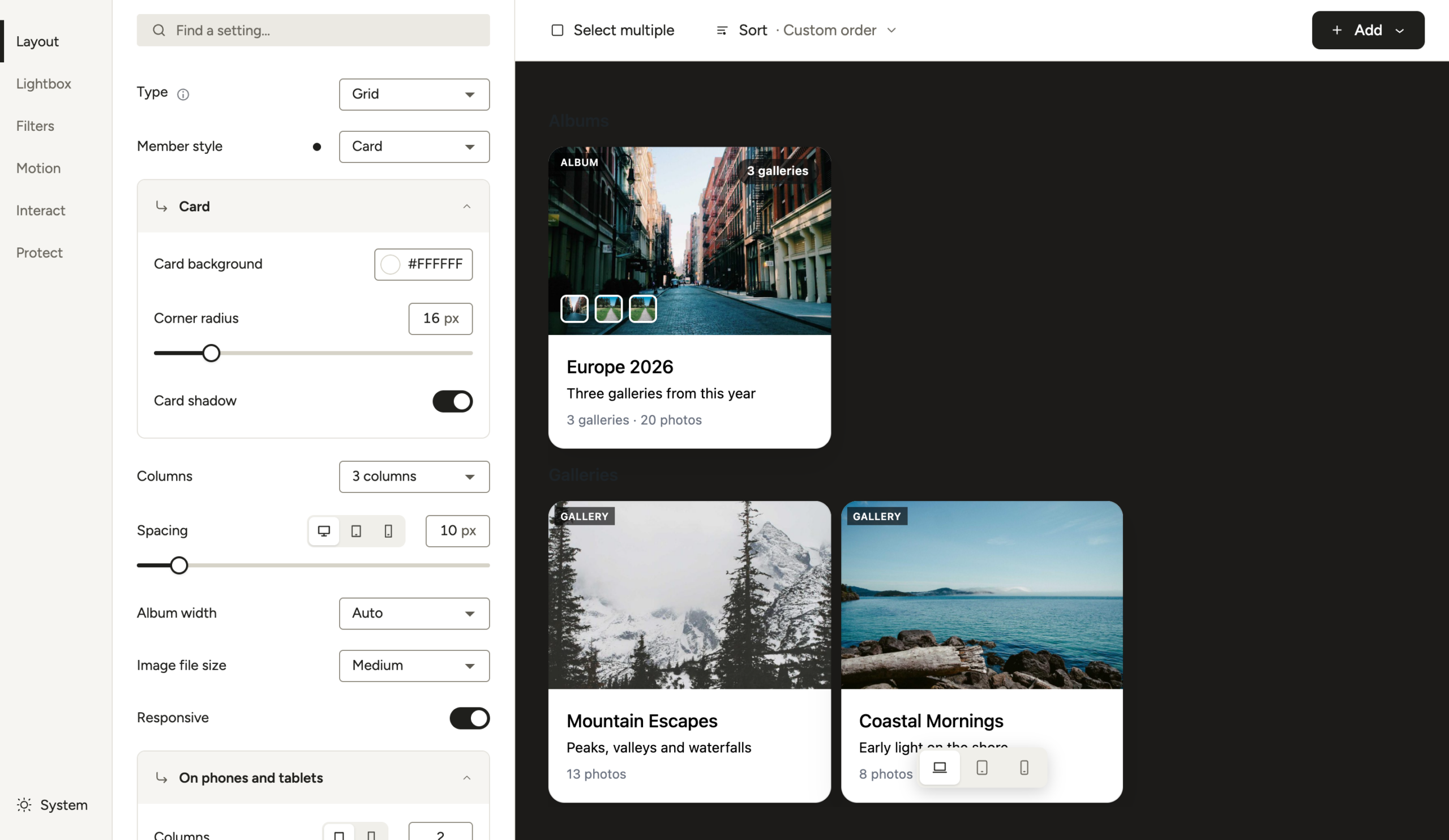
You can then style the cards:
- Card background: The color behind the title and caption.
- Corner radius: How rounded the card corners are, in pixels.
- Card shadow: Adds a soft shadow around each card.
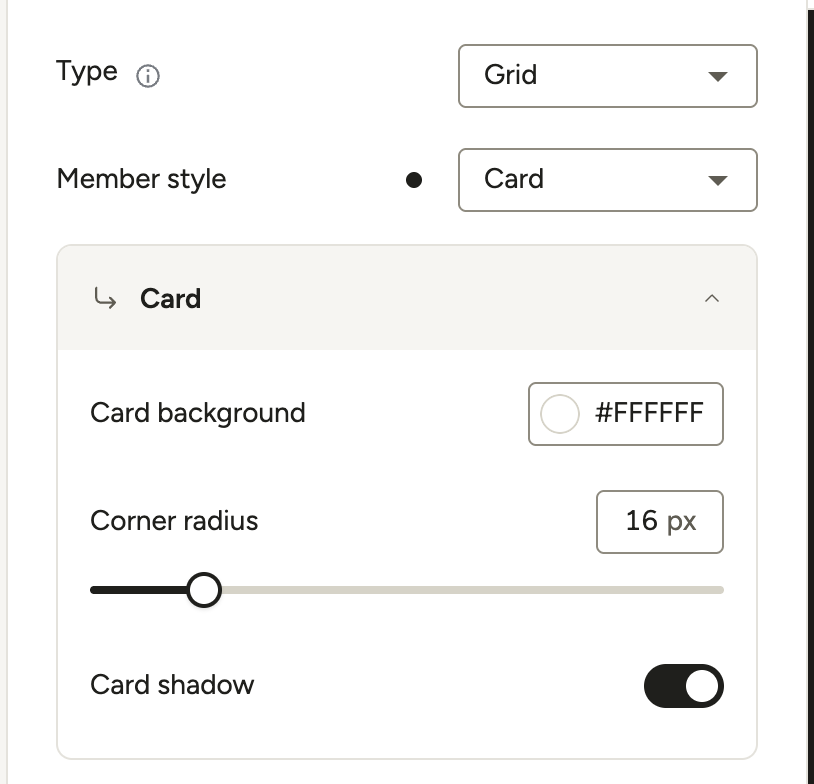
Counts on the cards
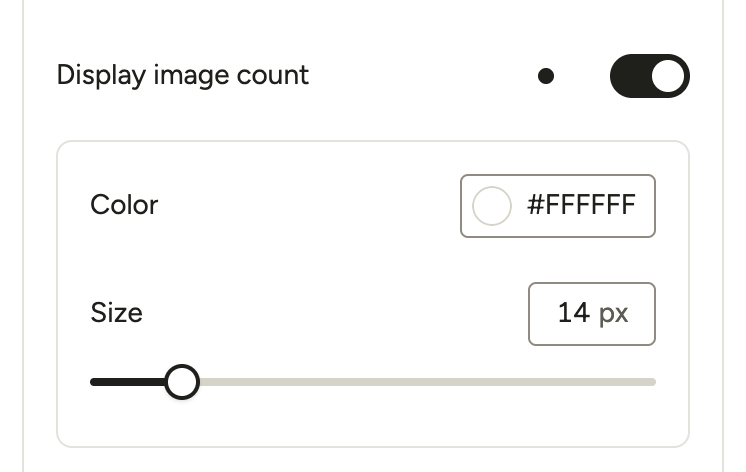
Turn on Layout > Captions > Display image count to show the counts on the cards. A gallery card shows its number of photos, for example 13 photos.
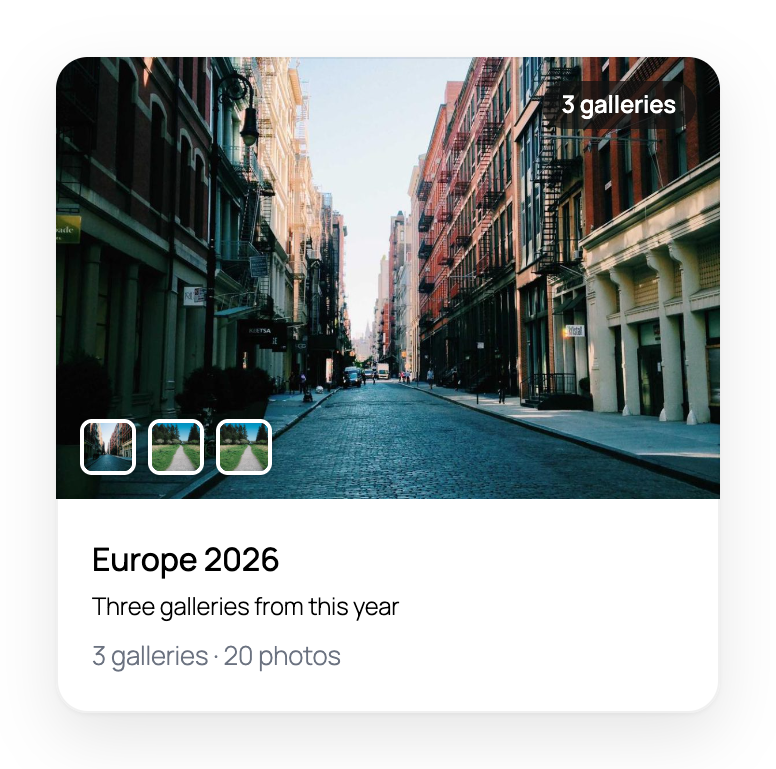
A sub-album card shows the galleries and photos inside it, for example 3 galleries · 20 photos. It also has a badge with the number of galleries on its cover, and a strip with the covers of its first galleries.
Cards in Grid and Custom grid albums
On Grid albums, every cover is cropped to the same 3:2 shape, so the cards in a row line up.
On Custom grid albums, each card fills the cell you draw for it. The cover takes the space the title and caption leave. A card always spans at least 3 × 3 grid cells, so it has room for its cover and text.
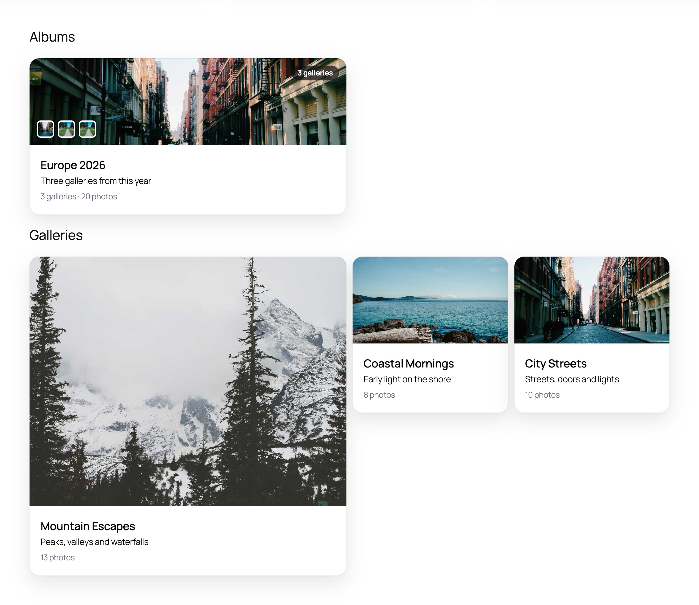
On phones, tablets and narrow content areas, Custom grid albums show as a single column. The cards then look like Grid cards, with a 3:2 cover.
Cards lift slightly when a visitor hovers over them or reaches them with the keyboard. For visitors who prefer reduced motion in their system settings, the cards stay still.
Settings for each gallery and sub-album
Each gallery or sub-album has its own cover image settings. To open them, click the gallery in the album preview. Click Back to settings to return to the album settings.
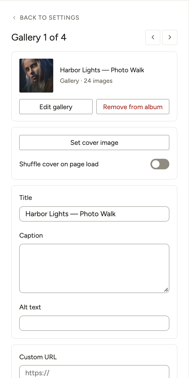
- Title: The label shown on the gallery cover in the album.
- Caption: A short description shown on the cover.
- Alt text: Alternative text for the cover image, used for accessibility and SEO.
- Set cover image: The image used as the gallery’s cover. If none is set, Modula uses the first image in the gallery.
- Shuffle cover on page load: When this is on, a random image from the gallery becomes the cover each time the page loads.
- Custom URL: When the lightbox is off, a click on the gallery cover sends visitors to this URL instead of opening the gallery.
Lightbox settings for albums
When the lightbox is on, a click on a gallery cover opens all its images in a lightbox view. These options control how that view works.
Click Lightbox in the left rail and turn on Enable lightbox to see them.
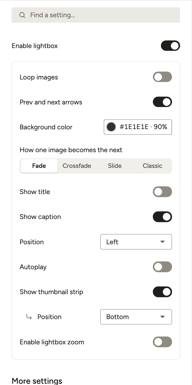
- Prev and next arrows: Shows left and right arrows for moving between images.
- Loop images: After the last image, the lightbox goes back to the first.
- Show title: Shows the image name below the image in the lightbox.
- Show caption: Shows the image description below the image in the lightbox.
- Position: Aligns the title and caption to the left, center or right.
- Background color: Sets a custom background color for the lightbox overlay.
- How one image becomes the next: The animation between images. The options are Fade, Slide, Crossfade and Classic.
- Autoplay: Images move on by themselves. Set Time between slides (ms) to control the delay, in milliseconds.
- Show thumbnail strip: Shows a strip of small images next to the lightbox. Its own Position puts the strip on the left, on the right or at the bottom.
Lightbox toolbar, animation and buttons
The next options change the toolbar, the animation and the buttons in the lightbox. You find them under More settings, in Lightbox & Links.
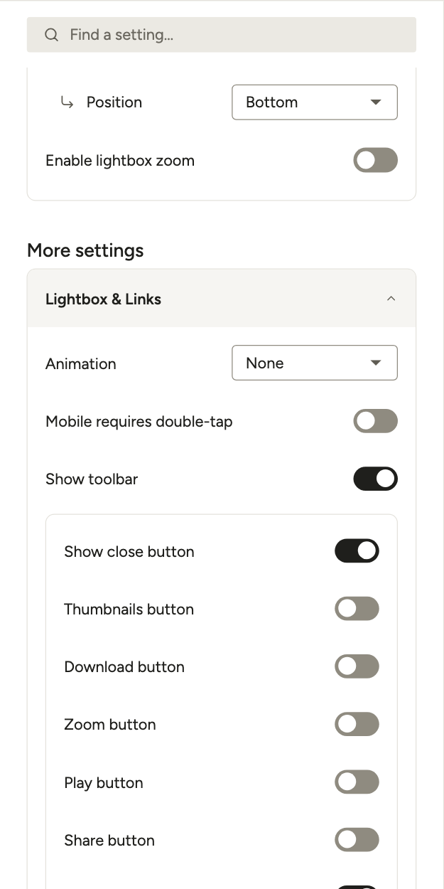
- Animation: The animation when the lightbox opens or closes. The options are Fade, Zoom, Zoom in/out and None.
- Mobile requires double-tap: On mobile, visitors must double-tap to use the lightbox.
- Show toolbar: Turns on the toolbar with options in the lightbox.
- Show close button, Thumbnails button and Play button: Add those buttons to the toolbar.
- Download button: Adds a download button in the top-right corner of the lightbox.
- Zoom button: Adds a zoom-in button in the lightbox.
- Share button: Adds a share button with links to LinkedIn, WhatsApp, Pinterest, X, Facebook and Email.
- Image counter: Shows the current image number out of the total, for example 3 / 12.
When the lightbox is off
If you turn the lightbox off, a click on a gallery cover opens a URL instead. Modula picks the address in this order:
- The Custom URL set in the gallery’s cover image settings, if there is one.
- The gallery’s standalone page URL, if the Standalone feature is on in Modula → Settings.
Caption settings
These settings control how titles and captions look on album cover images.
You find them in the Layout section, under Captions.
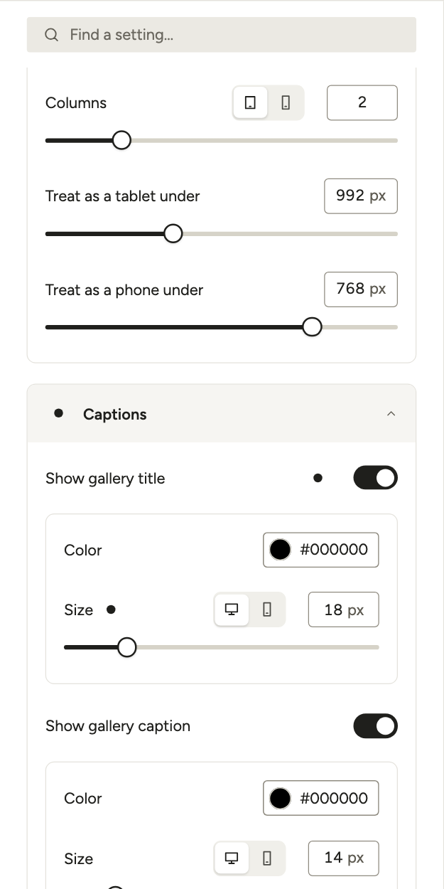
- Show gallery title: Shows the title on the covers in the album. When the title shows, you can set its Color and Size.
- Show gallery caption: Shows the caption on the covers. When the caption shows, you can set its Color and Size.
- Display image count: Shows the number of images in each gallery next to its title. You can also set its Color and Size.
- Where it sits, Background behind text and Padding around text: These show when Member style is Classic.
Hover effects on album covers
These settings control what visitors see when they hover over a gallery cover.
Click Motion in the left rail to find them.
Note: When Member style is Card, cards have their own hover (they lift slightly). The Hover effect, Darken on hover and the caption position settings are hidden for Grid and Custom grid albums.
Note: Hover effects don’t show on touchscreen devices, because there is no hover state on mobile.
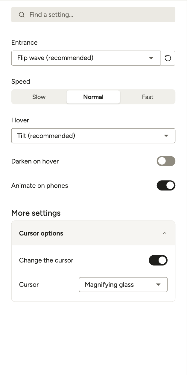
- Entrance: How covers appear as visitors scroll to them.
- Speed: The pace of the entrance, and of the hover motion where it applies.
- Hover: What happens when a visitor points at a cover.
- Darken on hover: Darkens the cover on hover, using the Dim color.
- Animate on phones: When this is off, phones show the album without entrance or hover motion.
- Dim color: The overlay color shown on hover. You find it under More settings.
- Change the cursor and Cursor: The cursor style shown on hover. The options include Pointer, Magnifying glass, Loading, Cell, Crosshair, two Diagonal resize cursors and Custom (upload your own icon). They are under More settings too.
Download settings
These settings let visitors download images from your album. For downloads in a single gallery, see how to let visitors download gallery images.
Click Interact in the left rail to find them.
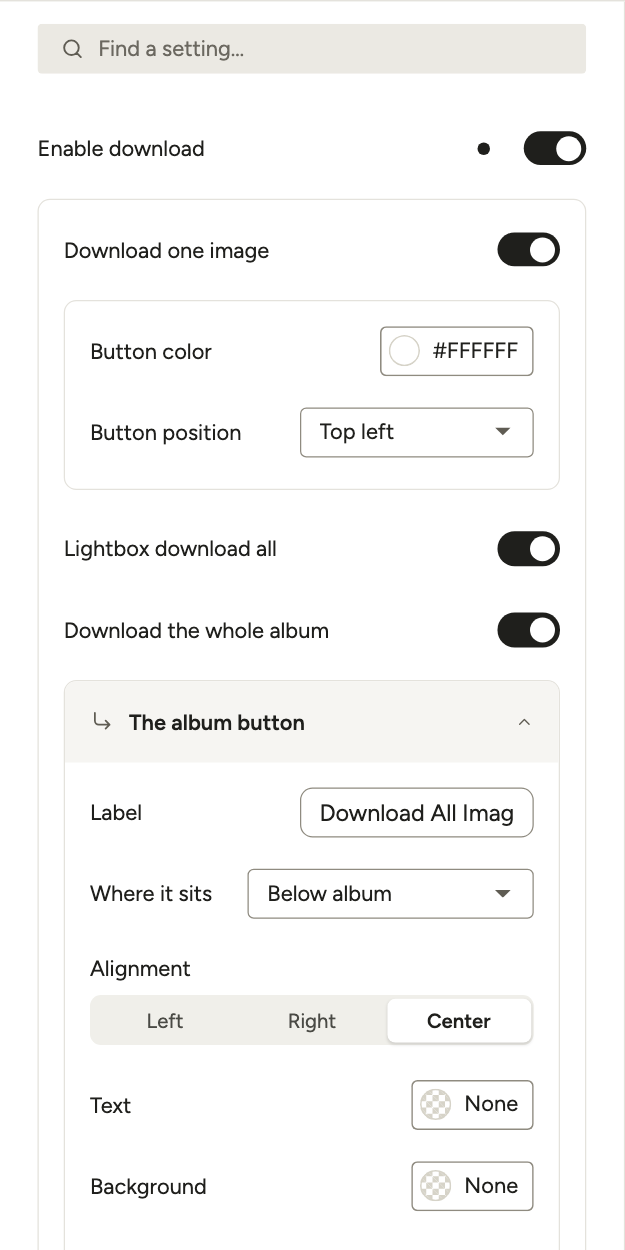
- Enable download: Lets users download the images from your album.
- Download size: Sets the size of the image when it is downloaded.
- Download one image: Adds a download button for the images. You can set its Button color and Button position.
- Lightbox download all: Turns on the download all option for the album.
- Download the whole album: Turns on the configuration options for the download all button.
- Alignment: Sets where this button shows, from left to right.
- Where it sits: Sets whether the button shows above the album, below it, or in both places.
- Label: Sets the label of the button.
- Text and Background: Set the colors of the button.
- Icon before the label: Turns on an icon for the button.
- Icon color: Sets the color of the icon.
- Zip file name: Sets the name of the ZIP file that holds all album images.
Zoom settings
These settings let visitors zoom in on the images in your album.
Click Lightbox in the left rail and turn on Enable lightbox zoom to see them.
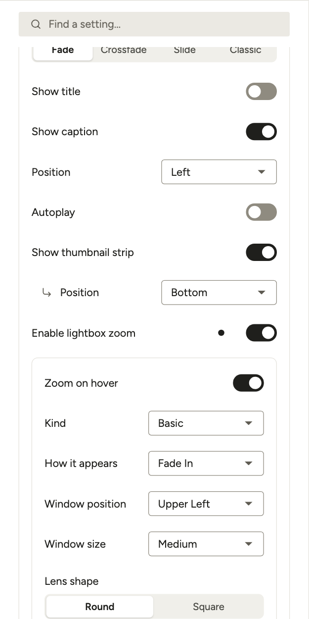
- Enable lightbox zoom: Turns on the zoom options for your album.
- Zoom on hover: Zooms in by itself when a visitor hovers over the image.
- Kind: Pick a basic zoom, an inner zoom or a lens.
- How it appears: Sets the effect used when zoom starts.
- Window position: Sets where the zoomed-in window appears.
- Window size: Sets the size of the zoom window.
- Lens shape: Pick a round or a square lens.
- Color: Sets the tint color when zoom is used.
- Strength: Sets how strong the tint looks.
EXIF settings
EXIF data is the shooting data a camera stores in each photo. In the Lightbox section, open EXIF. Use Show EXIF data to pick how EXIF data is handled in the album: Take Gallery setting, Display EXIF data or Hide EXIF data.
Responsive settings
Open Responsive in the Layout section to set a different number of columns for the album on tablet and mobile screens. This is separate from the desktop layout, and it helps the album look good on all devices.
Use Treat as a tablet under and Treat as a phone under to set where each screen size starts.
Password Protect settings
You can also keep an album private with a password.
Click Protect in the left rail to find these settings.
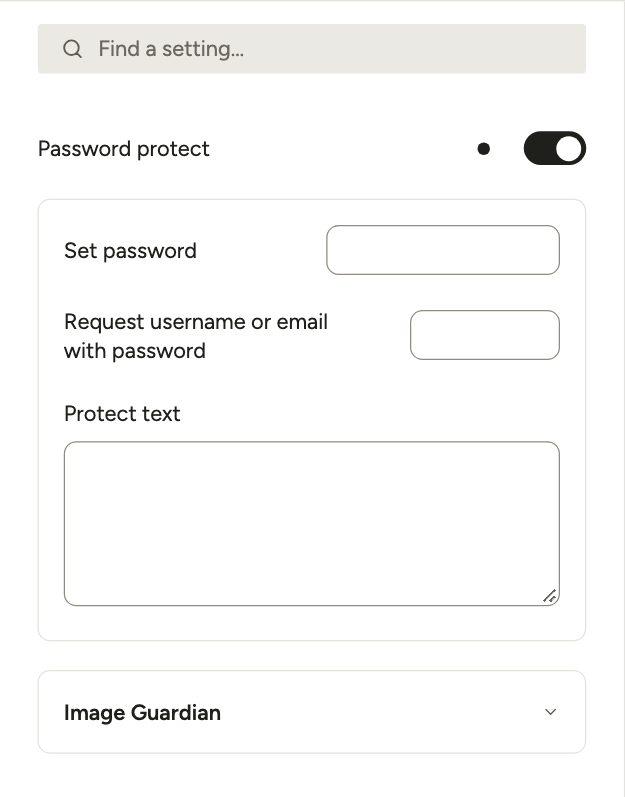
- Password protect: Turns on the password protection feature for your album.
- Set password: The password visitors have to enter.
- Request username or email with password: Type a username or an email here. Visitors then have to enter it too, next to the password.
- Protect text: The message visitors see above the password field. You can leave it empty.